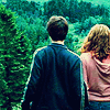
Tutorial 4
Tutorial#4 - Ron and Hermione
Learn how to go from this:
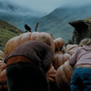
to this:
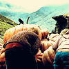
in 5 easy steps and 4 layers.
This tutorial is more of a color suggestion guide. Feel free to recreate similar coloring effects with this guide.
1. Pull out a screencap of your desired fandom/non-fandom and proceed to do your before icon preparation. Don't sharpen just yet.
* I cropped and resized to 100x100.
My Base:

2. Create 2 duplicates of your background layer and make the top most duplicate invisible by clicking the eye icon beside it. Sharpen the first duplicate and Fade Sharpen as needed.
* I fade sharpened mine to 75%. As an extra, I smoothed the background behind Ron and Hermione and smoothed some pixel-y areas.
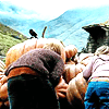
3. Open up the Brightness/Contrast Window. Add 30 to Brightness and Add 50 to Contrast. Close that window and open up the Hue/Saturation Window. And add 60 to the Saturation. Don't worry about it being saturated for now. And finally, set the layer to Screen.
After this layer:
4. Now, click on the eye icon beside the top most layer to make it visible once more. Completely desaturate it. Open up Brightness/Contrast and add 30 to Brightness again. Set the layer to Soft Light.
After this layer I achieved:
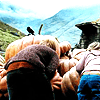
5. Now, create a layer between the softlight and screen layer and fill the layer with #0c2489, a shade of blue. Set the layer to Difference 24% or whatever you desire but somewhere along those lines.
My Final Icon:

Feel free to Mem this or show me what you created! Anything is appreciated!
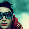
Icons created by following this coloring:
and
