(no subject)

to
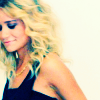
in PSP9.
weee. i'm really just procrastinating.
coloring requested by starbie
Crop, etc. I never sharpen. I hate it when my edges get all pixel-y.

Adjust > Automatic Color Balance. Slide the little slider all the way to the left - cooler (blue) 9300. Strength: 62 (this really varies, it honestly depends on your image). Make sure 'remove color cast' is checked. screencap. This gives your image a nice blueish tint. It shouldn't be too obvious, but you should notice a difference.
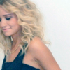
The color balance takes some of the brightness out of the image. I want it back. Adjust > Automatic Saturation Enhancement. Bias: More Colorful, Strength: Strong. Make sure the 'skintones present' box is checked - I find that this enhances colors more than leaving it unchecked.
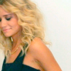
Wooh. Base is all done. New Raster Layer. Flood fill with a light tan color (I used #f2e4aa), set to 'multiply' opacity:100. this makes the image a bit brown and yellow. It's not ugly, per se, but it is very flat and unfinished looking.

New Raster Layer. Flood fill with a light blue (middle of the spectrum, I used #74bbfe). Set to burn. Woosh. Dark.
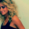
Duplicate base, drag on top of burn layer (in the layer pallet) and set to screen. Opacity: 50%. This all depends on your image. You may need more than one layer set to screen. Play with it.
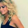
Okay, it's not bad looking, but I want a little more pop. So now it gets a bit tricky. New Raster Layer > Fill with a dark blue (I used #0f1e3b) > set to 'exclusion'. Exclusion layer's aren't always necessary, and often leave images looking flat and uncontrasted, but occasionally they're very useful. Duplicate exclusion layer change opacity to about 50%.
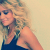
That's not popped at all. In fact, it's very dull and, well, ugly. Go to your multiply layer (in the layer pallet) - click the little eye next to it. Do the same for your burn layer. (layer pallet). So now we have:
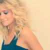
Bah! Flat! Ctrl + Shift + C (or edit > copy merged), then Ctrl +L (paste as a new layer) and set to 'soft light'. Make sure this layer is above the exclusion layers in your pallet, otherwise it's pretty much useless. Now go back to your multiply and burn layers, click the eye again. we now have a brighter image.
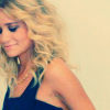
It's still not exactly what I'm looking for, so I flatten my image and then go to Adjust > Automatic Contrast Enhancement > Bias: Lighter, Strength: Mild, Appearance: Flat.
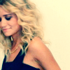
I have a brighter image, but it's lost some of its color - Adjust > Automatic Saturation Enhancement. Bias: Normal, Strength: Strong (once again, make sure 'skintones present' is checked).
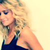
That's nice, but a blue-er image would be more fun. So I duplicate my merged image, go to Adjust > Automatic Color Balance and slide the little slider all the way to the left - cooler (blue) 9300. But this time, I set the strength to 100.
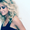
Eh, ugly much? Adjust > Automatic Saturation Enhancement. Bias: More Colorful, Strength: Strong.
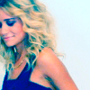
How's that for colorful? But I don't like it. So I set that layer to 'color (legacy)' at about 50% opacity.
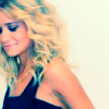
This looks okay. You can leave now. But oomph is what I wanted, and oomph is what I'll get. Duplicate merged image, drag to the top of your layer pallet. Shift + H (adjust > hue and saturation > hue/saturation/lightness), set saturation to +30 and hue to +10. Set layer to 'hard light' and opacity 45%. I often set this layer to soft light instead, it depends on your image. And we're finished.

Yaay.
original:

reproduction:

not bad, this process often creates varied products, you'll never end up with exactly the same output.
Other examples:
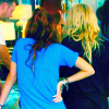
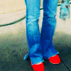
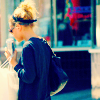
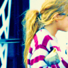
confused? lost? feel free to ask :)