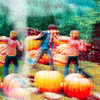
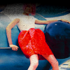
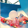
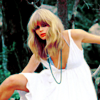
(no subject)

>

using PS CS2, not translatable to PSP [selective color]
as requested by herfaith
Prepare your base, this step is a matter of preference.

The image is a bit dark and dull, but instead of a screen layer, I decided to use curves. (I picked up this technique from brasaremean). Set this layer to softlight.*
RGB
i: 129 o: 173
RED
i: 167 o: 186
GREEN
i: 104 o: 150
BLUE
i: 146 o: 206
screenshots

>

To give me a psuedo blank pallet, I set a orangey fill layer to softlight (layer > new fill layer > solid color; mode: soft light). For this image I used #ca9d01.

>

Well isn't that ugly? Layers > New Adjustment Layer > Selective Color.
REDS
cyan: -100
magenta: 19
yellow: 13
black: 0
YELLOWS
cyan: -3
magenta: -23
yellow: -40
black: 25
NEUTRALS
cyan: 30
magenta: 0
yellow: -53
black: 17

>

It's a bit dull and washed out, so I add another selective color layer.
REDS
cyan: -100
magenta: 6
yellow: 100
black: 0
YELLOWS
cyan: 0
magenta: 0
yellow: 100
black: 56
NEUTRALS
cyan: -7
magenta: 0
yellow: 7
black: 0

>

It's still not as vibrant as I'd like, so I add a third selective color layer.
REDS
cyan: -2
magenta: 6
yellow: 100
black: 0
YELLOWS
cyan: 0
magenta: 0
yellow: 100
black: 56
WHITES
cyan: 0
magenta: 0
yellow: 0
black: -12
NEUTRALS
cyan: 5
magenta: 0
yellow: 9
black: 12

>

fini!
herfaith also asked about the coloring in this icon:

The trick is toning down the yellow just a bit in the last two selective color layers, but it also comes from the effect on the image. I flattened the image and then duplicated this new base. Then I blurred the image (filter > blur > blur), darkened it dramatically (image > adjustments > brightness/contrast; brightness: -60), set this layer to screen and then shifted it a bit.

>

other examples (with varied settings)


