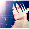
Tutorial 001: Playing around with gradients and textures
This is my first icon tutorial. So feedback and lots of feedback would be lovely and how I could improve my explanation/technique. I never got around to doing icon tutorials because I tend to have a lot of layers and play around with a lot of filters for my icons. So if I were to go step by step it's probably going to take a lot of work.
This icon tutorial is made for people who have already grasp the basics of Adobe Photoshop. So I'm assuming that playing with layers, filters and adjustment layers is child's play for most of you.
The tutorial should be relatively easy to comprehend and is most effective for Adobe Photoshop 7.0 users. I won't go into intrinsic details, because this tutorial is basically to grasp the techiniques and so, I do not expect to see exact replicas of my icons roaming around. Not that people would even bother. Nya.

to
Tutorial 001

Crop and resize original image.

Create a new layer. Use eyedropper tool to select a dark bluish color, #011F43. Set to exclusion, opacity 100%.

Duplicate base layer. Set to soft light, opacity 100%.

I want a more faded off look. So in this case, I used a bluish gradient. Set the gradient to pin light, opacity 100%.

I used a slightly edited texture that was downloaded from immoral. Set the texture to overlay, opacity 100%.

Play with the adjustment layers (Layer > New Adjustment Layer) a little bit to get better contrast, coloring etc.

The color is a little bit too bluish some parts, so I used a orangey gradient. Set the gradient to soft light, opacity 25%.

Add a border and text to finalise the look.
That's all! :D
If you don't understand any part of my explanation, feel free to ask! I would most definitely love feedback. ♥
This icon tutorial is made for people who have already grasp the basics of Adobe Photoshop. So I'm assuming that playing with layers, filters and adjustment layers is child's play for most of you.
The tutorial should be relatively easy to comprehend and is most effective for Adobe Photoshop 7.0 users. I won't go into intrinsic details, because this tutorial is basically to grasp the techiniques and so, I do not expect to see exact replicas of my icons roaming around. Not that people would even bother. Nya.

to

Tutorial 001

Crop and resize original image.

Create a new layer. Use eyedropper tool to select a dark bluish color, #011F43. Set to exclusion, opacity 100%.

Duplicate base layer. Set to soft light, opacity 100%.

I want a more faded off look. So in this case, I used a bluish gradient. Set the gradient to pin light, opacity 100%.

I used a slightly edited texture that was downloaded from immoral. Set the texture to overlay, opacity 100%.

Play with the adjustment layers (Layer > New Adjustment Layer) a little bit to get better contrast, coloring etc.

The color is a little bit too bluish some parts, so I used a orangey gradient. Set the gradient to soft light, opacity 25%.

Add a border and text to finalise the look.
That's all! :D
If you don't understand any part of my explanation, feel free to ask! I would most definitely love feedback. ♥