Text in Photoshop
I have no idea why I'm doing this, or whether it's been done before. I'm also not sure how it will translate to earlier versions :(
But anyway!
I had a lot of trouble with text when I first started using photoshop, especially coming from paintshop pro.
Text in Photoshop CS
- how can you incorperate it into your icons.
A tutorial/tips guide by __gunner
Firstly, your photoshop settings should look like this, with the text tool selected:
When creating an icon, the image size should be 100x100, and the resuolution should be 72. The resolution, or dpi, stands for dots per inch, or pixels, and really only applies if you want to print your icons.. which completley defies their purpose, but anyway..
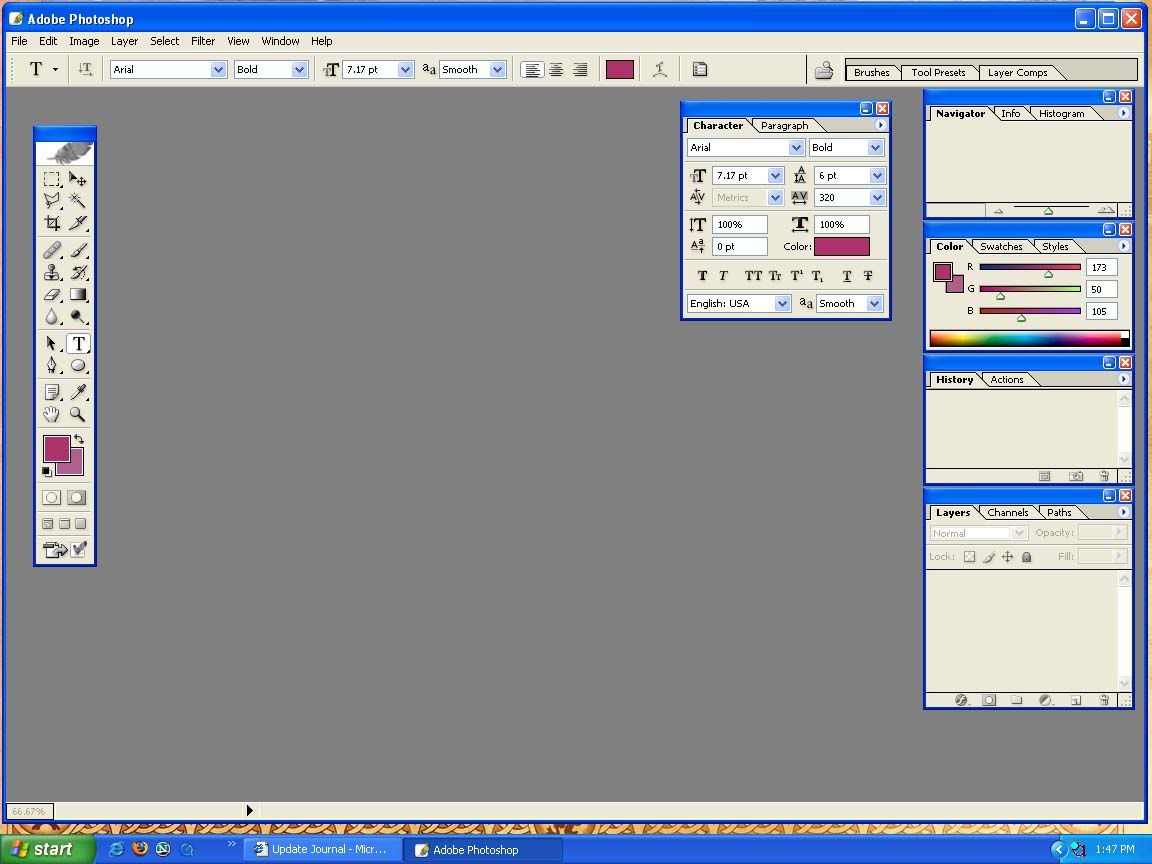
Now. Once you have your icon all spiffy and ready for text... this is where the fun begins.Select the text tool, and open the character and paragraph palette by clicking on the button surrounded by the obvious pink circle :0 selecting this will open the palette, and close it.
Text doesn't, and shouldn't just be straight and default. Sure, it looks good, but it's boring and repetitive, and very cliche. These control will allow you to edit and.. yes.. control.. the size, shape, width, weight, style, colour, line height, line width... of your text.
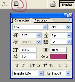
These, very basically, are the default controls. They control the default setting of the fonts. Arial being the font face, bold being the weight of the text. pretty much common sense, but you can adjust the weight of your text to suit other settings I'm going to cover :)
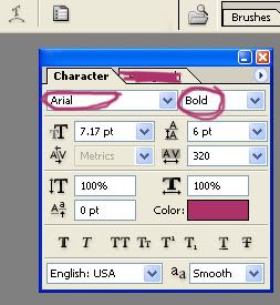
This control the point size of your text. The size. It can be pretty much any size - 0.01 to whatever. Using point sizes is vital for really controling how the text fits into an icon. Another tip is: not all of the text on your icon has to be the same size. You might have one big word, one slightly smaller, and another smaller.
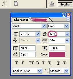
My favourite. Line height, or LEADING. This feature controls the line height between your letters, or paragraphs.
you have to have
at least two lines of text
to see it working
Now, because my schools intenet is playing up, I no longer have pictures... so..
I've never used metrics, but apparently it's similar to kerning in PSP... *cries*
The controls the letter spacing, or the TRACKING. This controls how close, or how far the letters are spaced apart. So it's this.. o r i t ' s t h i s.
The next control ^T controls the vertical width of your letters, or how tall or small they are. This is diffent in choosing font size, because this feature allows you to only edit the vertical size, and not the width. Be careful when using this in icons, as it can leave text looking very pixelated if in the wrong setting. If you need to change it back to default, simply return the settings back to 100%
the next one: does the opposite of ^T in that it only controls the horizontal size of your text. The same warning applies here too *-*
And again, I have no idea what this does.. as I've never used it before..
Anyway. I hope this half assed attepmt at a tutorial has helped someone.. it definatley cured my boredom :/
If you know anything that should be up here, don't hesitate to tell me, and I'll put it up.