Heroes Tutorial
From 
to
A tutorial for welldoyouwantto. I used Photoshop CS 2. It's kind of complicated.
I didn't keep all the layers for the icon but...
Preface: So, I'm big on the whole "even if you follow a trend/tutorial you should still sort of know what the heck each step does" thing. Yes, I know, that's such a pain. But, basically, you should never follow a tutorial exactly. Okay? Okay.
Step One: Get Your Base
I grabbed a cap from The Striped Wall from the Heroes episode "Five Years Gone." It features the very pretty Mohinder Suresh in the future in the oval office. Then crop it to 100x100 (or 80x100 or whatever if you feel like it)
Here we go:
As you can see, that is not a square like in the icon. The thing is, I wanted a more interesting crop. So I took the smudge brush at 60% opacity and smudged the green color up and around until...

Step Two: Lighting
Luckilly, the cap was already pretty well lit. I wanted more brightness/contrast, however. You can do this using levels, curves, brightness/contrast, fill layers, or just plain screen and softlight layers. I think on the original I did a mixture of all of those but, for the sake of ease, I just used a curves layer on this one. Just remember different caps mean that different ways of lighting are better.
I made a new curves layer and made a dot. Clicked the dot and set the setting to "Input: 155, Output: 234." Made another dot on the line below the first dot and set that to "Input: 69, Output: 168." The icon looks like...

Step Three: Fill Layers
Here's the big thing with the coloring. I made a new layer, set to Exclusion (100% Opacity) and filled it with NOT the typical blue/green coloring but with a dark brown/red color (2f0700).

Now I wanted this to be more green so I made a new layer and filled it with a light green/yellow (dde6b3) and set it to Multiply (100% Opacity). The image wasn't clear enough so I dragged the fill underneath the Curves layer.

Step Four: Selective Coloring
Okay, fun times with selective coloring. I love selective coloring; the key is not to overdo things. The poor setting has gotten a lot of abuse with the blue/oversaturated trend thing.
Selective Color Settings:
Red:
C: -100
M: -50
Y: 100
K: 0
Yellow:
C: -100
M: -32
Y: 37
K: 0

Step Five: Textures
To get the background grunge I took textures from peoplemachines and cropped them all into 100x100 squares. I inverted one of them so that the three looked like:


Set the first two to Screen and the last to Multiply. I erased the parts of the texture over Mohinder with a fuzzy eraser at 50% opacity so that the texture was still there but not oppressively.

Step Six: Saturation
New Hue/Saturation layer. I just bumped the Saturation up to 14.

Step Six: Soft Light
Okay, now go all the way back down and take your 100x100 base. Duplicate that and drag the layer on top. Set that to Soft Light. Duplicate the Soft Light Layer. Now erase everything that isn't Mohinder on the second layer. Set the second layer to 50% Opacity.

Step Seven: Selective Coloring Part Two
Time to make things a tad more interesting!
Selective Coloring Settings:
Reds:
C: -20
M: 15
Y: 22
K: 0
Yellows:
C: -34
M: 21
Y: 8
K: 0
Whites:
C: 0
M: 0
Y: 0
K: -100
Neutrals:
C: 13
M:-10
Y: 13
K: -33
Blacks:
C: -20
M: 100
Y: 30
K: 31

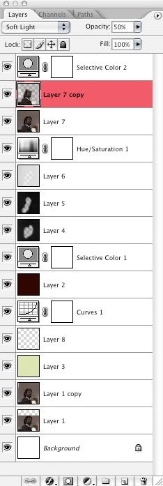
The end! Not perfect, but pretty close. Here's an overview of the layers if you're still confused:

Feel free to ask questions if you're still unsure about something. Hope this helped!
Coming Soon: Big Damn Multifandom Post

to

A tutorial for welldoyouwantto. I used Photoshop CS 2. It's kind of complicated.
I didn't keep all the layers for the icon but...
Preface: So, I'm big on the whole "even if you follow a trend/tutorial you should still sort of know what the heck each step does" thing. Yes, I know, that's such a pain. But, basically, you should never follow a tutorial exactly. Okay? Okay.
Step One: Get Your Base
I grabbed a cap from The Striped Wall from the Heroes episode "Five Years Gone." It features the very pretty Mohinder Suresh in the future in the oval office. Then crop it to 100x100 (or 80x100 or whatever if you feel like it)
Here we go:

As you can see, that is not a square like in the icon. The thing is, I wanted a more interesting crop. So I took the smudge brush at 60% opacity and smudged the green color up and around until...

Step Two: Lighting
Luckilly, the cap was already pretty well lit. I wanted more brightness/contrast, however. You can do this using levels, curves, brightness/contrast, fill layers, or just plain screen and softlight layers. I think on the original I did a mixture of all of those but, for the sake of ease, I just used a curves layer on this one. Just remember different caps mean that different ways of lighting are better.
I made a new curves layer and made a dot. Clicked the dot and set the setting to "Input: 155, Output: 234." Made another dot on the line below the first dot and set that to "Input: 69, Output: 168." The icon looks like...

Step Three: Fill Layers
Here's the big thing with the coloring. I made a new layer, set to Exclusion (100% Opacity) and filled it with NOT the typical blue/green coloring but with a dark brown/red color (2f0700).

Now I wanted this to be more green so I made a new layer and filled it with a light green/yellow (dde6b3) and set it to Multiply (100% Opacity). The image wasn't clear enough so I dragged the fill underneath the Curves layer.

Step Four: Selective Coloring
Okay, fun times with selective coloring. I love selective coloring; the key is not to overdo things. The poor setting has gotten a lot of abuse with the blue/oversaturated trend thing.
Selective Color Settings:
Red:
C: -100
M: -50
Y: 100
K: 0
Yellow:
C: -100
M: -32
Y: 37
K: 0

Step Five: Textures
To get the background grunge I took textures from peoplemachines and cropped them all into 100x100 squares. I inverted one of them so that the three looked like:


Set the first two to Screen and the last to Multiply. I erased the parts of the texture over Mohinder with a fuzzy eraser at 50% opacity so that the texture was still there but not oppressively.

Step Six: Saturation
New Hue/Saturation layer. I just bumped the Saturation up to 14.

Step Six: Soft Light
Okay, now go all the way back down and take your 100x100 base. Duplicate that and drag the layer on top. Set that to Soft Light. Duplicate the Soft Light Layer. Now erase everything that isn't Mohinder on the second layer. Set the second layer to 50% Opacity.

Step Seven: Selective Coloring Part Two
Time to make things a tad more interesting!
Selective Coloring Settings:
Reds:
C: -20
M: 15
Y: 22
K: 0
Yellows:
C: -34
M: 21
Y: 8
K: 0
Whites:
C: 0
M: 0
Y: 0
K: -100
Neutrals:
C: 13
M:-10
Y: 13
K: -33
Blacks:
C: -20
M: 100
Y: 30
K: 31

The end! Not perfect, but pretty close. Here's an overview of the layers if you're still confused:

Feel free to ask questions if you're still unsure about something. Hope this helped!
Coming Soon: Big Damn Multifandom Post