Tutorial? What's a tutorial?
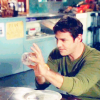
We'll be going from this: 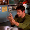
to this: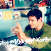
I use PSP8 but I'm sure it can be used in PS.
Step 1: I resized the picture, which is from screencap paradise located here, anyways, resized to 215x121px. Then I made a new 100x100 icon base and pasted the newly resized picture onto the base as a new layer. Then went to Layers -> Merge -> Merge all (Flatten).

Step 2: OK. So, we've got the base icon. Woo! Well, now you're going to go to Adjust -> Color Balance -> Automatic Color Balance. Here's a picture of my settings:
Settings
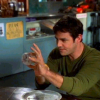
Step 3: Now, the icon won't look that much different, but that's good. Now, duplicate your base 2 times and set them to screen.
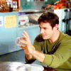
Step 4: Select the lowest screened layer and make a new layer right above it, but still under the top screen layer. Fill this with #011537 and set it to exclusion. Duplicate it.

Step 5: Go to Edit -> Copy Merged. Then, select the top screened layer, and go to Edit -> Paste -> Paste as new layer. The copied layer should now be pasted on top of everything. Set this layer to soft light.
Step 6: Now select the screened layer right below the top soft light layer, and create a new layer under the soft light but above the screened. Fill it with #A4DDF4. Set this layer to burn.
Step 7: Keep the burn layer selected, then go to Layers -> New Adjustment Layer -> Curves. I always mess around with the red and green. I very seldom use the RGB and I never use the Blue. So, just play around a little. I usually use a lot of red, then a little green, and the colors even out. Here are pictures of my settings.
RGB
Red
Green
Blue

Step 8: Flatten all the layers. (Merge -> Merge All (Flatten).) Then, I added a text brush by unmasked_icons. And voila! Completed. Here is the final icon:

Other icons I made using this method:
1.
2.
3.
4.
Please don't copy this tutorial exactly, and on some pictures it may not work because of darkness or bad quality etc. If I see people abusing this statement, I will take the tutorial down. Thanks.

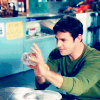
to this:

I use PSP8 but I'm sure it can be used in PS.
Step 1: I resized the picture, which is from screencap paradise located here, anyways, resized to 215x121px. Then I made a new 100x100 icon base and pasted the newly resized picture onto the base as a new layer. Then went to Layers -> Merge -> Merge all (Flatten).

Step 2: OK. So, we've got the base icon. Woo! Well, now you're going to go to Adjust -> Color Balance -> Automatic Color Balance. Here's a picture of my settings:
Settings

Step 3: Now, the icon won't look that much different, but that's good. Now, duplicate your base 2 times and set them to screen.

Step 4: Select the lowest screened layer and make a new layer right above it, but still under the top screen layer. Fill this with #011537 and set it to exclusion. Duplicate it.

Step 5: Go to Edit -> Copy Merged. Then, select the top screened layer, and go to Edit -> Paste -> Paste as new layer. The copied layer should now be pasted on top of everything. Set this layer to soft light.

Step 6: Now select the screened layer right below the top soft light layer, and create a new layer under the soft light but above the screened. Fill it with #A4DDF4. Set this layer to burn.

Step 7: Keep the burn layer selected, then go to Layers -> New Adjustment Layer -> Curves. I always mess around with the red and green. I very seldom use the RGB and I never use the Blue. So, just play around a little. I usually use a lot of red, then a little green, and the colors even out. Here are pictures of my settings.
RGB
Red
Green
Blue

Step 8: Flatten all the layers. (Merge -> Merge All (Flatten).) Then, I added a text brush by unmasked_icons. And voila! Completed. Here is the final icon:

Other icons I made using this method:
1.

2.

3.

4.

Please don't copy this tutorial exactly, and on some pictures it may not work because of darkness or bad quality etc. If I see people abusing this statement, I will take the tutorial down. Thanks.