(no subject)
THREE, yes 3 tutorials. I have too much free time on my hands........
All 3 made in Photoshop7
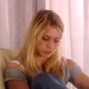
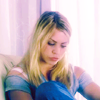
-->
or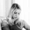

-->
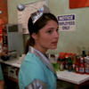
-->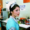
Tutorial #1 - Rose Tyler

-->
or
-Start with your base
-Duplicate your base once and set it to multiply at 90% opacity.
-Duplicate your base 2 more times, drag them to the top and set them both to screen. Set the TOP screen layer to 70% opacity
-Add a new and fill it with #C8B3AE and set it to overlay at 30% opacity.
-Time for tricky adjustment layers. I'll explain best I can.
-Make a curves adjustment layer.
RGB: I:70 O:59
RED: first point: I:132 O:134
second point: I:152 O:158
BLUE: first point: I:143 O:161
second point: I:108 O:113
-Make a selective colour adjustment layer.
REDS: Cyan: +72
Yellow: -18
YELLOWS: Cyan: +100
Yellow: +30
NEUTRALS: Cyan: +100
Yellow: -32
-Make ANOTHER selective colour adjustment layer.
NEUTRALS: Cyan: +37
Yellows: -5
set the opacity of that layer to 50%
-Make a new Hue/Saturation adjustment layer. Set saturation at +16
You can stop now but if you want the black and white-ness just simply make a gradient map adjustment layer and use a black and white gradient and leave the blending mode to normal
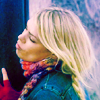
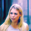
other icons made using this method:
Tutorial #2 - Max/Liz "never let me go"

-->
-Duplicate your base. You're going to have to do stuff to the base so bare with me.
To the duplicate you just made to to Image>Adjustments>Brightness/Contrast
Brightness: +7
Contrast: +20
hit OK
To the SAME duplicate go to Image>Adjustmenst>Colour Balance or simply press Ctrl+B on your keyboard
0,0,+26
MAKE SURE THESE ARE NOT ADJUSTMENT LAYERS!
i hope that bit was easy to undertand.
leave that duplicate to NORMAL.
-Make a new layer and fill it with #E1E1E1 and set it to colour burn
-now, go BACK to your origional base, duplicate it 2 times. Drag them both to the top and set them BOTH to screen
YAY! the hard part is OVER!
-Colour Fill layer #2E5F9D set it to soft light at 70% opacity
-Colour Fill layer #C8B3AE set it to overlay at 32% opacity
-Colour Fill layer #48D285 set it to soft light at 20% opacity
-Colour Fill layer #FCE6BD set it to overlay at 10% opacity
-Colour Fill layer #BCEBFF set it to colour burn at 100% opacity
and voila, add a dusty texture, text and you're done.
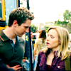
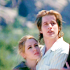
other icons made using this method:
Tutorial #3 - Liz

-->
-Again with the tricky-ness from the previous tutorial.
Duplicate your base. go to Image>Adjustments>Brightness/Contrast again
Brightness: +12
Contrast: +20
on the SAME duplicate go to Image>Adjustmenst>Colour Balance again.
0,0,+26
MAKE SURE THESE ARE NOT ADJUSTMENT LAYERS!
-Colour Fill layer #E1E1E1 set it to colour burn at 100% opacity
-Colour Fill layer #C8B3Ae set it to overlay at 10% opacity.
-now, go BACK to your origional base, duplicate it 2 times. Drag them both to the top and set them BOTH to screen
YAY! the hard part is OVER! (for now muhuhahaha)
-Colour Fill layer #1F68A5 set it to soft light at 100% opacity
-Colour Fill layer #27F130 set it to soft light at 20% opacity
-Colour Fill layer #D0FFF0 set it to colour burn at 20% opacity
-Make a Selective Colour adjustment layer.
REDS: Cyan: -68
Yellow: +42
Black: -24
YELLOWS: Cyan: +52
Yellow: +100
GREENS: Cyan: -100
Yellow: +100
NEUTRALS Cyan: -19
Yellow: +17
and voila
other icons made using this method:
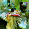
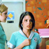
I hope they were easy to understand! If there are any questions please ask
AND i'd LOVE to see what everyone comes up with!! :D
All 3 made in Photoshop7

-->

or


-->


-->

Tutorial #1 - Rose Tyler

-->

or

-Start with your base
-Duplicate your base once and set it to multiply at 90% opacity.
-Duplicate your base 2 more times, drag them to the top and set them both to screen. Set the TOP screen layer to 70% opacity
-Add a new and fill it with #C8B3AE and set it to overlay at 30% opacity.
-Time for tricky adjustment layers. I'll explain best I can.
-Make a curves adjustment layer.
RGB: I:70 O:59
RED: first point: I:132 O:134
second point: I:152 O:158
BLUE: first point: I:143 O:161
second point: I:108 O:113
-Make a selective colour adjustment layer.
REDS: Cyan: +72
Yellow: -18
YELLOWS: Cyan: +100
Yellow: +30
NEUTRALS: Cyan: +100
Yellow: -32
-Make ANOTHER selective colour adjustment layer.
NEUTRALS: Cyan: +37
Yellows: -5
set the opacity of that layer to 50%
-Make a new Hue/Saturation adjustment layer. Set saturation at +16
You can stop now but if you want the black and white-ness just simply make a gradient map adjustment layer and use a black and white gradient and leave the blending mode to normal
other icons made using this method:


Tutorial #2 - Max/Liz "never let me go"

-->

-Duplicate your base. You're going to have to do stuff to the base so bare with me.
To the duplicate you just made to to Image>Adjustments>Brightness/Contrast
Brightness: +7
Contrast: +20
hit OK
To the SAME duplicate go to Image>Adjustmenst>Colour Balance or simply press Ctrl+B on your keyboard
0,0,+26
MAKE SURE THESE ARE NOT ADJUSTMENT LAYERS!
i hope that bit was easy to undertand.
leave that duplicate to NORMAL.
-Make a new layer and fill it with #E1E1E1 and set it to colour burn
-now, go BACK to your origional base, duplicate it 2 times. Drag them both to the top and set them BOTH to screen
YAY! the hard part is OVER!
-Colour Fill layer #2E5F9D set it to soft light at 70% opacity
-Colour Fill layer #C8B3AE set it to overlay at 32% opacity
-Colour Fill layer #48D285 set it to soft light at 20% opacity
-Colour Fill layer #FCE6BD set it to overlay at 10% opacity
-Colour Fill layer #BCEBFF set it to colour burn at 100% opacity
and voila, add a dusty texture, text and you're done.
other icons made using this method:


Tutorial #3 - Liz

-->

-Again with the tricky-ness from the previous tutorial.
Duplicate your base. go to Image>Adjustments>Brightness/Contrast again
Brightness: +12
Contrast: +20
on the SAME duplicate go to Image>Adjustmenst>Colour Balance again.
0,0,+26
MAKE SURE THESE ARE NOT ADJUSTMENT LAYERS!
-Colour Fill layer #E1E1E1 set it to colour burn at 100% opacity
-Colour Fill layer #C8B3Ae set it to overlay at 10% opacity.
-now, go BACK to your origional base, duplicate it 2 times. Drag them both to the top and set them BOTH to screen
YAY! the hard part is OVER! (for now muhuhahaha)
-Colour Fill layer #1F68A5 set it to soft light at 100% opacity
-Colour Fill layer #27F130 set it to soft light at 20% opacity
-Colour Fill layer #D0FFF0 set it to colour burn at 20% opacity
-Make a Selective Colour adjustment layer.
REDS: Cyan: -68
Yellow: +42
Black: -24
YELLOWS: Cyan: +52
Yellow: +100
GREENS: Cyan: -100
Yellow: +100
NEUTRALS Cyan: -19
Yellow: +17
and voila
other icons made using this method:


I hope they were easy to understand! If there are any questions please ask
AND i'd LOVE to see what everyone comes up with!! :D