(no subject)
Learn how to go from 
to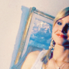
or
in eleven (or fifteen) easy steps.
For PS, not translatable.
JUST A NOTE: Like I said in my last tutorial, I always crop and resize AFTER the coloring, but for space purposes on the tutorial, I did it before.
Steps Four through Eight come from
_chokeanddie's tutorial, which is here, and which I will talk about at the end of the tutorial.
Step One: Grab your screencap. Mine is here, from Screencap Paradise. For this icon (and actually for most of mine) I also rotated the picture (15 degrees to the right for this one), because I think it makes the crops more interesting. Crop and resize.

So pretty.
Step Two: Duplicate the base TWICE and set both to SCREEN, 100% opacity.


Step Three: Create a NEW RASTER LAYER, and fill it with #026AB2. Set it to SOFT LIGHT, 15% opacity.


Step Four: Create a new SELECTIVE COLOR adjustment layer, opacity 100%.
SETTINGS:
REDS:
C: -12
Y: +51
YELLOWS:
C: +25
Y: +15
NEUTRALS:
C: +68
M: -17
Y: -63
B: +18


Step Five: Create another SELECTIVE COLOR adjustment layer, opacity 50%.
REDS:
C: -42
Y: +66
YELLOWS:
C: -100
Y: +100
NEUTRALS:
C: +70
Y: -73


Step Six: Create a NEW RASTER LAYER and fill with #C8B3AE. Set to OVERLAY, 30% opacity.


Step Seven: Create a CURVES adjustment layer, 50% opacity. Here are the settings.
RGB: first point: I:211 O:217
second point: I:188 O:193
RED: first point: I:191 O:205
second point: I:220 O:229
GREEN: first point: I:149 O:132
second point: I:128 O:117
BLUE: first point: I:161 O:155
second point: I:197 O:206


Step Eight: Create a NEW RASTER LAYER and fill with #D7D7D7. Set to COLOR BURN, 50% opacity.


Step Nine: Create a NEW RASTER LAYER and fill with #D1AB4F. Set to MULTIPLY, 25% opacity. FLATTEN the icon.


Step Ten: Grab this texture by peoplemachines and paste it as a new layer. Set it to SOFT LIGHT, 100% opacity.


Step Eleven: Grab this texture (and I fail at life because I completely forgot whose it is) and paste it as a new layer. Set it to SCREEN, 100% opacity.


And you're done, unless you want sidewaystext!Veronica.
Step Twelve: Flatten the icon, and then rotate your image CLOCKWISE 90%.


Step Thirteen: Copy the base, paste as a new image, and then FLIP the canvas horizontal and vertical. Then paste it as a new layer on top of the other one, 100% opacity. (Confusing much? Thats way easier to do in PSP)


Step Fourteen: Erase the painting and wall behind Veronica, so you can see both images of her.


Step Fifteen: And add some text! I did two seperate vector layers, one in #DC4539 (which is a color I pulled from her lips) and the other in white. Font is Emma Script MVB, size 14.


Done!
So the main point of this tut was not only to show you a neat way to color, but also to show you that using a tutorial as a GUIDE (as I did for Bekka's) rather than following every single step to a T can create really pretty results, and can give you an end product that is completely different from that of the tutorials. Dont believe me?

Here's my icon if I follow Bekka's tutorial exactly.

And here's what you get from mine.
Both use the exact same selective color layers, the exact same curves layer, the same overlay and color burn layers, and the same brush, and yet the icons dont look remotely alike.
So my main point (I like to talk a lot, I know) is EXPERIMENT WITH TUTORIALS, and USE THEM AS GUIDES.
KTHNX.
I'd love to see what you guys come up with!

to

or

in eleven (or fifteen) easy steps.
For PS, not translatable.
JUST A NOTE: Like I said in my last tutorial, I always crop and resize AFTER the coloring, but for space purposes on the tutorial, I did it before.
Steps Four through Eight come from
_chokeanddie's tutorial, which is here, and which I will talk about at the end of the tutorial.
Step One: Grab your screencap. Mine is here, from Screencap Paradise. For this icon (and actually for most of mine) I also rotated the picture (15 degrees to the right for this one), because I think it makes the crops more interesting. Crop and resize.

So pretty.
Step Two: Duplicate the base TWICE and set both to SCREEN, 100% opacity.


Step Three: Create a NEW RASTER LAYER, and fill it with #026AB2. Set it to SOFT LIGHT, 15% opacity.


Step Four: Create a new SELECTIVE COLOR adjustment layer, opacity 100%.
SETTINGS:
REDS:
C: -12
Y: +51
YELLOWS:
C: +25
Y: +15
NEUTRALS:
C: +68
M: -17
Y: -63
B: +18


Step Five: Create another SELECTIVE COLOR adjustment layer, opacity 50%.
REDS:
C: -42
Y: +66
YELLOWS:
C: -100
Y: +100
NEUTRALS:
C: +70
Y: -73


Step Six: Create a NEW RASTER LAYER and fill with #C8B3AE. Set to OVERLAY, 30% opacity.


Step Seven: Create a CURVES adjustment layer, 50% opacity. Here are the settings.
RGB: first point: I:211 O:217
second point: I:188 O:193
RED: first point: I:191 O:205
second point: I:220 O:229
GREEN: first point: I:149 O:132
second point: I:128 O:117
BLUE: first point: I:161 O:155
second point: I:197 O:206


Step Eight: Create a NEW RASTER LAYER and fill with #D7D7D7. Set to COLOR BURN, 50% opacity.


Step Nine: Create a NEW RASTER LAYER and fill with #D1AB4F. Set to MULTIPLY, 25% opacity. FLATTEN the icon.


Step Ten: Grab this texture by peoplemachines and paste it as a new layer. Set it to SOFT LIGHT, 100% opacity.


Step Eleven: Grab this texture (and I fail at life because I completely forgot whose it is) and paste it as a new layer. Set it to SCREEN, 100% opacity.


And you're done, unless you want sidewaystext!Veronica.
Step Twelve: Flatten the icon, and then rotate your image CLOCKWISE 90%.


Step Thirteen: Copy the base, paste as a new image, and then FLIP the canvas horizontal and vertical. Then paste it as a new layer on top of the other one, 100% opacity. (Confusing much? Thats way easier to do in PSP)


Step Fourteen: Erase the painting and wall behind Veronica, so you can see both images of her.


Step Fifteen: And add some text! I did two seperate vector layers, one in #DC4539 (which is a color I pulled from her lips) and the other in white. Font is Emma Script MVB, size 14.


Done!
So the main point of this tut was not only to show you a neat way to color, but also to show you that using a tutorial as a GUIDE (as I did for Bekka's) rather than following every single step to a T can create really pretty results, and can give you an end product that is completely different from that of the tutorials. Dont believe me?

Here's my icon if I follow Bekka's tutorial exactly.

And here's what you get from mine.
Both use the exact same selective color layers, the exact same curves layer, the same overlay and color burn layers, and the same brush, and yet the icons dont look remotely alike.
So my main point (I like to talk a lot, I know) is EXPERIMENT WITH TUTORIALS, and USE THEM AS GUIDES.
KTHNX.
I'd love to see what you guys come up with!