Tutorial 03- Daisuke
Tutorial requested by orlandogirl, the orignal is of an image done by CLAMP, but I decided to do this with a D.N.Angel character due to the music I was using. SO I did it of Daisuke! This Might Get Confusing, SORRY! Tell me were you need help x X;
By the way. Do NOT fully copy this and make legions of this, that would suck. And that isn't very creative now is it? :/ And please comment, please tell me what you think of this XD Also, if you'd like to request a tutorial, I can still do two more!
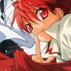
to
Image is from: KISEKI-net. (one of the best/favourite sites for the series and others)
For this type of tutorial I suggest you have gradients on your computer- not the default ones from PSP or PS but rather from others on lj. For example, I will use two I believe are done by ladylenne and 77words. If not...I'll just give you the four colors i use 9 9; I mean, you don't absoloutely need them but its easier.
1. Get your image, crop it to 100x100, standard lj size.
From there I go up to Image > Adjustments > Auto Levels. Do that, go back and then do Auto Contrast, if I do the third Auto Color it looks alright, but that's not the case all the times with icons. So its up to you what you want to do with your base.

2. Alright, now right click your base and click Duplicate Layer. From there go up to Image > Selective Color. Where the drop down menu says 'Reds' click that and go down to Neutrals. Play with the settings since every image is different. For my settings you can click HERE and see what I did. See the difference it makes? Soft Light at 100% the layer.

3. Alright, next layer and where the difficulty might rise for those who haven't figured out PS completely or those not using it. Alright, for those using ladylenne's gradient or anyone elses, go to where your Layers are. Go to the bottom, see that almost looking yin-yang sign?
. Click it and go to Gradient Map. See pop up window! And you see the image suddenly change to the two colors in your color palette thing! :D Alright, time to really play with your gradients/color choices.
For me, this is my colors:
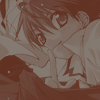
Play with it but try to get the same effect I did, in which you can see the image still and the color is just overlapping it, not making it weird and stick out. Sometimes Reverse will help but other times it won't.
For what I Mean
Soft Light the layer those who have gradients XD;
3.5 FOR THOSE WITH NO GRADIENTS:
For those without gradients, its alright. This is what I do something. Pick two colors that look good together (my colors will be based off the actual gradient I'm using). For example [#847A71] & [#847A71]! I'm using this for my image, usually when I want the same effect I keep the greyish looking color and mess with the red one by playing with the Color Picker (double click the square) but that's not the point here. Go to
Gradient Map and viola! You created a Gradient Map! Soft Light the layer.
When all is said and done your layer should look like:
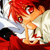
Hopefully it wasn't that confusing!
4. Duplicate your base. Bring it to the top. Darken.
5. ...Since we all took a crash course on Gradient Maps, this shouldn't be too hard, hopefully? Play with your gradients/colors everyone! XD In the end I will use a gradient by 77words I believe. Hopefully, I'm right >>;! These are my colors for those who don't feel like playing with/dont have gradients: [#9D615E] & [#FCD171]. Hard Light the layer at 75%.
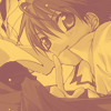
> >
6. Almost somewhat nearly done, its time to use LIGHT TEXTURES ;D For the type of light textures I suggest is the circle looking ones...like the one I'm going to use by colorfilter. (is it me or do all my tutorials have her stuff in them?) Find your light texture(s) and put them on Screen. Play with this as well, generally you can do a lot with this tutorial, you don't exactly have to put text or light textures, just doing the Maps give you a good base image..thing o o;
For me I went to Edit > Transform > Flip Horizontal. Basically the least/best kept secret in iconing, well for me anyway. What it does is flip the individual layer, not the whole thing and it totally helps.

> >
7. Now we are going to put text :D Create a just...a white bar XD; anywhere you're text is going. For those confused just..here XD; (delete the black around the white). You're going to set your white bar at Soft Light @ 65% We need the bar to see the text but we don't need to see the bar. Unless you want it there.
My text for this icon is going to be 'Can You Keep A Secret?' inspired by Daisuke's finger and look. He look coy yet playful to me and besides what's a bigger secret then having a phantom theif in your DNA?
To see my text click here. Ew, text doesn't stick out as much as we need it. Time to fix it!
8. Go to your text layers and double click and a pop should appear called Layer Style. Go to Outer Glow, automatically when you click the name it'll check the box. You can play with the settings, but my settings are this:
Blend Mode: Screen
Opacity: 100%
Noise: 0
Elements: Softer
Spread: 0
Size 5
Range: 50
Jitter: 0
Its a subtle but very strong difference. Before the text you really couldn't tell and it didn't stand out, now it does.
here
9. Ok to the border @_@; Create a new layer, CTRL + ALT + SHIFT + E and it makes a duplicate stamp..thing. Go to Edit > Stroke., change the color to white. Set it to 4.
10. Do step 9 once again, this time instead of white be a color from the image or black and set it to 2. AND WE ARE DONE ! My final no longer has the bar since it just..works better but its up to the creator to do whatever. My layers if you need to see them: Layers

By the way. Do NOT fully copy this and make legions of this, that would suck. And that isn't very creative now is it? :/ And please comment, please tell me what you think of this XD Also, if you'd like to request a tutorial, I can still do two more!
to
Image is from: KISEKI-net. (one of the best/favourite sites for the series and others)
For this type of tutorial I suggest you have gradients on your computer- not the default ones from PSP or PS but rather from others on lj. For example, I will use two I believe are done by ladylenne and 77words. If not...I'll just give you the four colors i use 9 9; I mean, you don't absoloutely need them but its easier.
1. Get your image, crop it to 100x100, standard lj size.
From there I go up to Image > Adjustments > Auto Levels. Do that, go back and then do Auto Contrast, if I do the third Auto Color it looks alright, but that's not the case all the times with icons. So its up to you what you want to do with your base.
2. Alright, now right click your base and click Duplicate Layer. From there go up to Image > Selective Color. Where the drop down menu says 'Reds' click that and go down to Neutrals. Play with the settings since every image is different. For my settings you can click HERE and see what I did. See the difference it makes? Soft Light at 100% the layer.
3. Alright, next layer and where the difficulty might rise for those who haven't figured out PS completely or those not using it. Alright, for those using ladylenne's gradient or anyone elses, go to where your Layers are. Go to the bottom, see that almost looking yin-yang sign?
. Click it and go to Gradient Map. See pop up window! And you see the image suddenly change to the two colors in your color palette thing! :D Alright, time to really play with your gradients/color choices.
For me, this is my colors:
Play with it but try to get the same effect I did, in which you can see the image still and the color is just overlapping it, not making it weird and stick out. Sometimes Reverse will help but other times it won't.
For what I Mean
Soft Light the layer those who have gradients XD;
3.5 FOR THOSE WITH NO GRADIENTS:
For those without gradients, its alright. This is what I do something. Pick two colors that look good together (my colors will be based off the actual gradient I'm using). For example [#847A71] & [#847A71]! I'm using this for my image, usually when I want the same effect I keep the greyish looking color and mess with the red one by playing with the Color Picker (double click the square) but that's not the point here. Go to
Gradient Map and viola! You created a Gradient Map! Soft Light the layer.
When all is said and done your layer should look like:
Hopefully it wasn't that confusing!
4. Duplicate your base. Bring it to the top. Darken.
5. ...Since we all took a crash course on Gradient Maps, this shouldn't be too hard, hopefully? Play with your gradients/colors everyone! XD In the end I will use a gradient by 77words I believe. Hopefully, I'm right >>;! These are my colors for those who don't feel like playing with/dont have gradients: [#9D615E] & [#FCD171]. Hard Light the layer at 75%.
> >
6. Almost somewhat nearly done, its time to use LIGHT TEXTURES ;D For the type of light textures I suggest is the circle looking ones...like the one I'm going to use by colorfilter. (is it me or do all my tutorials have her stuff in them?) Find your light texture(s) and put them on Screen. Play with this as well, generally you can do a lot with this tutorial, you don't exactly have to put text or light textures, just doing the Maps give you a good base image..thing o o;
For me I went to Edit > Transform > Flip Horizontal. Basically the least/best kept secret in iconing, well for me anyway. What it does is flip the individual layer, not the whole thing and it totally helps.
> >
7. Now we are going to put text :D Create a just...a white bar XD; anywhere you're text is going. For those confused just..here XD; (delete the black around the white). You're going to set your white bar at Soft Light @ 65% We need the bar to see the text but we don't need to see the bar. Unless you want it there.
My text for this icon is going to be 'Can You Keep A Secret?' inspired by Daisuke's finger and look. He look coy yet playful to me and besides what's a bigger secret then having a phantom theif in your DNA?
To see my text click here. Ew, text doesn't stick out as much as we need it. Time to fix it!
8. Go to your text layers and double click and a pop should appear called Layer Style. Go to Outer Glow, automatically when you click the name it'll check the box. You can play with the settings, but my settings are this:
Blend Mode: Screen
Opacity: 100%
Noise: 0
Elements: Softer
Spread: 0
Size 5
Range: 50
Jitter: 0
Its a subtle but very strong difference. Before the text you really couldn't tell and it didn't stand out, now it does.
here
9. Ok to the border @_@; Create a new layer, CTRL + ALT + SHIFT + E and it makes a duplicate stamp..thing. Go to Edit > Stroke., change the color to white. Set it to 4.
10. Do step 9 once again, this time instead of white be a color from the image or black and set it to 2. AND WE ARE DONE ! My final no longer has the bar since it just..works better but its up to the creator to do whatever. My layers if you need to see them: Layers