9th Tutorial
9th Tutorial!
In 9 steps!
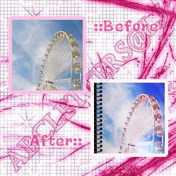
1. Get your prepped base.
(Personally, I sharpened first the base before duplicating it. Set the first duplication to Soft Light@60% to make the contrast better then set the second to Screen@50% to brighten it.)
2. New Adjustment Layer: Selective Color
Yellows: -92, 100, 95, 100
Cyan: 100, -26, -100, 86
Blue: 100, 24, -77, 47
White: -56, 12, -63, -100
Neutrals: -14, -18, -40, 7
3. New Adjusment Layer: Curves
RGB
Input: 175 Output: 188
Input: 151 Output: 153
Input: 77 Output: 50
4. Duplicate the base and desaturate it. Set it to Overlay@40%
5. New Adjustment Layer: Selective Color
White: -39, 9, 6, 19
Neutrals: -34, -12, -15, 15
6. I added this notebook textures by girlboheme set on Multiply@100%
7. And this grainy texture by toybirds set on Multiply@40%
8. For a little lighting effect, I also added this bloblight texture by Wicked_Enough set on Screen@100%
9. Then you can add more stuff in the icon if you aren't satisfied yet. Just don't overdo it. :D
Other Examples

to
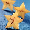
to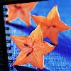
*I can't help but notice that this was slightly similar to my previous tutorial. *shrugs* Oh well, at least I tried to emphasize the color blue this time. *grin* And I know I said its gonna be f-locked but my friend said I should at least wait until my 10th tutorial. *rolls eyes* If I know, she's just saying that cuz' she doesn't have an lj and she's too lazy to make one.
*I might make a tutorial for a big graphic soon. *hint, hint* I'm kind of getting bored with icon graphics. :D Wait for that tutorial okay? :)
In 9 steps!

1. Get your prepped base.
(Personally, I sharpened first the base before duplicating it. Set the first duplication to Soft Light@60% to make the contrast better then set the second to Screen@50% to brighten it.)
2. New Adjustment Layer: Selective Color
Yellows: -92, 100, 95, 100
Cyan: 100, -26, -100, 86
Blue: 100, 24, -77, 47
White: -56, 12, -63, -100
Neutrals: -14, -18, -40, 7
3. New Adjusment Layer: Curves
RGB
Input: 175 Output: 188
Input: 151 Output: 153
Input: 77 Output: 50
4. Duplicate the base and desaturate it. Set it to Overlay@40%
5. New Adjustment Layer: Selective Color
White: -39, 9, 6, 19
Neutrals: -34, -12, -15, 15
6. I added this notebook textures by girlboheme set on Multiply@100%
7. And this grainy texture by toybirds set on Multiply@40%
8. For a little lighting effect, I also added this bloblight texture by Wicked_Enough set on Screen@100%
9. Then you can add more stuff in the icon if you aren't satisfied yet. Just don't overdo it. :D
Other Examples

to


to

*I can't help but notice that this was slightly similar to my previous tutorial. *shrugs* Oh well, at least I tried to emphasize the color blue this time. *grin* And I know I said its gonna be f-locked but my friend said I should at least wait until my 10th tutorial. *rolls eyes* If I know, she's just saying that cuz' she doesn't have an lj and she's too lazy to make one.
*I might make a tutorial for a big graphic soon. *hint, hint* I'm kind of getting bored with icon graphics. :D Wait for that tutorial okay? :)