Header tutorial
Curious on how I made this header?*
I am using Photoshop for this tutorial.
STEP ONE
BACKGROUND TEXTURE. I used one from Oxoniensis-art.net.

STEP TWO
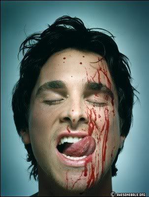
GET YOUR PICTURE. I used one from AwesomeBale.org of the beautiful Christian Bale. Paste it as a new layer onto your background.
STEP THREE
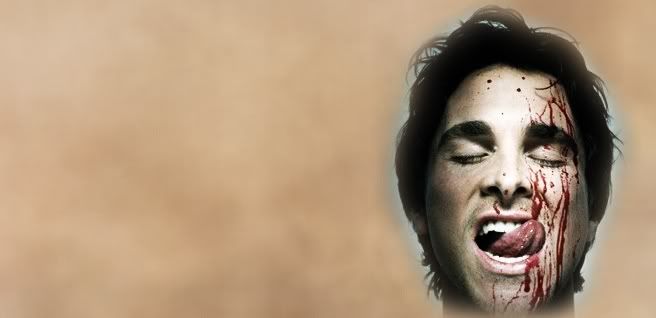
MODIFY YOUR PICTURE. I duplicated my bloody Christian picture, desaturated it, and set it to Overlay. I merged the two Christian layers together and using the 100 pixel airbrush, I erased around him to blend him into the background. It doesn't have to be perfect... that's what gradients and brushes are for. ;)
STEP FOUR
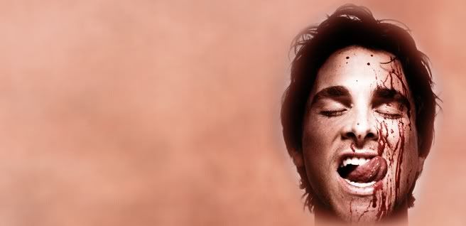
TEXTURE. I used another texture from the same site, this time a reddish one because I wanted my header to have a tint of red in it. I set it to Color at 45%.

STEP FIVE
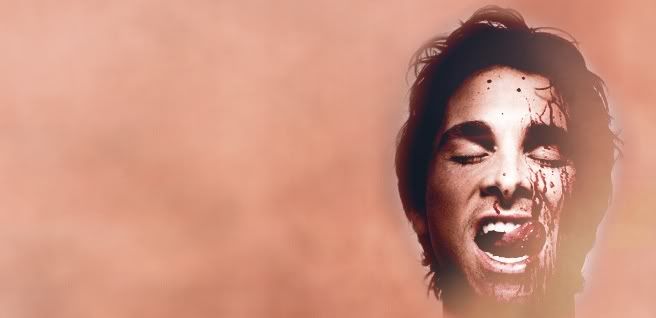
TEXTURE. My new favorite blend mode with textures is Lighten. Seriously, it kicks ass. I used another texture from the same site (I like that site, stfu.), moved it so that it only covered the right side of Christian's face, and set it to Lighten at 100%.
STEP SIX
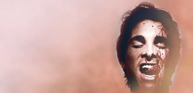
GRADIENT. I used a gradient by crumblingwalls and set it to Overlay at 100%.

STEP SEVEN
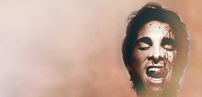
GRADIENT. I used another gradient by crumblingwalls and set it to Hard Light at 29%.

STEP EIGHT
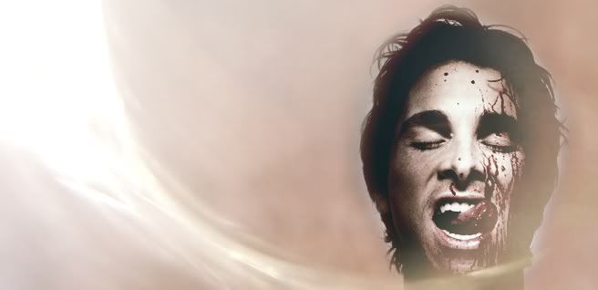
TEXTURE. I used a light texture made by teh_indy, moved it where I wanted, and set it to Screen at 100%.

STEP NINE
FLOODFILL. I created a new layer and floodfilled it with black (#000000) and set it to Color at 35%.
STEP TEN
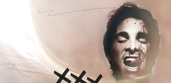
BRUSHES. I used some brushes from teh_indy's scribble set and in black and set them to Soft Light at 100%.

STEP ELEVEN
MORE BRUSHES. I used some X brushes made by my_wonderful in black and left them at Normal at 100%.
STEP TWELVE
JUST ONE MORE BRUSH. I have no idea who made this brush and I feel bad for not knowing. If anyone knows who made this, please let me know so I can credit them. It's the horizontal line thingy at the top. I used the color black for the brush and set it to Soft Light at 100%.
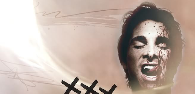
STEP THIRTEEN
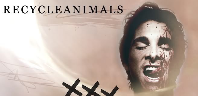
TEXT. I used the font Georgia, size 36 with 150 tracking. I typed out my regular username since I was making it for personal use, and left it at the normal setting and opacity.
STEP FOURTEEN
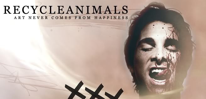
MORE TEXT. I typed out "ART NEVER COMES FROM HAPPINESS" (I was reading Choke by Chuck Palahniuk at the time) in Georgia again, size 12 with 400 tracking.
STEP FIFTEEN.
EVEN MORE TEXT. I duplicated my last text layer twice and moved them to different areas. I changed the tracking from 400 to 300 and set both of them to Soft Light. I left the first one at 100% but lowered the bottom one to 48%.

STEP SIXTEEN
I LIED. ANOTHER BRUSH. I used a splatter brush made by teh_indy in a dark red color and set it to Multiply at 100%.

STEP SEVENTEEN
BORDER. I just added a 3 pixel border in black around the entire thing. Now you're done.

The same idea was used for this friends only banner* that I made to match my header:

*Please do not take the header or the banner; they were made for personal use for my regular journal (recycleanimals).
I am using Photoshop for this tutorial.
STEP ONE
BACKGROUND TEXTURE. I used one from Oxoniensis-art.net.

STEP TWO
GET YOUR PICTURE. I used one from AwesomeBale.org of the beautiful Christian Bale. Paste it as a new layer onto your background.

STEP THREE
MODIFY YOUR PICTURE. I duplicated my bloody Christian picture, desaturated it, and set it to Overlay. I merged the two Christian layers together and using the 100 pixel airbrush, I erased around him to blend him into the background. It doesn't have to be perfect... that's what gradients and brushes are for. ;)

STEP FOUR
TEXTURE. I used another texture from the same site, this time a reddish one because I wanted my header to have a tint of red in it. I set it to Color at 45%.


STEP FIVE
TEXTURE. My new favorite blend mode with textures is Lighten. Seriously, it kicks ass. I used another texture from the same site (I like that site, stfu.), moved it so that it only covered the right side of Christian's face, and set it to Lighten at 100%.

STEP SIX
GRADIENT. I used a gradient by crumblingwalls and set it to Overlay at 100%.


STEP SEVEN
GRADIENT. I used another gradient by crumblingwalls and set it to Hard Light at 29%.


STEP EIGHT
TEXTURE. I used a light texture made by teh_indy, moved it where I wanted, and set it to Screen at 100%.

STEP NINE
FLOODFILL. I created a new layer and floodfilled it with black (#000000) and set it to Color at 35%.

STEP TEN
BRUSHES. I used some brushes from teh_indy's scribble set and in black and set them to Soft Light at 100%.

STEP ELEVEN
MORE BRUSHES. I used some X brushes made by my_wonderful in black and left them at Normal at 100%.

STEP TWELVE
JUST ONE MORE BRUSH. I have no idea who made this brush and I feel bad for not knowing. If anyone knows who made this, please let me know so I can credit them. It's the horizontal line thingy at the top. I used the color black for the brush and set it to Soft Light at 100%.

STEP THIRTEEN
TEXT. I used the font Georgia, size 36 with 150 tracking. I typed out my regular username since I was making it for personal use, and left it at the normal setting and opacity.

STEP FOURTEEN
MORE TEXT. I typed out "ART NEVER COMES FROM HAPPINESS" (I was reading Choke by Chuck Palahniuk at the time) in Georgia again, size 12 with 400 tracking.

STEP FIFTEEN.
EVEN MORE TEXT. I duplicated my last text layer twice and moved them to different areas. I changed the tracking from 400 to 300 and set both of them to Soft Light. I left the first one at 100% but lowered the bottom one to 48%.

STEP SIXTEEN
I LIED. ANOTHER BRUSH. I used a splatter brush made by teh_indy in a dark red color and set it to Multiply at 100%.

STEP SEVENTEEN
BORDER. I just added a 3 pixel border in black around the entire thing. Now you're done.

The same idea was used for this friends only banner* that I made to match my header:

*Please do not take the header or the banner; they were made for personal use for my regular journal (recycleanimals).