(no subject)

bixits asked for a cropping guide, so here it is!
1. My Process
I tend to crop after my initial colouring layers (curves, colour balance, selective) and before I apply any textures. I start with a 500px canvas and then use the cropping tool with these settings post colouring:

There are definitely other ways to crop that may work better for you, this is just my preference. I know some people think it is harder to play around with but I've just come to love the 'undo' command. I also like this method versus image resizing because I like the sharpness it maintains, but again this could just all be in my head.
The best advice I have for cropping is to play around! It sounds simple but it is the best way to see what will work for the cap, since certain crops (especially close up) won't work with certain caps. Look at the basic canvas and chose what you want the focus to be and that can definitely help you chose the type of crop you want.
2. My Fav Crops & What not to do (starring old emberassing icons of mine)
I love center crops just as much as more interesting ones. I tend to decide based on how much of the image I want in the icon, center crops are usually me falling in love with the background colours or not having the heart to crop out some detail I can't part with, lol.
Close up: When cropping close up, I look for a focus, such as the eyes or lips and I really try to crop in a way that keeps some of the angles of the face, otherwise it can look flat. Just watch where you crop, if you look at the Willow icon, cutting off the chin and nose makes it look awkward. It works best on caps that are naturally close up. Close ups with contrast are really good since that sort of illuminates some of the contours of the face and also keeps the icon from looking boring.

Bad Close up:
No Eyes, No Problem: This one is easily my favourite, like above its all about the focus, usually the lips (or fangs). The right sharpness is really important to bring out the features, usually I sharpen a full 100% on the large canvas and after I crop I sharpen again 20-30%.
Eyes Only: A great way to make a center crop more interesting.

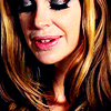
A bit of brow: Same as above, it makes a center crop more interesting, just be careful not to show too much forehead, it can look awkward.
Side: This is all about the negative space, a great way to create some.
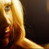
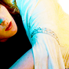
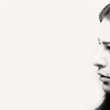
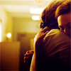
Center: I refuse to believe center crops are boring, as long as you work on the colouring and texture use, this can be a great crop.

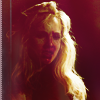
Out of focus: Where the face isn't the focus of the icon. Focusing on other Details can make some of the most interesting crops, even if it means only you know who is in the image.

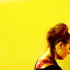
\
My Least fav Crops
(Ignore how awful these old ones are/proof that I use to be awful at cropping!)
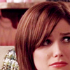
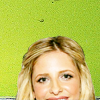
Attack of the forehead: Too much forehead can make a crop look really awkward, which is why I favour cropping at the brow line or below. Also attack of the chinless crop, losing that angle can make a crop look flat and uninteresting.
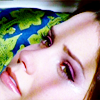
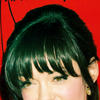
You don't need no chin or lips: This crop is HORRIBLE, I don't know why I ever used it. The focus is really uninteresting and useless.
watch.
♠ Please don't edit anything.
♠ Comments are always appreciated!