Tutorial #23 - Emmy Rossum icon 8
LOL it seems almost that I only do icon tutorials featuring Emmy Rossum xD
Requested by beckslfd
*MADE USING PSP8*
Going from this to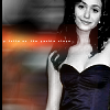
.
PLEASE DON'T COPY THIS ICON, USE THE STEPS TO CREATE SOMETHING THAT IS YOUR OWN; THAT'S MAKES IT MORE FUN, ANYWAY :)
- I took this image from Emmy Rossum dot Net and cropped it down to a 100x100 base.
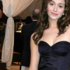
Sharpened it once, then did an unsharp mask (my settings)
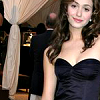
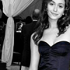
- This part is exactly like two other tutorials I've done xD (you'll discover if you look at my icons, that i really love selective coloring lol) Duplicate the base layer, desaturate it (Shift+H), then take the eraser tool and erase the black and white part over Emmy's dress.
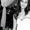
>
Reselect the base layer and duplicate it twice; set the middle layer to screen, 100 and the top one to overlay, 80.
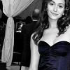
- I decided to change the brightness and contrast of the black and white layer ONLY since i didn't like the way it looked, so if you're fine with the look of yours, you can skip this step :) I used Levels (Adjust > Brightness and Contrast > Levels) [my settings]
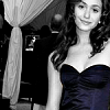
yeah well...it looks better to me, anyway xD
Now, merge the layers.
- For the blurred background, I first duplicated the base layer. Then, I selected the original base layer (the one on the bottom) and went up to Adjust > Blur > Motion Blur set it to 270 degrees and between 50% & 90%.
Then i selected the top layer again, clicked on the eraser tool and erased everything BUT EMMY.
>
MERGE LAYERS.
- For the light texture, I used one by honerbright and set it to screen, 100. I then moved/positioned it so that the top was toward the middle rather than at the top of the icon. Then I erased a little part of the top to make it look a little better.
>
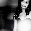
now i have...

- I didn't like that the light texture was so difficult to see, so I duplicated the base layer and selected the copy. I then went to Adjust > Brightness and Contrast > Highlight/Midtone/Shadow to make that layer darker (my settings). I then erased the part of that newly darkened layer that was covering her dress.
>
Personally, I think that's 10 million times better xD
- Now for the tiny text. I used a brush that I used quite often but tina_sparkle in white (#FFFFFF) *layer set to screen, 100*.
>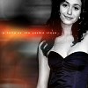
- For the border, I zoomed in, selected a portion of the left side using the Preset Shape Tool (AKA the Marquee tool...it's that dotted line box, ya'll xD) and, on a new layer, flood filled it with black (#000000).

>
**Opacities for layers may vary depending upon your image; don't be afraid to experiment!**
And that's it :)
FRIEND ME | RESOURCES | OTHER TUTORIALS
Requested by beckslfd
*MADE USING PSP8*
Going from this to
.
PLEASE DON'T COPY THIS ICON, USE THE STEPS TO CREATE SOMETHING THAT IS YOUR OWN; THAT'S MAKES IT MORE FUN, ANYWAY :)
- I took this image from Emmy Rossum dot Net and cropped it down to a 100x100 base.
Sharpened it once, then did an unsharp mask (my settings)
- This part is exactly like two other tutorials I've done xD (you'll discover if you look at my icons, that i really love selective coloring lol) Duplicate the base layer, desaturate it (Shift+H), then take the eraser tool and erase the black and white part over Emmy's dress.
>
Reselect the base layer and duplicate it twice; set the middle layer to screen, 100 and the top one to overlay, 80.
- I decided to change the brightness and contrast of the black and white layer ONLY since i didn't like the way it looked, so if you're fine with the look of yours, you can skip this step :) I used Levels (Adjust > Brightness and Contrast > Levels) [my settings]
yeah well...it looks better to me, anyway xD
Now, merge the layers.
- For the blurred background, I first duplicated the base layer. Then, I selected the original base layer (the one on the bottom) and went up to Adjust > Blur > Motion Blur set it to 270 degrees and between 50% & 90%.
Then i selected the top layer again, clicked on the eraser tool and erased everything BUT EMMY.
>
MERGE LAYERS.
- For the light texture, I used one by honerbright and set it to screen, 100. I then moved/positioned it so that the top was toward the middle rather than at the top of the icon. Then I erased a little part of the top to make it look a little better.
>
now i have...
- I didn't like that the light texture was so difficult to see, so I duplicated the base layer and selected the copy. I then went to Adjust > Brightness and Contrast > Highlight/Midtone/Shadow to make that layer darker (my settings). I then erased the part of that newly darkened layer that was covering her dress.
>
Personally, I think that's 10 million times better xD
- Now for the tiny text. I used a brush that I used quite often but tina_sparkle in white (#FFFFFF) *layer set to screen, 100*.
>
- For the border, I zoomed in, selected a portion of the left side using the Preset Shape Tool (AKA the Marquee tool...it's that dotted line box, ya'll xD) and, on a new layer, flood filled it with black (#000000).
>
**Opacities for layers may vary depending upon your image; don't be afraid to experiment!**
And that's it :)
FRIEND ME | RESOURCES | OTHER TUTORIALS