Round 1: Challenge 4 Results
Finally I can bring you the results. My internet's now 1000% back thanks to the lovely people who jerked me around for over a month. :\
Eliminated: (please stick around, vote and participate in the comeback challenge)
phoebs3094 (-5 votes)
People's Choice:

michelle_sarah (+3 votes)
People's Choice:

llean (+3 votes)
TALLIES:
01. - 0 + 3 = +3
02. - 4 + 1 = -3
03. - 1 + 4 = +3
04. - 0 + 2 = +2
05. - 2 + 2 = 0
06. - 5 + 0 = -5
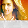
ICON #01
(+) Love the orange texture
(+) nice composition and interesting effect of zoom blur.
(+) If nothing else credit goes to the cropping and positioning of the image in the icon.
ICON #02
(+) nice coloring, nice crop, the square&text give it a nice touch.
(-) coloring of her skin is too green-ish
(-) The Coloring is too yellow
(-) The colouring is too greeny/yellow. Doesn't suit image at all.
(-) square looks too sharped, texture of text is spare
ICON #03
(+) the circles fit great, it's hard to make such texture fit so well
(+) great coloring and icon`s quality; these rings make icon looks interesting
(+) nice crop, the circle brush gives it a very nice look and is complimentary.
(+) Lovely cropping, colouring and that circle brush makes it look unique and fresh.
(-) The circle brushes go awkwardly with the image.
ICON #04
(+) Great b/w coloring
(+) The black and white looks great with the pink over the text.
ICON #05
(+) great composition and coloring
(+) The blend's well done, and the light texture is used well.
(-) icon is too weight `cause of big duplicates, also light texture doesn`t suit with image
(-) it's a little pixelated, the blend just doesn't fit with that image.
ICON #06
(-) the grey part doesn't fit the rest of the icon
(-) Also top yellow/green and the Texture is misplaced
(-) The coloring's too yellow.
(-) the coloring is too light and goldish.
(-) The yellowish glow doesn't match the image of Jessica. Neither does the grey texture.
Eliminated: (please stick around, vote and participate in the comeback challenge)
phoebs3094 (-5 votes)
People's Choice:
michelle_sarah (+3 votes)
People's Choice:
llean (+3 votes)
TALLIES:
01. - 0 + 3 = +3
02. - 4 + 1 = -3
03. - 1 + 4 = +3
04. - 0 + 2 = +2
05. - 2 + 2 = 0
06. - 5 + 0 = -5
ICON #01
(+) Love the orange texture
(+) nice composition and interesting effect of zoom blur.
(+) If nothing else credit goes to the cropping and positioning of the image in the icon.
ICON #02
(+) nice coloring, nice crop, the square&text give it a nice touch.
(-) coloring of her skin is too green-ish
(-) The Coloring is too yellow
(-) The colouring is too greeny/yellow. Doesn't suit image at all.
(-) square looks too sharped, texture of text is spare
ICON #03
(+) the circles fit great, it's hard to make such texture fit so well
(+) great coloring and icon`s quality; these rings make icon looks interesting
(+) nice crop, the circle brush gives it a very nice look and is complimentary.
(+) Lovely cropping, colouring and that circle brush makes it look unique and fresh.
(-) The circle brushes go awkwardly with the image.
ICON #04
(+) Great b/w coloring
(+) The black and white looks great with the pink over the text.
ICON #05
(+) great composition and coloring
(+) The blend's well done, and the light texture is used well.
(-) icon is too weight `cause of big duplicates, also light texture doesn`t suit with image
(-) it's a little pixelated, the blend just doesn't fit with that image.
ICON #06
(-) the grey part doesn't fit the rest of the icon
(-) Also top yellow/green and the Texture is misplaced
(-) The coloring's too yellow.
(-) the coloring is too light and goldish.
(-) The yellowish glow doesn't match the image of Jessica. Neither does the grey texture.