Tutorial #11: Ron & Hermione
How to go from
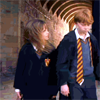
to

using Photoshop, as requested by wecrash. Uses Selective Coloring, so is not translatable. Sorry!
Please note that these steps will not work with all bases; most likely you’ll need to fiddle with the settings to get the best results.
1) Start with a 100x100 base. Mine is of Ron and Hermione from Harry Potter and the Sorcerer’s Stone.
2) Duplicate the base twice. Set the first one on screen, 60% opacity and the top one on soft light, 100% opacity. Merge the layers so you have a new base.

3) Create a new Selective Colors layer and put the following settings:
REDS
Yellow: +100
YELLOWS
Cyan: +100
Yellow: -55
NEUTRALS
Cyan: +3
Magenta: +3
Yellow: -10
Put the layer on normal, 90% opacity.

4) Create a new layer and fill it with a light blue (#8ECADA). Set the layer on soft light, 90% opacity.

>

5) Duplicate that layer but change the settings to color burn, 70% opacity.
>

6) Create a Hue/Saturation layer and change the saturation to +40.

7) Create a new layer and fill it with a light pink (#FFD6D6). Set the layer on soft light, 70% opacity.

>

8) Create another new layer and fill it with a bright yellow (#FFFC00). Set the layer on soft light, 30% opacity.

>

9) Create another new layer and fill it with a peachish color (#E7A076). Set the layer on soft light, 40% opacity.

>

10) Create another Selective Color layer and use the following settings:
REDS
Cyan: -100
Magenta: +50
Yellow: +35
NEUTRALS
Cyan: -50
Yellow: -20
Black: +20
Keep it on normal, 100% opacity

11) Go all the way down to the bottom and duplicate your base. Bring it to the top and set it on luminosity, 70%. This step isn’t always necessary, but for this icon it helps bring back some of the definition without losing the coloring.
>

12) Almost done now! Create a Hue/Saturation layer and set the saturation to +40.
And that’s it! It’s not exactly like the original, but it’s close enough for me.
Other icons made in a similar way:


and in this post.
If you have any questions, please don't hesitate to ask :)