Tutorial five
This is a tut for colouring i tried out in an upcoming batch of icons.

to
PROGRAM USED: Photoshop 7
INVOLVES: colour layers, selective colour, colour balance layer.
DIFFICULTY: easy--medium
TRANSFERABLE?: NO
If you found this tutorial useful then please feel free to join/watch this community.
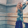
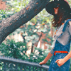
Other icons with this colouring:

A while ago I promised cleansemysins a tut for a batch of Romeo + Juliet icons i did here, but i've recently noticed about a zillion tuts coming up using the same method i did so i didn't see the point in doing yet another one, so instead i've done one for a more coolish colouring using selective colouring and colour balance.
Okay so we have a rather long tutorial so bare with me and try not to fall asleep. I'm going to try and explain why i did certain things rather than just give out a bunch of settings and leave it at that.
1) Take your base and duplicate it once, set this to screen. The opacity level varies between icons, for the one i'm using as the example it was only 20% as this picture is quite light and HQ. For screencaps or darker images, I would leave it at 100% to lighten everything.
2) New adjustment layer, hue/saturation, put the saturation at +15 if you would like to have a fairly cool-coloured icon. If however you'd like something more vibrant then obviously up the saturation.
3) New fill layer, solid colour, fill with FFFEC2 and set to soft light at 75% opacity. Yellow soft light layers are nothing new, they're used as sort of a blank pallete, so you can adjust the colours to your liking. Now, if you were after a softer, cooler look then you'd use a pale yellow at a lower opacity much like i have, and if you'd like a more vibrant icon then you'd use a more intense yellow at maximum opacity. If you've seen some of my other icons then you'll notice i do that alot, especially to emphasise the red in them.
4) New adjustment layer, selective colour. Okay boo-hiss, i know that some people can't get their head around this but it's actually quite simple. After i used the yellow soft light layer i obviously wanted to remove most of the yellow, so...
Reds
Cyan: +22
Magenta: +6
Yellow: +100
Black: +5
Yellows
Cyan: +100
Magenta: +46
Yellow: -6
Black: +32
Neutrals
Cyan: +22
Magenta: +5
Yellow: -8 *if you were using a more intense yellow then you'd most probably want to decrease the yellow more to remove it from your image.
Black: +5
Blacks
Cyan: 0
Magenta: 0
Yellow: 0
Black: -27 *Note; if you have a lot of black in your icon then you may want to leave this at 0, or something higher such as -15 otherwise your finished result can look kinda funny.
5) New fill layer, solid colour, fill with FFE7E7 and set to colour burn at 100% opacity. This will give your icon a sort of warmish tone, decrease the opacity of this layer if you fancy a more cyan/blue result. In some cases you might not even have to use this layer, it depends on your desired effect.
6) New fill layer, solid colour, fill with FFB2B2 and set to soft light at 40%. This layer gives a very subtle pinkish tone while lightening the icon a bit. If you lower the opacity of this layer/decide not to use it at all then you'll notice your icon has a very cyan-saturated result in the end.
7) New adjustment layer, selective colour. This layer sort of dampens the previous pinky tones you put into your image so it's not too 'wow, really pink'. It also makes the colours that little bit more intense.
Reds
Cyan: +23
Magenta: -22
Yellow: +17
Black: +13
Yellows
Cyan: +17
Magenta: +30
Yellow: -34
Black: +6
Neutrals
Cyan: +15
Magenta: +2
Yellow: 0
Black: +4
8) New adjustment layer, selective colour. If you've seen my previous icons then you'll know i like to intensify reds...alot. So this is what this layer is for, but because of your previous colour settings it's not too red and is in keeping with the cool colours of your icon.
Reds
Cyan: -100
Magenta: 0
Yellow: 0
Black: +8
Yellows
Cyan: -66
Magenta: +6
Yellow: -20
Black: +100
Neutrals
Cyan: +7
Magenta: 0
Yellow: -3
Black: -11
9) New adjustment layer, colour balance. This is a niftly little way to remove those yellowy tones you have left over, if you use psp and don't have selective colour then try using colour balance with a yellow soft light layer to get a bright colouring effect, at the same time you could use it to maintain a cool/cyan induced look. (For a tut on bright colours with colour balance in psp, see here)
Anyways the settings for this icon were
shadows
Cyan-red: -18
Magenta-green: -6
Yellow-blue: +6
midtones
Cyan-red: +7
Magenta-green: -3
Yellow-blue: +3
highlights
Cyan-red: -8
Magenta-green: -5
Yellow-blue: +6
Make sure 'preserve luminosity' is checked.
You're done, you may want to add a brightness/contrast layer or you may not need to. Add textures/text/whatever the hell you like and enjoy.

to

PROGRAM USED: Photoshop 7
INVOLVES: colour layers, selective colour, colour balance layer.
DIFFICULTY: easy--medium
TRANSFERABLE?: NO
If you found this tutorial useful then please feel free to join/watch this community.
Other icons with this colouring:


A while ago I promised cleansemysins a tut for a batch of Romeo + Juliet icons i did here, but i've recently noticed about a zillion tuts coming up using the same method i did so i didn't see the point in doing yet another one, so instead i've done one for a more coolish colouring using selective colouring and colour balance.
Okay so we have a rather long tutorial so bare with me and try not to fall asleep. I'm going to try and explain why i did certain things rather than just give out a bunch of settings and leave it at that.
1) Take your base and duplicate it once, set this to screen. The opacity level varies between icons, for the one i'm using as the example it was only 20% as this picture is quite light and HQ. For screencaps or darker images, I would leave it at 100% to lighten everything.
2) New adjustment layer, hue/saturation, put the saturation at +15 if you would like to have a fairly cool-coloured icon. If however you'd like something more vibrant then obviously up the saturation.
3) New fill layer, solid colour, fill with FFFEC2 and set to soft light at 75% opacity. Yellow soft light layers are nothing new, they're used as sort of a blank pallete, so you can adjust the colours to your liking. Now, if you were after a softer, cooler look then you'd use a pale yellow at a lower opacity much like i have, and if you'd like a more vibrant icon then you'd use a more intense yellow at maximum opacity. If you've seen some of my other icons then you'll notice i do that alot, especially to emphasise the red in them.
4) New adjustment layer, selective colour. Okay boo-hiss, i know that some people can't get their head around this but it's actually quite simple. After i used the yellow soft light layer i obviously wanted to remove most of the yellow, so...
Reds
Cyan: +22
Magenta: +6
Yellow: +100
Black: +5
Yellows
Cyan: +100
Magenta: +46
Yellow: -6
Black: +32
Neutrals
Cyan: +22
Magenta: +5
Yellow: -8 *if you were using a more intense yellow then you'd most probably want to decrease the yellow more to remove it from your image.
Black: +5
Blacks
Cyan: 0
Magenta: 0
Yellow: 0
Black: -27 *Note; if you have a lot of black in your icon then you may want to leave this at 0, or something higher such as -15 otherwise your finished result can look kinda funny.
5) New fill layer, solid colour, fill with FFE7E7 and set to colour burn at 100% opacity. This will give your icon a sort of warmish tone, decrease the opacity of this layer if you fancy a more cyan/blue result. In some cases you might not even have to use this layer, it depends on your desired effect.
6) New fill layer, solid colour, fill with FFB2B2 and set to soft light at 40%. This layer gives a very subtle pinkish tone while lightening the icon a bit. If you lower the opacity of this layer/decide not to use it at all then you'll notice your icon has a very cyan-saturated result in the end.
7) New adjustment layer, selective colour. This layer sort of dampens the previous pinky tones you put into your image so it's not too 'wow, really pink'. It also makes the colours that little bit more intense.
Reds
Cyan: +23
Magenta: -22
Yellow: +17
Black: +13
Yellows
Cyan: +17
Magenta: +30
Yellow: -34
Black: +6
Neutrals
Cyan: +15
Magenta: +2
Yellow: 0
Black: +4
8) New adjustment layer, selective colour. If you've seen my previous icons then you'll know i like to intensify reds...alot. So this is what this layer is for, but because of your previous colour settings it's not too red and is in keeping with the cool colours of your icon.
Reds
Cyan: -100
Magenta: 0
Yellow: 0
Black: +8
Yellows
Cyan: -66
Magenta: +6
Yellow: -20
Black: +100
Neutrals
Cyan: +7
Magenta: 0
Yellow: -3
Black: -11
9) New adjustment layer, colour balance. This is a niftly little way to remove those yellowy tones you have left over, if you use psp and don't have selective colour then try using colour balance with a yellow soft light layer to get a bright colouring effect, at the same time you could use it to maintain a cool/cyan induced look. (For a tut on bright colours with colour balance in psp, see here)
Anyways the settings for this icon were
shadows
Cyan-red: -18
Magenta-green: -6
Yellow-blue: +6
midtones
Cyan-red: +7
Magenta-green: -3
Yellow-blue: +3
highlights
Cyan-red: -8
Magenta-green: -5
Yellow-blue: +6
Make sure 'preserve luminosity' is checked.
You're done, you may want to add a brightness/contrast layer or you may not need to. Add textures/text/whatever the hell you like and enjoy.