[TUT] PS -- Coloring
A tutorial on making colors stand out. And matching colors. Thank you!
For Stand-out Colors
I suggest that you guys do this step-by-step using the images I'm going to include. Just so you'll see how everything goes together. And... the numbers I have here is different for every image. Play with the sliders a bit... so you'll know what the action does to your project. ^^ The ones I will post is true ONLY to the image I'm using. That's why I suggest that you do this one first before making your own. Okay? I hope so.
Here we go:
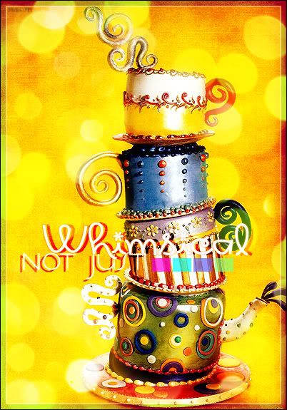
This is what we are going to make.
From this image.
01. New -- 402x575-- Copy / Paste.
02. Duplicate layer.
03. Sharpen your copy.
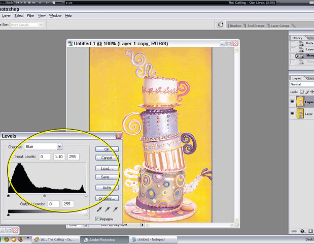
04. Image -- Adjustments -- Levels
RGB -- 1.31 (to lighten image)
Red -- 2.20
Green -- 1.09
Blue -- 1.10
Click OK.
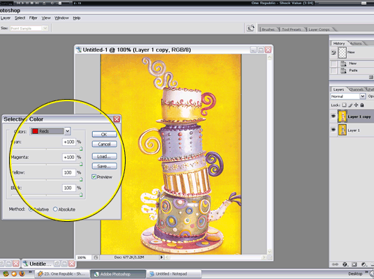
05. Image -- Adjustments -- Selective Color
Reds, Greens, Cyans, Blues, Magentas & Blacks -- 100% EVERYTHING
Yellows -- Cyan -100, Magenta -100, Yellow 100, Black 100
Whites -- Cyan 100, Magenta +17, Yellow +72, Black 0
Neutrals -- Cyan 100, Magenta +34, Yellow +28, Black 0
Click OK.

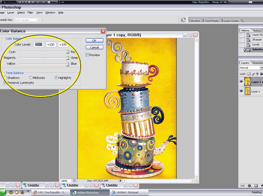
05. Image -- Adjustments -- Color Balance
+100 all three ^^
Click OK.
06. Image -- Adjustments -- Brightness / Contrast
Brightness -- -15
Contrast -- +36
Click OK.
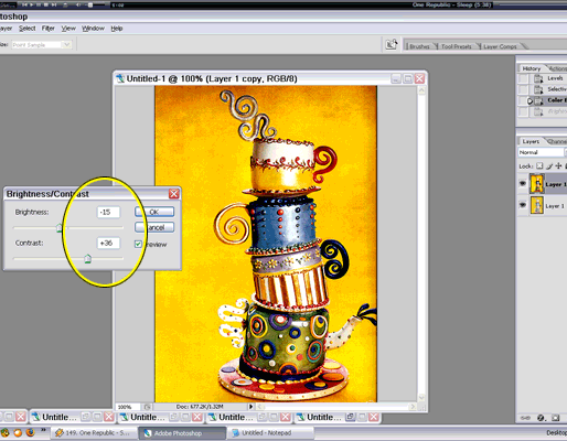
07. Duplicate Layer.
08. Filter -- Blur -- Gaussian Blur -- 8.0
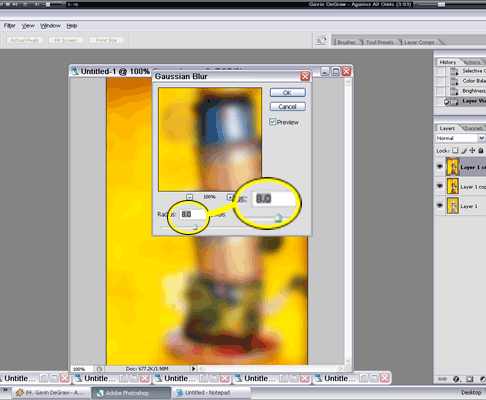
09. Set Layer to SOFT LIGHT.
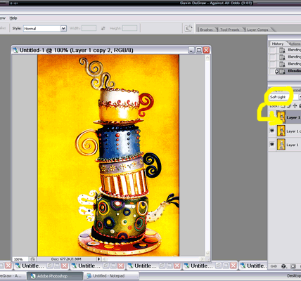
10. Add layer.Texture01 and put layer under the blurred-softlight.
11. Add Texture02 -- Transform and rotate -90 -- Duplicate it.
12. Set the bottome Texture02 layer to Overlay with Opacity of 30%. Set the other layer to Screen 90%.
13. Make New Layer for the text. Add some more designs like brushes. ^^ I recommend that text be under the textures so they would blend well with all the colors.
14. Make sure that both texture02 layers are above Texture 01. Don't put any layer above the blurred one... except if you have something like that color squares I put in it. Layer Tray should look like this. (w/o text and other designs).
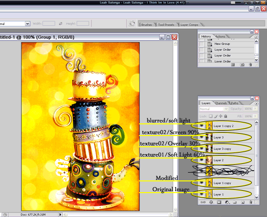
15. Finally, borders! It's optional. ^^ Play with the colors a bit... and the blending options... to come up with dramatic effects.
16. Phew... there you go! I hope it comes out good! ^_____^
**Steps 4-6 are meant to emphasize the colors. The trick here is to blend the colors until they stand out.
***Steps 8&9 makes the colors appear sharper and stronger.
****I usually have more layers for text, borders, and textures than I have for the image itself. I usually experiment on which blending option would look good on the poster. Hehehe.
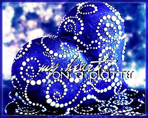
Here's another one I made with this technique.
----------
For Color Matching
Let's pretend that you already have an almost finished work. ^^
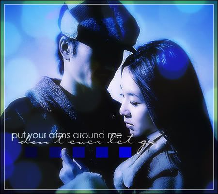
Look at the poster above. You'll notice that it's blue.
Note the light texture. It's also blue, right?
But this is the original texture.
Lets turn it blue!
01. (everything's opened on PS) Image -- Adjustments -- Match Color
02. On the box beside SOURCE, choose your project. Your texture will now turn into the color of the backround of your project.
03. Now, on the box beside LAYER, choose which layer has the color you want the texture to have. (In the example, I chose the topmost layer I have. ^^)
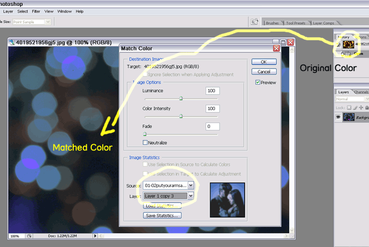
04. Click OK and you have your new texture. Just drag-and-drop or copy-paste it to your project. ^___^
Credits: AOL, GOOGLE, UST Lib, DA, DAFONT, LJ, SOOMPI, 1001Free Fonts, SJ*FH
For Stand-out Colors
I suggest that you guys do this step-by-step using the images I'm going to include. Just so you'll see how everything goes together. And... the numbers I have here is different for every image. Play with the sliders a bit... so you'll know what the action does to your project. ^^ The ones I will post is true ONLY to the image I'm using. That's why I suggest that you do this one first before making your own. Okay? I hope so.
Here we go:
This is what we are going to make.

From this image.
01. New -- 402x575-- Copy / Paste.
02. Duplicate layer.
03. Sharpen your copy.
04. Image -- Adjustments -- Levels
RGB -- 1.31 (to lighten image)
Red -- 2.20
Green -- 1.09
Blue -- 1.10
Click OK.

05. Image -- Adjustments -- Selective Color
Reds, Greens, Cyans, Blues, Magentas & Blacks -- 100% EVERYTHING
Yellows -- Cyan -100, Magenta -100, Yellow 100, Black 100
Whites -- Cyan 100, Magenta +17, Yellow +72, Black 0
Neutrals -- Cyan 100, Magenta +34, Yellow +28, Black 0
Click OK.


05. Image -- Adjustments -- Color Balance
+100 all three ^^
Click OK.

06. Image -- Adjustments -- Brightness / Contrast
Brightness -- -15
Contrast -- +36
Click OK.

07. Duplicate Layer.
08. Filter -- Blur -- Gaussian Blur -- 8.0

09. Set Layer to SOFT LIGHT.

10. Add layer.Texture01 and put layer under the blurred-softlight.
11. Add Texture02 -- Transform and rotate -90 -- Duplicate it.
12. Set the bottome Texture02 layer to Overlay with Opacity of 30%. Set the other layer to Screen 90%.
13. Make New Layer for the text. Add some more designs like brushes. ^^ I recommend that text be under the textures so they would blend well with all the colors.
14. Make sure that both texture02 layers are above Texture 01. Don't put any layer above the blurred one... except if you have something like that color squares I put in it. Layer Tray should look like this. (w/o text and other designs).

15. Finally, borders! It's optional. ^^ Play with the colors a bit... and the blending options... to come up with dramatic effects.
16. Phew... there you go! I hope it comes out good! ^_____^
**Steps 4-6 are meant to emphasize the colors. The trick here is to blend the colors until they stand out.
***Steps 8&9 makes the colors appear sharper and stronger.
****I usually have more layers for text, borders, and textures than I have for the image itself. I usually experiment on which blending option would look good on the poster. Hehehe.
Here's another one I made with this technique.

----------
For Color Matching
Let's pretend that you already have an almost finished work. ^^

Look at the poster above. You'll notice that it's blue.
Note the light texture. It's also blue, right?
But this is the original texture.
Lets turn it blue!
01. (everything's opened on PS) Image -- Adjustments -- Match Color
02. On the box beside SOURCE, choose your project. Your texture will now turn into the color of the backround of your project.
03. Now, on the box beside LAYER, choose which layer has the color you want the texture to have. (In the example, I chose the topmost layer I have. ^^)

04. Click OK and you have your new texture. Just drag-and-drop or copy-paste it to your project. ^___^
Credits: AOL, GOOGLE, UST Lib, DA, DAFONT, LJ, SOOMPI, 1001Free Fonts, SJ*FH