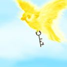
Caged
I've been working on work and finally some personal pieces.
...
well, actually one piece so far. but the new year JUST started so... there!
^_^;

( Read more... )
...
well, actually one piece so far. but the new year JUST started so... there!
^_^;

( Read more... )
Comments 11
Reply
TY!
Reply
To lose the illusion that the wall is so close, I would have made the grass a wavy blur of green with no distinguishable line of individual blades at the end. perhaps, then, it will keep to scale with the rest of the lawn.
That's my guess.
Reply
thanks!
Reply
Reply
Reply
Reply
Reply
Reply
Excellent job!
Oh and if you want I have new pictures up you are welcome to look at!
<3 Ash
Reply
Reply
Leave a comment