Tutorial!
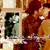
Today we're going to learn how to make this icon:

TUTORIAL - Stars Aligned icon
+ Best made in PSP8, but it's probably translateable in other programs
+ When I have something like 100%, it means opacity of the layer you're working on
+ I've hopefully made this easy for all icon users, but it helps if you have some knowledge of PSP8
beforehand. Any questions, I'll be happy to answer.
+ Hope you guys enjoy! Any feedback is greatly appreciated
LAYER ONE: I started off with a picture from the season premiere of Gilmore Girls. I was able to download a zip of the episode here provided by the lovely noyo88. Most of the time, prepping a base is pretty easy, so here's what I usually do:
Layer one: Adjust > Sharpness > Sharpen
Copy of Layer one: Screen 100%
Copy of Screened Layer one: Soft Light 100%
Obviously, it varies from picture to picture, depending on the quality. I believe I had to screen & soft light a couple of times to get the quality that I wanted, but that's something you can play around with.
LAYER TWO: I decide that I want to make my base black and white. There are many different ways you can go about this, but here's how I went about it:
Layer Two: Pick the "black" color from your palette and using your paintbucket, fill the layer with "black" and set the layer to Color at 100%
LAYER THREE: Using black & white is pretty cool because you can work with a lot of different coloring techniques that wouldn't look as good on a regular colored icon. Just remember that experimentation is key.
Layer Three: Use #E2BEB1 and set it to Soft Light at 100%
Copy of Layer Three: Use #E2BEB1 and set it to Soft Light at 100%
LAYER FOUR: That's good, but it's a little too pink for me. I want to try to get some more depth.
Layer Four: Use #C4B1B3 and set it to Burn at 80%
LAYER FIVE: I think a gradient would come in handy at this point. If I don't use my own gradient's, I'm usually using ones made by detoxcocktails from a pack that she made for icon_crack. Since they were members only gradients, I'm not going to post the gradient, but it's kind of a dark purple-y/blue looking thing.
Layer Five: Use whatever gradient you have, set to Soft Light at 54%
LAYER SIX: Textures are awesome when it comes to adding color and cool effects to your icon and inxsomniax makes some of the best I've ever seen.
Layer Six Using this texture, set to Burn at 40%
LAYER SEVEN: The part where the pole is by Luke's arm looks kind of bare, so I go back to my original image and use my Selection tool to cut out a tiny piece of the picture. I resize it to something like 30x54 (Image > Resize) and then make it black and white. The other way to make an image black and white in PSP8 is by going Adjust > Hue and Saturation > Colorize and making it so your settings are set on zero. So now it's black and white and that's fine and dandy, but I want to punch it up a bit. By going to Adjust > Brightness and Contrast > Brightness/Contrast, I play with the settings so that the black and white stand out more.
So when you're done playing with the tiny!Luke/Lorelai, just copy and paste it as a new layer on to your original icon and situate it to where it looks best.
LAYER EIGHT: Using this new layer, I decide to make a box around tiny!Luke/Lorelai. Using the color #CFA495, I take my paintbrush tool and make it so that it's set at the square setting, size 3 at 100% hardness and then draw around tiny!Luke/Lorelai
LAYER NINE: Okay, this next layer might sound a little tricky, but it's actually really easy, so if you have any questions on this part I'll be happy to explain in more detail. Basically, you want to make another box around your original one pink one (using #C0816E) and make it slightly bigger. I want the edges to be rounded, so I use my Selection tool and select the next box I've just drawn. I go to Selections > Modify > Smooth and I make my smoothing amount to be 5px. Make sure your anti-alias box is checked. So after you hit okay, go to Selections > Invert and you'll see almost the whole icon selected. Fill the selected part with #C0816E and then use your eraser icon to erase all the pink that you don't want and you'll see the box around tiny!Luke/Lorelai is all rounded
and nice.
LAYER TEN: I use another texture from the fabulous inxsomniax right here and set it to Soft Light at 100% Copy Layer 10: Burn, 20%
LAYER ELEVEN: colorfilter put up some pretty lace brushes the other day so I use one of those and erase the the lacy parts that I don't want. You could do with this with any sort of decorative brush.
LAYER TWELVE: Now it's time for text. I used Violation at 12 point (I think, it may have been 10 pt) and you can download that font at DaFont.com. I type out "stars aligned"> and then used some tiny text underneath it (Arial, pt. 1) and that's it!
If you take the icon, please credit _breezybee
Remember that this tutorial is supposed to be used as a GUIDE and not to copy the exact icon. I'll be very angry if you do.
Any questions/comments/feedback - I would LOVE you forever.
enjoy :)