Tutorial #025
From 
to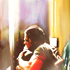
requested by iwantpie
Tools
Adobe Photoshop CS5
Vibrance, Brightness/contrast, Color Balance, Channel Mixer
Textures
by discolore
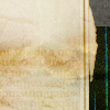
by skydawnjade

Layer list
Each of the layer you see in the tutorial are the same than the ones in the layer list here.
1/ On the original picture, use the smudge tool, strength at 50% in order to make the logo disapeared.
2/Layer 2 copy 2: When you're done, resize the picture so that the guys will look smaller (from memory, i think I put it 50 pixels of height, but I'm not sure). Then, instead of looking at the icon in the normal size (100%), increase to 300%. You can do that changing the figures here. When, it will be at 300%, you'll see something like this. With the smudge tool, still at a strength of 50%, extend the background of the picture until the whole icon is full.In order to make an unified background, be patient and take your time. When you're done and you're still not happy with it, use the blur tool.
RESULT: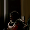
3/ Layer 2 copy 3: Duplicate your base and set it to screen, 100% of opacity.
4/ Layer 2 copy 10: Duplicate your base and set it to screen (again)
5/ Layer 2 copy 13: Guess what? Duplicate and set it to screen.
RESULT: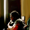
6/ Layer 3: As you can see, when you set to screen, contrasts are, well even more contrasted. But, it doesn't give you more colors. In order to have less contrast and more colors, I decided to use a texture. Use this texture. Set it to screen, 100% of opacity. I wasn't happy with some of the few parts of the texture so I used the smudge tool and modify the texture. When I was done, the texture looked like this.
7/ Layer 2 copy 11: The main issue now is that with a screen texture, contrasts nearly disapeared. But, as I wanted to keep the colors, I duplicate the base and set it to soft light, opacity 100%.
8/ Layer 2 copy 12: I wanted more contrasts again so I duplicate the base and set it to soft light again, opacity to 87%.
RESULT: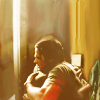
9/ Brightness/Contrast 1: More brightness is needed at this point. Open a brightness/contrast layer.
Brightness: 48
Contrast: 39
10/Color Balance 1: As you can see, the icon is too yellow. I wanted a result with more than one color scheme. Create a color balance layer:
Shadows: -65, -8, +6
Midtones: -31, +8, +87
Highlights: 0, 0, -10
RESULT: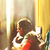
11/Channel Mixer: Thanks to the color balance layer, there is more colors but I was still not happy and decided to redo a bit the whole colorscheme.For that, I used a channel mixer:
Blue: +3, -5, +164
RESULT: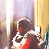
12/Vibrance: To make the colors a bit more vibrant, I used the vibrance tool.
Vibrance: +32
Saturation: +1
13/Layer 4: I wanted a cloudy effect in order to soften the icon. I created this texture and set it to screen 100%.
RESULT: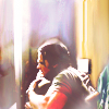
14/ Layer 2 copy 14: I wanted more contrast so I duplicated the base and set it to soft light, opacity of 54%
15/ Color Balance 2: The colors are less vibrant than what I wanted originally so I decided to open a color balance layer:
Midtones: +2, -6, -44
Highlights: -2, 0, -9
16/ Merge all the layers and sharpen a bit. You're done!
RESULT:
DO NOT ASK FOR A .PSD
Feel free to use the textures, but credit the right maker and don't use the modified textures.
If you have any questions, don't hesitate to ask!
English is not my native language so all my apologizes for the mistakes.
The settings here work on this icon, it doesn't mean it will work on yours.
Comments make me happy :)

to

requested by iwantpie
Tools
Adobe Photoshop CS5
Vibrance, Brightness/contrast, Color Balance, Channel Mixer
Textures
by discolore

by skydawnjade

Layer list
Each of the layer you see in the tutorial are the same than the ones in the layer list here.
1/ On the original picture, use the smudge tool, strength at 50% in order to make the logo disapeared.
2/Layer 2 copy 2: When you're done, resize the picture so that the guys will look smaller (from memory, i think I put it 50 pixels of height, but I'm not sure). Then, instead of looking at the icon in the normal size (100%), increase to 300%. You can do that changing the figures here. When, it will be at 300%, you'll see something like this. With the smudge tool, still at a strength of 50%, extend the background of the picture until the whole icon is full.In order to make an unified background, be patient and take your time. When you're done and you're still not happy with it, use the blur tool.
RESULT:

3/ Layer 2 copy 3: Duplicate your base and set it to screen, 100% of opacity.
4/ Layer 2 copy 10: Duplicate your base and set it to screen (again)
5/ Layer 2 copy 13: Guess what? Duplicate and set it to screen.
RESULT:

6/ Layer 3: As you can see, when you set to screen, contrasts are, well even more contrasted. But, it doesn't give you more colors. In order to have less contrast and more colors, I decided to use a texture. Use this texture. Set it to screen, 100% of opacity. I wasn't happy with some of the few parts of the texture so I used the smudge tool and modify the texture. When I was done, the texture looked like this.
7/ Layer 2 copy 11: The main issue now is that with a screen texture, contrasts nearly disapeared. But, as I wanted to keep the colors, I duplicate the base and set it to soft light, opacity 100%.
8/ Layer 2 copy 12: I wanted more contrasts again so I duplicate the base and set it to soft light again, opacity to 87%.
RESULT:

9/ Brightness/Contrast 1: More brightness is needed at this point. Open a brightness/contrast layer.
Brightness: 48
Contrast: 39
10/Color Balance 1: As you can see, the icon is too yellow. I wanted a result with more than one color scheme. Create a color balance layer:
Shadows: -65, -8, +6
Midtones: -31, +8, +87
Highlights: 0, 0, -10
RESULT:

11/Channel Mixer: Thanks to the color balance layer, there is more colors but I was still not happy and decided to redo a bit the whole colorscheme.For that, I used a channel mixer:
Blue: +3, -5, +164
RESULT:

12/Vibrance: To make the colors a bit more vibrant, I used the vibrance tool.
Vibrance: +32
Saturation: +1
13/Layer 4: I wanted a cloudy effect in order to soften the icon. I created this texture and set it to screen 100%.
RESULT:

14/ Layer 2 copy 14: I wanted more contrast so I duplicated the base and set it to soft light, opacity of 54%
15/ Color Balance 2: The colors are less vibrant than what I wanted originally so I decided to open a color balance layer:
Midtones: +2, -6, -44
Highlights: -2, 0, -9
16/ Merge all the layers and sharpen a bit. You're done!
RESULT:

DO NOT ASK FOR A .PSD
Feel free to use the textures, but credit the right maker and don't use the modified textures.
If you have any questions, don't hesitate to ask!
English is not my native language so all my apologizes for the mistakes.
The settings here work on this icon, it doesn't mean it will work on yours.
Comments make me happy :)