Tutorial: the making of 'I burn for you'
The Making of "I burn for you"
from this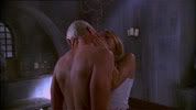
to this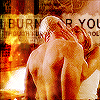
General Notes:
ok, then
Step 01: Cropping (background layer 00)
- open your pic
- try to find a nice cropping area.
- I wanted to put some text behind the heads of our two lovers so I croppped it with this space in mind...
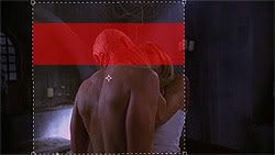
- I got this result
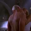
Step 02: Preparing (layers 01-03)
- I duplicated the background layer
- I used on the copied layer a Gaussian blur of 1.3 (Filter - Blur - Gaussian Blur) and set the layer mode to Screen
- then I duplicated the layer twice
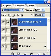
this step will brighten the dark picture a lot and because of the blurring we get a dreamlike texturing
- so far the icon looks like this
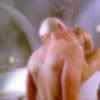
Step 03: Adjustment layer (layer 04)
- we're adding an Adjustment layer to change the Hue and Saturation of the whole icon a bit
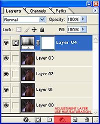
- I used the following settings, mainly to decrease the saturation
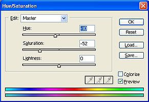
and the result of this step looked like this
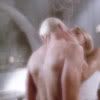
Step 04: Sharpening (layer 05)
- with this step we'll add some sharpness and get rid of the blurry look
- I made a new layer and copied the whole icon into this new layer (you can do this with ctrl+alt+shift+e very easily, no need to select and copy and paste it, as it's all done in one step)
- on this new layer I used the sharpening filter (Filter- Sharpen - Sharpen), and repeated the sharpening twice (you can recall the last filter with ctrl+f)
the result is

Step 05: Coloring1 (layer 06)
- as we need the pic brighter and and more yellowish, we're adding a new layer
- fill it with #C2AE7A and set it on Overlay
now that was easy...
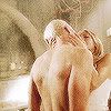
Step 06: Text background (layer 07)
- we want the area where the main text will be visible to look like a banner
- therefore we're adding a new layer and fill it with white
- we're adding a layer mask and fill it with black so that nothing is visible
- then we mark the area we want to be visible (the banner thingie) and fill this area on the layer mask with white
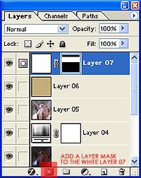
the result of this step should look like this

and after we set the layer mode of this layer to Soft Light like this
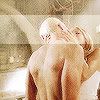
I know this sounds complicated for just a white rectangular but you'll see why this technique works great for us
- we want the banner look a bit more torn and edgy, so we use on the layer mask (make sure it is active by clicking on it!) a Crystallize effect
(Filter - Pixelate - Crystallize), I used strength 4.
- then I added a layer style to this layer (Outer Glow, Blend Mode: Soft Light, Opacity: 50%, Color: Black) by right clicking on the layer in the Layer Pallette and choosing Blending Options
now our banner looks like this
- we don't want the banner to hide the heads and bodies of our couple, so we paint with black and one of Photoshop's default small round brushes on the Layer Mask over these areas to make these parts invisible
- if you're making any mistakes around the edges you can paint with white to get the banner back
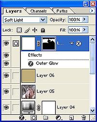
weee, finally finished this step
Step 07: Text (layers 08-10)
- I used the lyrics of Sting's 'I burn for you' for this icon
Now that I have found you
In the coolth of your evening smile
The shade of your parasol
And your love flows through me
Though I drink at your pool
I burn for you, I burn for
You and I are lovers
When night time folds around our bed
In peace we sleep entwined
And your love flows through me
Though an ocean soothes my head
I burn for you, I burn for
Stars will fall from dark skies
As ancient rocks are turning
Quiet fills the room
And your love flows through me
Though I lie here so still
I burn for you, I burn for you
I burn...
- added the whole song in a tiny, tiny font size (Arial Narrow, all caps, size: 3pt, leading: 3pt, tracking: 100, color: black, alignment: left) on the upper left site of the canvas
- added 'I burn for you' (Arial Narrow, all caps, size: 13pt, leading: 3pt, tracking: 100, color: black, alignment: left) across the banner, and the heads...
- added another line of the song right under the main line (size: 6 pt)
- for all three text layers I added Layer Masks and painted black over Spike&Buffy's heads and bodies on the masks, to make the text invisible there
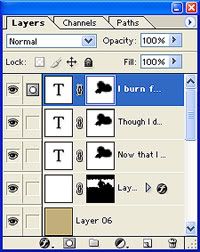
the result of Step 7 should look somehow like this
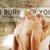
Step 08: Coloring2 (layer 11)
- we're adding a one of Photoshop's default gradients. it's the Yellow, Pink, Green one which belongs into the Pastel group
- we're dragging with the linear gradient tool from the right lower corner to the left upper corner and set the layer mode to Soft Light
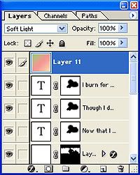
the icon starts to look pretty
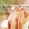
Step 09: Decoration (layers 12-14)
- on the left side of the icon I added some rectangulars in different colors and blending modes
- I just made the rectangular selection and filled it with either #696969 or #9A5D39, each on a new layer
so each decoration layer on its own...
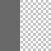
set on Color Burn
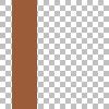
set on Screen
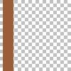
set on Overlay
the result so far

- each layer that hid the bodies/faces got a layer mask just like in the steps above
- the big grey one got also a mask in the shape of the banner so that this part didn't get too dark
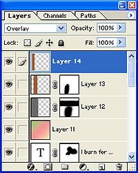
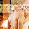
the final result of this step
Step 10: Final Touching (layer 15)
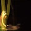
- to increase the burning colors I added this stock image from GettyImages and set it on Layer Mode Overlay
- after a lot of moving around and size adjustments I finally got a position I liked, I smudged the parts over Spike's back so that the effect wasn't too strong there
the part of the stock I've chosen (note: it's already smudged on the area that covers Spike's back)
and we're done
Step 11: Saving for the Web
- I used the png-24 format for the final image

that's about it.
if there are any questions feel free to ask :)
[weee, that took actually really, really long to write. lol. but I'm thinking about doing another one nontheless (which could take a few days though as this week will get very busy), so the tutorial poll is still open and so far porntastic and midsummernight are pretty much on the same level...]
and sorry I haven't replied to comments yet, I'm pretty busy reading all the fabulous submissions for the Spuffy Kinkathon...
from this

to this

General Notes:
- I used Photoshop 7.0
- the original cap was made by _jems_. feel free to use it for this tutorial but please only for educational reasons, don't claim the final icon yours afterwards...
- I like to work on a 200x200 canvas and resize it in the end. it's just a thing of me, but for this tut I assumed to work on 100x100...
- I also assumed that you know some tools in PS
- I couldn't remember the correct order of all these steps, as I generally mess around a lot and delete layers I don't like and change settings of adjustments layers on several occasions until I'm finally satisfied. so I just explain what happens on each layer of the final psd file. you can download the psd-file here.
ok, then
Step 01: Cropping (background layer 00)
- open your pic
- try to find a nice cropping area.
- I wanted to put some text behind the heads of our two lovers so I croppped it with this space in mind...

- I got this result

Step 02: Preparing (layers 01-03)
- I duplicated the background layer
- I used on the copied layer a Gaussian blur of 1.3 (Filter - Blur - Gaussian Blur) and set the layer mode to Screen
- then I duplicated the layer twice

this step will brighten the dark picture a lot and because of the blurring we get a dreamlike texturing
- so far the icon looks like this

Step 03: Adjustment layer (layer 04)
- we're adding an Adjustment layer to change the Hue and Saturation of the whole icon a bit

- I used the following settings, mainly to decrease the saturation

and the result of this step looked like this

Step 04: Sharpening (layer 05)
- with this step we'll add some sharpness and get rid of the blurry look
- I made a new layer and copied the whole icon into this new layer (you can do this with ctrl+alt+shift+e very easily, no need to select and copy and paste it, as it's all done in one step)
- on this new layer I used the sharpening filter (Filter- Sharpen - Sharpen), and repeated the sharpening twice (you can recall the last filter with ctrl+f)
the result is

Step 05: Coloring1 (layer 06)
- as we need the pic brighter and and more yellowish, we're adding a new layer
- fill it with #C2AE7A and set it on Overlay
now that was easy...

Step 06: Text background (layer 07)
- we want the area where the main text will be visible to look like a banner
- therefore we're adding a new layer and fill it with white
- we're adding a layer mask and fill it with black so that nothing is visible
- then we mark the area we want to be visible (the banner thingie) and fill this area on the layer mask with white

the result of this step should look like this

and after we set the layer mode of this layer to Soft Light like this

I know this sounds complicated for just a white rectangular but you'll see why this technique works great for us
- we want the banner look a bit more torn and edgy, so we use on the layer mask (make sure it is active by clicking on it!) a Crystallize effect
(Filter - Pixelate - Crystallize), I used strength 4.
- then I added a layer style to this layer (Outer Glow, Blend Mode: Soft Light, Opacity: 50%, Color: Black) by right clicking on the layer in the Layer Pallette and choosing Blending Options
now our banner looks like this

- we don't want the banner to hide the heads and bodies of our couple, so we paint with black and one of Photoshop's default small round brushes on the Layer Mask over these areas to make these parts invisible
- if you're making any mistakes around the edges you can paint with white to get the banner back

weee, finally finished this step

Step 07: Text (layers 08-10)
- I used the lyrics of Sting's 'I burn for you' for this icon
Now that I have found you
In the coolth of your evening smile
The shade of your parasol
And your love flows through me
Though I drink at your pool
I burn for you, I burn for
You and I are lovers
When night time folds around our bed
In peace we sleep entwined
And your love flows through me
Though an ocean soothes my head
I burn for you, I burn for
Stars will fall from dark skies
As ancient rocks are turning
Quiet fills the room
And your love flows through me
Though I lie here so still
I burn for you, I burn for you
I burn...
- added the whole song in a tiny, tiny font size (Arial Narrow, all caps, size: 3pt, leading: 3pt, tracking: 100, color: black, alignment: left) on the upper left site of the canvas
- added 'I burn for you' (Arial Narrow, all caps, size: 13pt, leading: 3pt, tracking: 100, color: black, alignment: left) across the banner, and the heads...
- added another line of the song right under the main line (size: 6 pt)

- for all three text layers I added Layer Masks and painted black over Spike&Buffy's heads and bodies on the masks, to make the text invisible there

the result of Step 7 should look somehow like this

Step 08: Coloring2 (layer 11)
- we're adding a one of Photoshop's default gradients. it's the Yellow, Pink, Green one which belongs into the Pastel group
- we're dragging with the linear gradient tool from the right lower corner to the left upper corner and set the layer mode to Soft Light

the icon starts to look pretty

Step 09: Decoration (layers 12-14)
- on the left side of the icon I added some rectangulars in different colors and blending modes
- I just made the rectangular selection and filled it with either #696969 or #9A5D39, each on a new layer
so each decoration layer on its own...

set on Color Burn

set on Screen

set on Overlay
the result so far

- each layer that hid the bodies/faces got a layer mask just like in the steps above
- the big grey one got also a mask in the shape of the banner so that this part didn't get too dark

the final result of this step

Step 10: Final Touching (layer 15)
- to increase the burning colors I added this stock image from GettyImages and set it on Layer Mode Overlay
- after a lot of moving around and size adjustments I finally got a position I liked, I smudged the parts over Spike's back so that the effect wasn't too strong there
the part of the stock I've chosen (note: it's already smudged on the area that covers Spike's back)

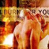
and we're done

Step 11: Saving for the Web
- I used the png-24 format for the final image

that's about it.
if there are any questions feel free to ask :)
[weee, that took actually really, really long to write. lol. but I'm thinking about doing another one nontheless (which could take a few days though as this week will get very busy), so the tutorial poll is still open and so far porntastic and midsummernight are pretty much on the same level...]
and sorry I haven't replied to comments yet, I'm pretty busy reading all the fabulous submissions for the Spuffy Kinkathon...