awmp
in
awmpdotnet
tutorial: coloring. light effects. etc. beginner-friendly
originally posted at awmp on 2005-03-16
still in tutorial mood, so here are some beginner-friendly tipps on coloring, light effects, etc.
from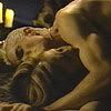
to
or to
Step 1: preparing the cropped pic
- I desaturated the pic (ctrl+shift+u)
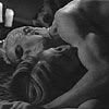
- I duplicated the layer thrice
- I set the first two copied layers on Screen mode and the last one on top on Soft Light mode
the result looked like this
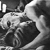
Step 2: coloring
- on a new layer I used a linear gradient from #DA6700 to #2B0524, dragged from the lower left to the upper right corner

- I set this layer on Color mode with 80% opacity
the result should look somehow like this
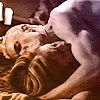
Step 3: light effects
- I used this stock image I made and added it on top of everything, set on Hard Light mode
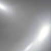
the result was this
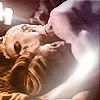
Variations of this step with other stock images:
(more can be found here)
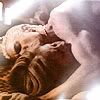
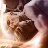
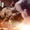
Step 4: designing or something funny like that
- I marked the whole icon (ctrl+a), merge-copied it (ctrl+shift+c)
- made a new layer on top and filled it with white
- pasted the icon on top of everything (ctrl+v) and resized it to about 80%
after I sharpened this layer (Filter - Sharpen - Sharpen) the result was this
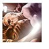
- I made a new layer and pasted the whole icon (with the white border) into this new layer (ctrl+shift+alt+e)
- I resized this to tiny 22%, and sharpened this layer again (crtl+f, as the last used filter at this point should be sharpening)
after a proper placement, the result is
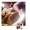
and after I copied this layer and moved it to the right, I got
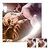
Step 5: text
- I added the words 'love bites' (font: AvantGarde Md BT, size: 8 pt, tracking: 270, all caps) and rotated the text
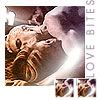
- I added another line to the icon, and to make it more visible I made a white rectangular on its own layer right under this text layer
- font: AvantGarde Md BT, size: 2pt, tracking: 250
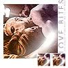
that's about it. we're already finished... if there are question feel free to ask.
alternatively:
Step 4: Variation 2
- we're working with this variation

- I added some text (font: AvantGarde Md BT, size: 11/6 pt, tracking: 280/270, all caps), set it on soft light
- I duplicated the text layer to increase the effect
- on the new text layer I added a drop shadow (multiply, 40%, 120°, distance:2, size:2)
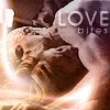
- made a new layer and pasted the whole icon onto this new layer (ctrl+shift+alt+e)
- used the sharpening filter (Filter - Sharpen -Sharpen)
and again we're finished

used program:
- PS 6.0 (gasp, yes an ancient version!)
used resources:
- caps from cappiness
- light stocks from here
still in tutorial mood, so here are some beginner-friendly tipps on coloring, light effects, etc.
from

to

or to

Step 1: preparing the cropped pic
- I desaturated the pic (ctrl+shift+u)

- I duplicated the layer thrice
- I set the first two copied layers on Screen mode and the last one on top on Soft Light mode
the result looked like this

Step 2: coloring
- on a new layer I used a linear gradient from #DA6700 to #2B0524, dragged from the lower left to the upper right corner

- I set this layer on Color mode with 80% opacity
the result should look somehow like this

Step 3: light effects
- I used this stock image I made and added it on top of everything, set on Hard Light mode

the result was this

Variations of this step with other stock images:
(more can be found here)


Step 4: designing or something funny like that
- I marked the whole icon (ctrl+a), merge-copied it (ctrl+shift+c)
- made a new layer on top and filled it with white
- pasted the icon on top of everything (ctrl+v) and resized it to about 80%
after I sharpened this layer (Filter - Sharpen - Sharpen) the result was this

- I made a new layer and pasted the whole icon (with the white border) into this new layer (ctrl+shift+alt+e)
- I resized this to tiny 22%, and sharpened this layer again (crtl+f, as the last used filter at this point should be sharpening)
after a proper placement, the result is

and after I copied this layer and moved it to the right, I got

Step 5: text
- I added the words 'love bites' (font: AvantGarde Md BT, size: 8 pt, tracking: 270, all caps) and rotated the text

- I added another line to the icon, and to make it more visible I made a white rectangular on its own layer right under this text layer
- font: AvantGarde Md BT, size: 2pt, tracking: 250

that's about it. we're already finished... if there are question feel free to ask.
alternatively:
Step 4: Variation 2
- we're working with this variation

- I added some text (font: AvantGarde Md BT, size: 11/6 pt, tracking: 280/270, all caps), set it on soft light
- I duplicated the text layer to increase the effect
- on the new text layer I added a drop shadow (multiply, 40%, 120°, distance:2, size:2)

- made a new layer and pasted the whole icon onto this new layer (ctrl+shift+alt+e)
- used the sharpening filter (Filter - Sharpen -Sharpen)
and again we're finished

used program:
- PS 6.0 (gasp, yes an ancient version!)
used resources:
- caps from cappiness
- light stocks from here