awmp
in
awmpdotnet
some tips for beginners...
originally posted at awmp on 11/20/04
some quick and easy tips and tricks in Photoshop for absolute beginners (I'm not that good myself, but some starting tips I can manage):
on to two very easy icon styles...
01
02
the results:
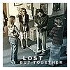
01
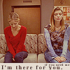
02
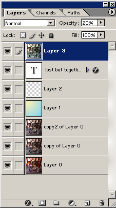
on 01 I duplicated the background layer, lowered the saturation (Image - Adjustment - Hue/saturation) to -50, duplicated this layer again, set the layer mode to screen and the transparency to 50% to make it lighter.
the next layer is a gradient, set on color and 50% transparency, as you can see it's a light yellow and a light bluegreen. the next layer is a simple white frame. then there is the text layer with a drop shadow. and the last layer on top is a copy of the whole icon (select all, ctrl+shift+C for mergecopying) that is sharpened a lot and set on 20% transparency. that's all. all layers that contain the original cap were sharpened several times.
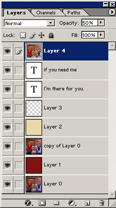
on 02 I used a red layer (#7F1212) set on Exclusion and 50% transparency for coloring, then the original layer again set on screen and 50% to make it lighter, another coloring layer set on Multiply (#EAD8A9). the next layer contains this little box at the bottom (color #E6DDD1). two text layers... the last layer is again a sharpened mergecopied version of the icon set on 50% transparency.
easy, right?
I used these styles on the following icons. none of them took longer than 3 minutes. and they only contain this little number of layers... try it, please.
some quick and easy tips and tricks in Photoshop for absolute beginners (I'm not that good myself, but some starting tips I can manage):
- the sharpening filter is your friend. use it. (filters - sharpen - sharpen)
- auto-levels, auto-contrast, auto-color can do wonders. try it. not all at the same time, sometimes they make everything worse but in general at least one of them will enhance your cap. (ctrl+shift+alt+L=auto-contrast, ctrl+shift+L=auto-levels, ctrl+shift+B=auto-colors [this one only Photoshop 7.0 and above])
- I have mentioned the sharpening, right?
- A.S.P.E.C.T.R.A.T.I.O.! use the cropping tool and set it to a fixed size (100x100) don't forget to set the resolution either (screen resolution is 72 dpi, I use 100 though because I'm superstitious...)
- get to know the layer blending modes. that's the left pull down menu in your layers pallette, where normally you can read 'normal'.
- don't be afraid of transparency. if you're using a coloring layers e.g. you don't have to use it at 100 %. try to make it more transparent
- don't be afraid of the eraser. if you're using texturing layers e.g., don't be shy and use the eraser for parts that should be seen more clearly
- there's a reason why standard fonts are that popular. Arial and Times New Roman are very good fonts. and they work on icons, too! who knew...
- drop shadow looks in most cases better than outlined text and it makes the text readable as well
on to two very easy icon styles...
01
02
the results:
01
02
on 01 I duplicated the background layer, lowered the saturation (Image - Adjustment - Hue/saturation) to -50, duplicated this layer again, set the layer mode to screen and the transparency to 50% to make it lighter.
the next layer is a gradient, set on color and 50% transparency, as you can see it's a light yellow and a light bluegreen. the next layer is a simple white frame. then there is the text layer with a drop shadow. and the last layer on top is a copy of the whole icon (select all, ctrl+shift+C for mergecopying) that is sharpened a lot and set on 20% transparency. that's all. all layers that contain the original cap were sharpened several times.
on 02 I used a red layer (#7F1212) set on Exclusion and 50% transparency for coloring, then the original layer again set on screen and 50% to make it lighter, another coloring layer set on Multiply (#EAD8A9). the next layer contains this little box at the bottom (color #E6DDD1). two text layers... the last layer is again a sharpened mergecopied version of the icon set on 50% transparency.
easy, right?
I used these styles on the following icons. none of them took longer than 3 minutes. and they only contain this little number of layers... try it, please.