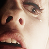
20 BTVS Icons (Season 1)
Posting this in a hurry, not at all satisfied with them. It's definitely not my best work but I was running out of time so, alas, these are the icons for season20in20
Themes
broken
end(ing)
far away
favourite scene
group
( Read more... )
Themes
broken
end(ing)
far away
favourite scene
group
( Read more... )
Comments 21
Reply
Reply
My favourites are favourite scene, group, inspire by song, smile and ac#2. I also love your cap choice for sight! :)
Reply
Reply
I apologize for missing these! I like pink (so stern and severe in contrast to the color) but AC4 is a WOW for me. I don't recall that image but I love what you've done with it, the intensity of her expression, the tight crop, the fine detail of her hair, the softeness of the image and the rich blackness - just wonderful.
Reply
Aw hon..thank you so much for the feedback and for liking the icon. I think it's an image for either The Puppet Show or Out of Mind,Out of Sight..I don't really remember...but thank YOU so much for liking it <3
Reply
I just saw debris4spike's entries for the btvsats20in20 - lots of Season 1 love, yay! S1 is so underrated IMO.
I keep looking at AC3 and forgot to mention it - fantastic balance of high saturation and soft focus, and a balance of blur and detail. (I find when I push one I tend to lose the other. Did you set the saturation very high before adding the blur?)
Reply
Yep, I agree. The earlier seasons are always less heavy for characters (like Elena from The Vampire Dairies) but it's a given. As years go by, things get generally worse for characters, in regards of emotional baggages, so it's only normal.
Yep, LOTS of season 1 icons..GOTTA LOVE THAT!
Thank you hon! Uhm, I think I added the blur, saturated and re-added the blur, If I remember correctly.
Reply
Leave a comment