Week 165: Winners
Because I think that it's necessary. We're going to have two first place winners this week since one of them was my own. ^_^ I felt it only fair [since I had actually seen the other people's work prior]. I just wanted to get the week up. So congrats to the other winner.
First Place(s):

mmrobitussin

margyydoodle
*If first place winners would like a banner. Please comment to this post stating you want a banner.*
*The icon maker may ask for the name of the bannermaker from any banner on the voting post.*
A single person can only place using one banner despite how many votes the "second" banner may get. Also, after 3 weeks of first place wins, participants are not allowed to submit for the following 3 weeks in order to give other people a better chance of winning.
Good Comments
01: I really like what you did with the violin. The text is also really nice.
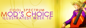
02 - I really like the way you extended into the banner portion. The colors match up really nicely, and I also love the detail of the lighting effect over the text. You did have room to put the full word "week" on the banner though.
02 - Great work matching the coloring and textures in the banner to the original icon. The only thing I'd change is spelling out "week" as there's plenty of room for it and no reason to abbreviate. Otherwise well balanced and designed.
02- Banner portion doesn't pull attention away from the icon and is still classic enough to look good next to it.
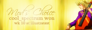
02 - The texture flows nicely and the typography is beautifully treated, while the circular gradient adds a soft touch.
03 - The colours of the fonts match the character, and the background gives a rather graceful feel to the banner.
03 - The lettering is clear and well colored and the texture looks really nice.
03 - the choice of text and colors match perfectly and not overpowering compared to the icon.
03- I like the simple elegant design in the bg! The font does seem a tad angular though in comparison?
03 - The simple texture used for the banner portion allows the icon to be the dominant visual element without the banner side seeming empty. The text is very easy to read, but perhaps a serif font would look a bit more interesting.
Other Comments:
01 - Although I appreciate the detail of putting the cello on the banner portion, it makes the text very hard to read.
03 - I love the way the text looks on this banner, and the decorative swirl is a nice touch as well~
First Place(s):

mmrobitussin

margyydoodle
*If first place winners would like a banner. Please comment to this post stating you want a banner.*
*The icon maker may ask for the name of the bannermaker from any banner on the voting post.*
A single person can only place using one banner despite how many votes the "second" banner may get. Also, after 3 weeks of first place wins, participants are not allowed to submit for the following 3 weeks in order to give other people a better chance of winning.
Good Comments
01: I really like what you did with the violin. The text is also really nice.
02 - I really like the way you extended into the banner portion. The colors match up really nicely, and I also love the detail of the lighting effect over the text. You did have room to put the full word "week" on the banner though.
02 - Great work matching the coloring and textures in the banner to the original icon. The only thing I'd change is spelling out "week" as there's plenty of room for it and no reason to abbreviate. Otherwise well balanced and designed.
02- Banner portion doesn't pull attention away from the icon and is still classic enough to look good next to it.
02 - The texture flows nicely and the typography is beautifully treated, while the circular gradient adds a soft touch.
03 - The colours of the fonts match the character, and the background gives a rather graceful feel to the banner.
03 - The lettering is clear and well colored and the texture looks really nice.
03 - the choice of text and colors match perfectly and not overpowering compared to the icon.
03- I like the simple elegant design in the bg! The font does seem a tad angular though in comparison?
03 - The simple texture used for the banner portion allows the icon to be the dominant visual element without the banner side seeming empty. The text is very easy to read, but perhaps a serif font would look a bit more interesting.
Other Comments:
01 - Although I appreciate the detail of putting the cello on the banner portion, it makes the text very hard to read.
03 - I love the way the text looks on this banner, and the decorative swirl is a nice touch as well~