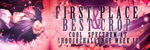
Week 177: Winner
First Place(s):

mmrobitussin
*If first place winners would like a banner. Please comment to this post stating you want a banner.*
*The icon maker may ask for the name of the bannermaker from any banner on the voting post.*
A single person can only place using one banner despite how many votes the "second" banner may get. Also, after 3 weeks of first place wins, participants are not allowed to submit for the following 3 weeks in order to give other people a better chance of winning.
Good Comments
01 - I realy like the background you chose~ It's very simple. The bottom text works out really nicely too.
02 - Nice match with the sakura background and still keeping the text readable. Great overall balance.
02 - I like the typography of this banner. It's done in such a way that even though there's a lot of text, it looks clean and styleish.
02 - Well done matching the coloring, and I think the typography is in great balance, color and font-wise, to the icon itself. The white blur adds the right dreamy touch.
02 - I love the way you did the text in this banner. The color choice balances out all of the pink.
02 - Beautiful font and the chosen color if a perfect match to the icon.
02- I like how you continued on with the cherry blossoms in this banner, and kept them the same size as in the icon. The text is crisp and easy to read!
02 - Great use of fonts.
02 - Excellent text work and nice job matching the color & texture use from the icon.
02 - I like the continuity and size of text in the second
02 - Lovely typography, plus nicely done the way you carried through the icon's colours into both the banner's background and text.
Other comments:
01 - The banner texture contrasts harshly on the edge against the icon. Maybe softening that side would blend the two parts better to make a more cohesive look. I like the fonts and colors you chose for the typography, but it's a little less clear than it could be against that busy texture. Adding a faint outline blur behind the winner's name could help make that part stand out more.
01 - I think compared to the icon, the textures you used on the banner portion feel a little too heavy. All of that black at the corners are too much of a contrast to the soft coloring of the icon.