Week 183: Winners
Happy Holidays! :)
First Place(s):

rashiea
*If first place winners would like a banner. Please comment to this post stating you want a banner.*
*The icon maker may ask for the name of the bannermaker from any banner on the voting post.*
A single person can only place using one banner despite how many votes the "second" banner may get. Also, after 3 weeks of first place wins, participants are not allowed to submit for the following 3 weeks in order to give other people a better chance of winning.
Good Comments
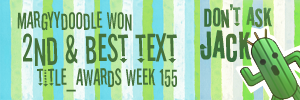
01 - Great job matching the slanted/wavy text style on the banner portion to the original icon.
01- Love how you matched the font in this one! Looks great!
03 - Nice readable font choice. Would be nice if week was spelled out as there is room for it if spaced right and it appears the wrong week number is listed. It looks like the icon's coloring may have been adjusted slightly as well.
04 - I like how the stripes match those in the icon, and that the text is balanced.
Other Comments
01 - While I really like the text placement and color chosen for the text itself, I believe the stripes in the background are too saturated, compared to those in the icon. It's subtle, but causes there to be a rift between the banner portion and the icon.
02 - The stripes in your banner portion have too much perriwinkle in them, so they don't match up well. I also find that the way you have the text placed feels a little too stationary, whereas the text on the icon has a natural flow, the way it's placed and curves. I believe adjusting the placement, or even tilting the text slightly may have helped with that aspect.
03 - The font you've chosen clashes with the font on the icon a little too much, and seems almost squished to fit into the space. Making the text smaller, or rearranging the placement might have helped things flow a little better.
First Place(s):

rashiea
*If first place winners would like a banner. Please comment to this post stating you want a banner.*
*The icon maker may ask for the name of the bannermaker from any banner on the voting post.*
A single person can only place using one banner despite how many votes the "second" banner may get. Also, after 3 weeks of first place wins, participants are not allowed to submit for the following 3 weeks in order to give other people a better chance of winning.
Good Comments
01 - Great job matching the slanted/wavy text style on the banner portion to the original icon.
01- Love how you matched the font in this one! Looks great!
03 - Nice readable font choice. Would be nice if week was spelled out as there is room for it if spaced right and it appears the wrong week number is listed. It looks like the icon's coloring may have been adjusted slightly as well.
04 - I like how the stripes match those in the icon, and that the text is balanced.
Other Comments
01 - While I really like the text placement and color chosen for the text itself, I believe the stripes in the background are too saturated, compared to those in the icon. It's subtle, but causes there to be a rift between the banner portion and the icon.
02 - The stripes in your banner portion have too much perriwinkle in them, so they don't match up well. I also find that the way you have the text placed feels a little too stationary, whereas the text on the icon has a natural flow, the way it's placed and curves. I believe adjusting the placement, or even tilting the text slightly may have helped with that aspect.
03 - The font you've chosen clashes with the font on the icon a little too much, and seems almost squished to fit into the space. Making the text smaller, or rearranging the placement might have helped things flow a little better.