.01-03 Results.
Thanks for your patience, guys! Without any further ado...
people's choice
Main challenge:

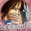
09. with 14 points
Bonus challenge:
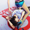

05. with 15 points
mod's choices
flashily's choices:

13. I love the texture use in this and how well you made a somewhat monotone icon pop with contrast and soft yet vivid colors.
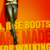

B 15. The side crop and the typography paired with the coloring really caught my eye. I also like how little of the detail was lost - you can still see the wrinkles in his jeans and the details on his belt.
inquisitory's choices:

12. HAHA this is brilliant! I love your lighthearted approach to the theme; as one of the commenters pointed out, it feels like a movie poster and I would like to see that movie made xD
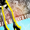

B 04. I loved this icon from the first moment I saw it. Fantastic bright colors and textures! I love how the text is behind Nana's legs but still legible, that's hard to do (and a few of you did it fantastically this week, I might add).
tallies
01. +5/-2/3g
02. +1/-5/3g
03. +0/-14/2g
04. +1/-10/3g
05. +12/-0/3g
06. +4/-1/7g
07. +8/-3/3g
08. +7/-0/2g
09. +14/-0/0g
10. +3/-3/0g
11. +6/-3/4g
12. +10/-0/5g
13. +7/-1/4g
14. +10/-0/2g
[no 15]**
16. +10/-1/3g
17. +0/-14/0g
18. +3/-5/4g
19. +5/-2/6g
20. +2/-6/2g
B 01. +3/6g
B 02. +9/2g
B 03. +9/3g
B 04. +5/3g
B 05. +15/1g
B 06. +0/5g
B 07. +2/7g
B 08. +7/6g
B 09. +7/3g
B 10. +12/2g
B 11. +12/3g
B 12. +9/3g
B 13. +1/6g
B 14. +2/6g
B 15. +12/1g
B 16. +0/7g
B 17. +3/4g
Voting table is here for reference.
** some crits were left before the icon was removed
Rankings are here. The shounen team is still leading!!
For your critiques, please comment to this screened post with the number(s) of your icon(s) and we'll reply with a screened comment.
And remember: don't promote your icons until the round is over!
The next theme is already up!
people's choice
Main challenge:


09. with 14 points
Bonus challenge:


05. with 15 points
mod's choices
flashily's choices:


13. I love the texture use in this and how well you made a somewhat monotone icon pop with contrast and soft yet vivid colors.


B 15. The side crop and the typography paired with the coloring really caught my eye. I also like how little of the detail was lost - you can still see the wrinkles in his jeans and the details on his belt.
inquisitory's choices:


12. HAHA this is brilliant! I love your lighthearted approach to the theme; as one of the commenters pointed out, it feels like a movie poster and I would like to see that movie made xD


B 04. I loved this icon from the first moment I saw it. Fantastic bright colors and textures! I love how the text is behind Nana's legs but still legible, that's hard to do (and a few of you did it fantastically this week, I might add).
tallies
01. +5/-2/3g
02. +1/-5/3g
03. +0/-14/2g
04. +1/-10/3g
05. +12/-0/3g
06. +4/-1/7g
07. +8/-3/3g
08. +7/-0/2g
09. +14/-0/0g
10. +3/-3/0g
11. +6/-3/4g
12. +10/-0/5g
13. +7/-1/4g
14. +10/-0/2g
[no 15]**
16. +10/-1/3g
17. +0/-14/0g
18. +3/-5/4g
19. +5/-2/6g
20. +2/-6/2g
B 01. +3/6g
B 02. +9/2g
B 03. +9/3g
B 04. +5/3g
B 05. +15/1g
B 06. +0/5g
B 07. +2/7g
B 08. +7/6g
B 09. +7/3g
B 10. +12/2g
B 11. +12/3g
B 12. +9/3g
B 13. +1/6g
B 14. +2/6g
B 15. +12/1g
B 16. +0/7g
B 17. +3/4g
Voting table is here for reference.
** some crits were left before the icon was removed
Rankings are here. The shounen team is still leading!!
For your critiques, please comment to this screened post with the number(s) of your icon(s) and we'll reply with a screened comment.
And remember: don't promote your icons until the round is over!
The next theme is already up!