GRAPHIC TUTORIALS: A GOOD BASE

If you haven't read my introduction to the tutorials yet I suggest you do.
You can't build a house without a solid foundation, or at least you shouldn't! The same concept goes for icons. You can't make a good icon without a solid, quality base image. That is what this tutorial will help you achieve. In this post you'll learn some beginner techniques including: brightening, sharpening and basic coloring. All using Paint Shop Pro. Yes Photoshop users, it actually is possible to make decent graphics with Paint Shop Pro.
to
A good base is easier to achieve with PSP than you may think. For this particular icon we're going to go very basic, just a simple base. No text, no brushes, no gradients, no textures. All coloring effects will be achieved through layers. So let's get down to business.
1.) First, it helps to start out with a decent image. Obviously. Also the bigger the image the better, because when you resize it down to 100x100 the imperfections tend to be much less obvious. Here's the image well be starting out with:
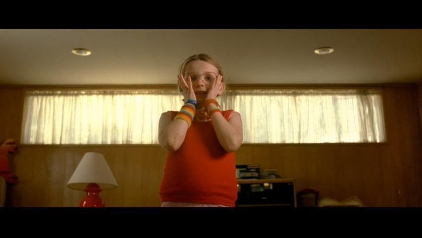
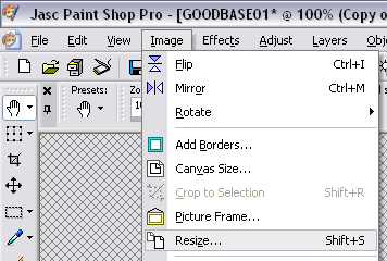
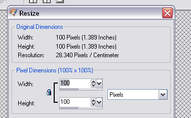
2.) Now we crop and resize to 100x100 pixels. Since we're going basic we're going to center our subject. If it looks good on the movie screen it'll look good on our icon.
Now we have this:

3.) Now for the learning experience. The following is how I achieve a brighter image with a nice contrast. Remember, layers are our friend!
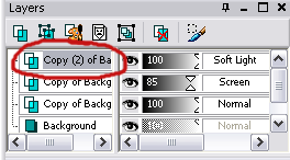
Right click on the background layer and select duplicate.
NOTE: Do not right click on the actual image, right click on the layer in the layer toolbox that is shown below. This is always where you need to right click to duplicate a layer.
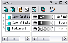
Now duplicate once more. You will have three layers of the same image. Leave the background image alone. Set the middle layer to 'screen' and the top layer to 'soft light'. (Again, those options are in the layers toolbox, left click on where it says 'normal' and it will give you a number of options.) I set the middle layer to 85% opacity, as I didn't want it to be too bright. (Just left click on where it says opacity and drag the arrows to the number percentage you'd like.)
NOTE: When you start experimenting with other images you may want more than one 'screen' or 'soft light' layer, or perhaps not even have one or the other. It all depends on the image you select, experiment with it. Play with the opacity. A dark base is not a good base. But a bright washed out base isn't good either.
Layers toolbox:
We now have this:

4.) Oversharpening an icon is easy to do. If you start with a high quality image go with this rule of thumb: when in doubt don't. Looking at the icon as it stands now it's not too blurry, and it's definitely not extremely sharp. A good way to experiment with how much sharpening the icon needs is this:
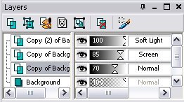
Duplicate the base/background image. Sharpen only that new layer. Change the opacity until it looks just right. For this icon I set the opacity of this layer to 70%. I thought that at 100% is was borderline oversharpened, it wasn't bad but I thought I'd play it safe.
We now have this:
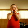
Not a huge change, but this was more of a way for me to show you a sharpening technique.
5.) Now for basic coloring using layers. For this icon I want to really bring out the colors, but don't want her face to get too red. If I just increased the saturation that's exactly what would happen. We don't want this poor little girl to look like an Oopma Loompa. So what do we do? Layers are our friend. Before we go further, be sure you have the top layer selected (it should be highlighted if it's selected). We do this so the layer we're about to create will appear above all the other layers.
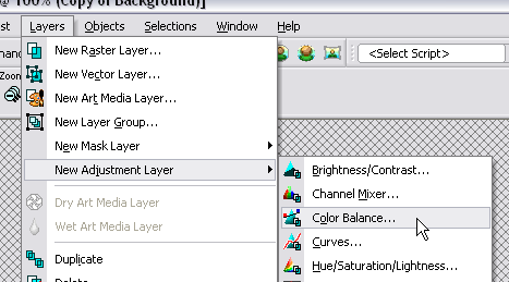
Go to the toolbar on the very top, select 'Layers'.
Then go down to 'New Adjustment Layer', from there select 'color balance'.
Once there I set the levels to the following:
Naturally you should use your best judgement on what to set this at for other images.
Different images will have different color variations.
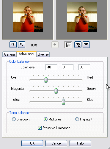
What does this do? Well setting it towards the Cyan helps to get rid of a lot of the redness, and putting it towards the Blue helps get rid of the yellowness. Like I said we did this so that when he increase the saturation she doesn't look too much like an Oompa Loompa.
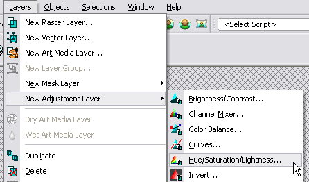
Now we go to 'Layers' yet again.
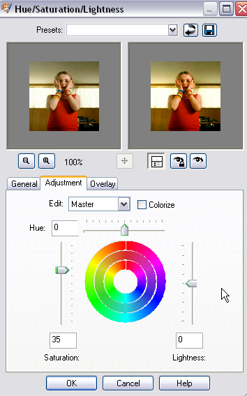
Go down to 'New Adjustment Layer' again, this time select 'Hue/Saturation/Lightness'.
Once there I set the levels to the following:
Naturally you should use your best judgement on what to set this at for other images.
Different images will have different color variations.
What would the icon have looked like without changing the color balance and going straight to saturation? The first isn't that bad, if you like the orange hue/Oompa Loompa look.
NO COLOR BALANCE
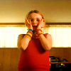
COLOR BALANCE

And that's it! You now have a decent base and a few techniques (brightening, sharpening, coloring) to try out on other images.

to

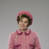
OTHER ICONS USING THE SAME STEPS :
(WITH SLIGHT VARIATIONS IN THE COLOR BALANCE AND SATURATION STEPS)

>

>


>

TUTORIAL SERIES:
INTRODUCTION
>>> A GOOD BASE <<<
BEGINNERS GUIDE TO FONTS
TEXT TECHNIQUES
BLEND MODES; BRUSHES & TEXTURES: THE DO'S AND DON'TS