Coloring Tutorial
I was asked to write tutorials for two of the icons from my recent batch. I've been pretty busy lately, so I decided to do the simpler one first. Of course, even though it was simple to make (from my perspective), it still ended up looking more complicated when I typed up the tutorial because I wanted to explain the process and why I did what I did. Because just listing what I did and the numbers I used in each adjustment layer isn't going to help you guys when you are working with different caps. It just won't look the same. So I took the opportunity to explain how I go about coloring icons (specifically how I use levels). I use Photoshop Elements, so I don't have Selective Coloring, Curves, Channel Mixer, and lots of other bells and whistles that your find in regular Photoshop.
So here it goes...
Going from this: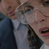
To this:
Using Photoshop Elements 6.
So you start out with the base:

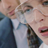
Most screencaps are a bit on the dark side, so the first thing I do with any icon is to duplicate the base and set the duplicated layer to screen in order to lighten the image:
Next, I almost always do a Levels adjustment layer (from the top drop down menu: Layer->New Adjustment Layer->Levels...). First, I adjust the settings on the RBG channel to increase the contrast. In Levels, there are three numbers you can change. As a general rule of thumb, moving the sliders to the right makes the image darker, moving the sliders to the left makes the image brighter. More specifically:
The slider on the far left adjusts the shadows. Move it to the right, and it makes the shadows darker.
The slider in the middle adjusts the midtones. Move it to the left, and it will brighten the image. If you move it to the right, it will make the image darker. I don't normally use the midtones to darken an image. I prefer to darken the shadows and then lighten the midtones and highlights. I think you get better contrast that way.
The slider on the far left adjusts the highlights. Move it to the right and it makes the highlights even brighter. You have to be careful with this one because if your not careful, you can make the image too bright and it will come out looking overcontrasted and oversaturated.
And here's a a little diagram to illustrate what I just said:
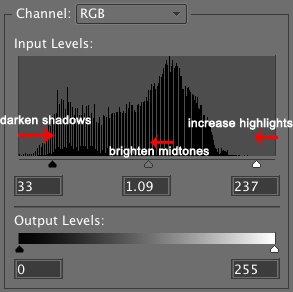
In this icon, I used the following RBG settings:
RBG: 33 1.09 237
And got this: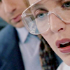
Its only a subtle increase in contrast, but I don't want to over contrast at this point because I want to give myself some room to play around with the coloring.
Next, I create a new Levels layer to adjust the coloring. In this layer, I will adjust the Red, Green, and Blue channels separately. Usually, I start with the reds, working left to right. I'll adjust the shadows, then the midtones, then the highlights, and then move on to the green and then blue channel. After that, I sometimes go back and fiddle with the individual channels until I get all the colors balanced and looking the way I want them to. Levels really is a balancing act. If you bring out one color, you need to adjust the other colors as well to compensate. So I'm going to go through and show you how the icon looked after each adjustment to give you a visual idea of how it works
Red Channel: 48 1.53 255
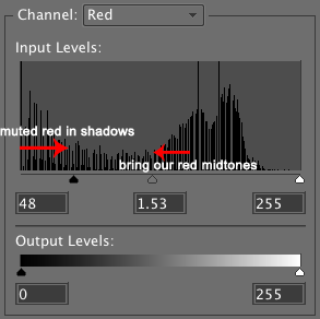
Shadows ->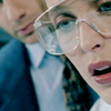
Midtones ->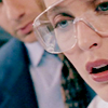
In this case, I didn't increase the red highlights. Sometimes, increasing the highlights just ends up making the color look oversaturated. I decide whether or not to adjust the highlights on an icon by icon bases.
Green Channel: 36 1.15 231
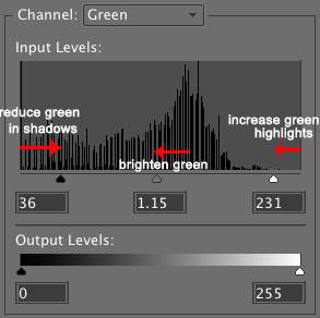
Shadows ->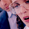
Midtones ->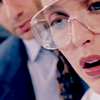
Highlights ->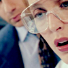
The green channel is a perfect example of balancing your adjustments in Levels. When you reduce the green color in the shadows, that makes the reds and blues more visible, so you end up with this magenta like tint to the coloring until you brighten and bring out the greens in the midtones and the highlights.
Blue Channel: 62 1.23 219
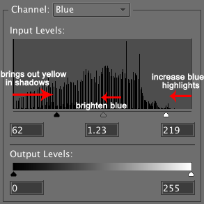
Shadows ->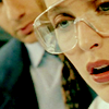
Midtones ->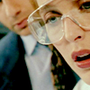
Highlights ->
As you can see from the where I adjusted the blues in the shadows, using the blue channel to turn down the intensity of the blues is actually quite useful if you want to bring out the yellows in the image.
So in summary, all that information on the Red, Green, and Blue channels describes just one adjustment layer I used to balance the coloring in the icon.
Before:
And after:
So at this point, I've only made subtle changes and fine tuning to the coloring. But I like bright, intense colors and a lot of contrast. It really depends on the image I'm working with how I can bring out those bright colors. Sometimes I can get bright vibrant colors just by fiddling with layers, but other times the image needs a little more help. One trick that I have to brighten the colors and make them pop out more is to duplicate the Levels layer I used to adjust all the colors:

Its a quick and easy way to increase your contrast and brighten your colors at the same time.
But as I said before, I like my colors bright, so another trick that I sometimes use is to take that duplicated levels layer and set it to Soft Light:
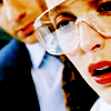
Often times, doing this increase the contrast so much that the coloring overpowers the icon, so I often turn down the opacity of this layer until I get the coloring just as strong as I like without it being to overpowering. In this case, I turned down the opacity to 41%. This is what I got:

So that's a lots better, but I still wanted to brighten the colors a bit more to really draw your eye to it. So I tried a Hue/Saturation layer (from the top drop down menu: Layer->New Adjustment Layer->Hue/Saturation). I'm not a huge fan of using hue/saturation levels for coloring, because you often end up with oversaturated, unnatural, radioactive looking colors. I hardly even use it since I figured out how to color using levels, but it still has its uses when used sparingly.
In this case, I created a Hue/Saturation layer and just nudged the Saturation slider a little to the right to increase the saturation just a little bit. The exact number I used for the Saturation is +15.

Its a subtle difference and I like the overall effect this has on the coloring in the icon, but I think the lips look a bit too red and oversaturated for my taste.
So, I decided to go back and selectively tone down the coloring on the lips. I did this by "masking" the area over the lips in one of the Levels adjustment layers I used to adjust the coloring. To mask an adjustment layer, you first have to select it (click on it) in the sidebar on the right. Then use the brush tool with a soft edged brush (in this case, a 18 px soft edged brush would work), pick a black color, and then use the brush to paint over the lips. Since you are painting on the adjustment layer, the back doesn't show up on the image, just on the thumbnail of the layer in the side bar:

Here, I masked the area over the lips in the levels layer that I had set to soft light @ 41% opacity. I decided to use grey instead of black because I didn't want to totally block out the coloring over the lips from the levels layer, just mute it a bit. It's kind of hard to explain, but basically, when you black out (mask) part of an adjustment layer, the part of the image under where you black out isn't affected by the settings you have in that layer. If you decide to use grey instead of black, you won't totally eliminate the effect of the layer, just diminish it.
So when I masked the area above the lips in the levels layer:
I went from this:
to this:
The only part of the coloring that was affected was the lips. (Note: The difference in coloring isn't as noticeable on different monitors. Its really obvious on the computer I use for making icons, but not so much on my laptop. So if you cant see a difference, that's probably why.)
At this point, I thought the coloring was still a bit too bright on the lips, and needed to be adjusted a bit more. This time, I used the Selection Brush Tool from the left sidebar:
. I used this to select the area of the icon over the lips, again using a soft edged brush (~18 px).
With the lips selected, I created another Hue/Saturation level. Since its really the reds that are overpowering the lips, I select the Red channel from the drop down menu.
Hue/Saturation: Red Channel:
Saturation: +7
Lightness: +17
I know it seems counter intuitive to increase the saturation when the coloring is too bright, but I'm writing this tutorial in hindsight since I made the icon months ago and that is what the layer was set at. The important part of this layer is that I increased the lightness on the red channel. Increasing the lightness in a Hue/Saturation level is a nice way to tone down overpowering colors without making them dull or grey, which often happens if your try to turn down the saturation.
And this was the result of the new layer: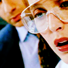
Now, the coloring is pretty much finished, but one thing I often do on icons like this is to add a light texture to change the direction of the light source in the icon to give it a more dynamic look. In this case, I used this light texture by ohfreckle and made it black and white using a Black and White gradient map. I mention how to use gradient maps to change the color of a light texture near the bottom of this tutorial for those of you who are not familiar with gradient maps.
So basically, I added this texture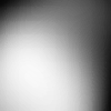
, set it to soft light, and got this:
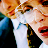
The black part of the texture darkens the right side of icon, so I used the eraser tool in the left side bar to get rid of the black parts until I liked how it looked.
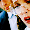
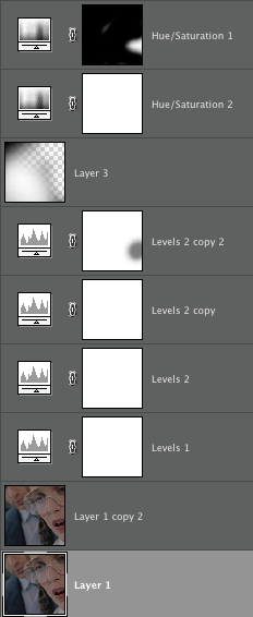
And I think that's pretty much it. All of the stuff I mentioned here are tricks that I learned on my own by trial and error, just experimenting and fiddling with settings until I got an effect that I liked, so I suggest trying variations of the stuff that I tried here. Different images will require different adjustments. Here is a cap of all the layers in the finished icon to give you a visual idea of how it was all put together:
I hope all my explanations of the "hows and why" made since and were helpful rather than confusing. And hopefully, you can see the differences after my adjustments. I know some of them are pretty subtle and not as noticeable on different monitors. I have a tendency to do a lot of fiddling and tweaking with my coloring and its not always very noticeable.
So here it goes...
Going from this:

To this:

Using Photoshop Elements 6.
So you start out with the base:

Most screencaps are a bit on the dark side, so the first thing I do with any icon is to duplicate the base and set the duplicated layer to screen in order to lighten the image:

Next, I almost always do a Levels adjustment layer (from the top drop down menu: Layer->New Adjustment Layer->Levels...). First, I adjust the settings on the RBG channel to increase the contrast. In Levels, there are three numbers you can change. As a general rule of thumb, moving the sliders to the right makes the image darker, moving the sliders to the left makes the image brighter. More specifically:
The slider on the far left adjusts the shadows. Move it to the right, and it makes the shadows darker.
The slider in the middle adjusts the midtones. Move it to the left, and it will brighten the image. If you move it to the right, it will make the image darker. I don't normally use the midtones to darken an image. I prefer to darken the shadows and then lighten the midtones and highlights. I think you get better contrast that way.
The slider on the far left adjusts the highlights. Move it to the right and it makes the highlights even brighter. You have to be careful with this one because if your not careful, you can make the image too bright and it will come out looking overcontrasted and oversaturated.
And here's a a little diagram to illustrate what I just said:

In this icon, I used the following RBG settings:
RBG: 33 1.09 237
And got this:

Its only a subtle increase in contrast, but I don't want to over contrast at this point because I want to give myself some room to play around with the coloring.
Next, I create a new Levels layer to adjust the coloring. In this layer, I will adjust the Red, Green, and Blue channels separately. Usually, I start with the reds, working left to right. I'll adjust the shadows, then the midtones, then the highlights, and then move on to the green and then blue channel. After that, I sometimes go back and fiddle with the individual channels until I get all the colors balanced and looking the way I want them to. Levels really is a balancing act. If you bring out one color, you need to adjust the other colors as well to compensate. So I'm going to go through and show you how the icon looked after each adjustment to give you a visual idea of how it works
Red Channel: 48 1.53 255

Shadows ->

Midtones ->

In this case, I didn't increase the red highlights. Sometimes, increasing the highlights just ends up making the color look oversaturated. I decide whether or not to adjust the highlights on an icon by icon bases.
Green Channel: 36 1.15 231

Shadows ->

Midtones ->

Highlights ->

The green channel is a perfect example of balancing your adjustments in Levels. When you reduce the green color in the shadows, that makes the reds and blues more visible, so you end up with this magenta like tint to the coloring until you brighten and bring out the greens in the midtones and the highlights.
Blue Channel: 62 1.23 219

Shadows ->

Midtones ->

Highlights ->

As you can see from the where I adjusted the blues in the shadows, using the blue channel to turn down the intensity of the blues is actually quite useful if you want to bring out the yellows in the image.
So in summary, all that information on the Red, Green, and Blue channels describes just one adjustment layer I used to balance the coloring in the icon.
Before:

And after:

So at this point, I've only made subtle changes and fine tuning to the coloring. But I like bright, intense colors and a lot of contrast. It really depends on the image I'm working with how I can bring out those bright colors. Sometimes I can get bright vibrant colors just by fiddling with layers, but other times the image needs a little more help. One trick that I have to brighten the colors and make them pop out more is to duplicate the Levels layer I used to adjust all the colors:

Its a quick and easy way to increase your contrast and brighten your colors at the same time.
But as I said before, I like my colors bright, so another trick that I sometimes use is to take that duplicated levels layer and set it to Soft Light:

Often times, doing this increase the contrast so much that the coloring overpowers the icon, so I often turn down the opacity of this layer until I get the coloring just as strong as I like without it being to overpowering. In this case, I turned down the opacity to 41%. This is what I got:

So that's a lots better, but I still wanted to brighten the colors a bit more to really draw your eye to it. So I tried a Hue/Saturation layer (from the top drop down menu: Layer->New Adjustment Layer->Hue/Saturation). I'm not a huge fan of using hue/saturation levels for coloring, because you often end up with oversaturated, unnatural, radioactive looking colors. I hardly even use it since I figured out how to color using levels, but it still has its uses when used sparingly.
In this case, I created a Hue/Saturation layer and just nudged the Saturation slider a little to the right to increase the saturation just a little bit. The exact number I used for the Saturation is +15.

Its a subtle difference and I like the overall effect this has on the coloring in the icon, but I think the lips look a bit too red and oversaturated for my taste.
So, I decided to go back and selectively tone down the coloring on the lips. I did this by "masking" the area over the lips in one of the Levels adjustment layers I used to adjust the coloring. To mask an adjustment layer, you first have to select it (click on it) in the sidebar on the right. Then use the brush tool with a soft edged brush (in this case, a 18 px soft edged brush would work), pick a black color, and then use the brush to paint over the lips. Since you are painting on the adjustment layer, the back doesn't show up on the image, just on the thumbnail of the layer in the side bar:

Here, I masked the area over the lips in the levels layer that I had set to soft light @ 41% opacity. I decided to use grey instead of black because I didn't want to totally block out the coloring over the lips from the levels layer, just mute it a bit. It's kind of hard to explain, but basically, when you black out (mask) part of an adjustment layer, the part of the image under where you black out isn't affected by the settings you have in that layer. If you decide to use grey instead of black, you won't totally eliminate the effect of the layer, just diminish it.
So when I masked the area above the lips in the levels layer:
I went from this:

to this:

The only part of the coloring that was affected was the lips. (Note: The difference in coloring isn't as noticeable on different monitors. Its really obvious on the computer I use for making icons, but not so much on my laptop. So if you cant see a difference, that's probably why.)
At this point, I thought the coloring was still a bit too bright on the lips, and needed to be adjusted a bit more. This time, I used the Selection Brush Tool from the left sidebar:

. I used this to select the area of the icon over the lips, again using a soft edged brush (~18 px).
With the lips selected, I created another Hue/Saturation level. Since its really the reds that are overpowering the lips, I select the Red channel from the drop down menu.
Hue/Saturation: Red Channel:
Saturation: +7
Lightness: +17
I know it seems counter intuitive to increase the saturation when the coloring is too bright, but I'm writing this tutorial in hindsight since I made the icon months ago and that is what the layer was set at. The important part of this layer is that I increased the lightness on the red channel. Increasing the lightness in a Hue/Saturation level is a nice way to tone down overpowering colors without making them dull or grey, which often happens if your try to turn down the saturation.
And this was the result of the new layer:

Now, the coloring is pretty much finished, but one thing I often do on icons like this is to add a light texture to change the direction of the light source in the icon to give it a more dynamic look. In this case, I used this light texture by ohfreckle and made it black and white using a Black and White gradient map. I mention how to use gradient maps to change the color of a light texture near the bottom of this tutorial for those of you who are not familiar with gradient maps.
So basically, I added this texture

, set it to soft light, and got this:

The black part of the texture darkens the right side of icon, so I used the eraser tool in the left side bar to get rid of the black parts until I liked how it looked.

And I think that's pretty much it. All of the stuff I mentioned here are tricks that I learned on my own by trial and error, just experimenting and fiddling with settings until I got an effect that I liked, so I suggest trying variations of the stuff that I tried here. Different images will require different adjustments. Here is a cap of all the layers in the finished icon to give you a visual idea of how it was all put together:

I hope all my explanations of the "hows and why" made since and were helpful rather than confusing. And hopefully, you can see the differences after my adjustments. I know some of them are pretty subtle and not as noticeable on different monitors. I have a tendency to do a lot of fiddling and tweaking with my coloring and its not always very noticeable.