.072
ASK THE MAKER ANSWERS
raktajinos asked me how I conceptually design my icons while littlemissnovel asked for a cropping guide. So without further ado, here is:

PART ONE: CROPPING
I'll begin by saying that I know nothing and what I do know, I picked up from takethewords and oviedo who are amazing at capturing moods and emotions with their crops. Anyhoo, I'll try my best to explain how I crop things.
Center Crops
The truth is, I'm a lazy icon-maker so like 80% of my icons are boringly center-cropped.


center crops FTW! used to emphasize negative space (1,2), symmetry (3) or to make it easier to incorporate text (4,5)
Well, if it works, it works! :P
The Rule of Thirds
But when I'm not being lazy, I do play around a bit. First, there's this thing called the rule of thirds which basically means you divide your canvas into thirds and put your subjects anywhere but the middle. It also helps to put interesting details in the points where the grid intersects. Like in the example below:

>>>
His eye in the point of "power" pulls focus to his emotions and then draws your attention to the object of his affections. I rarely do this intentionally (again, because I'm ~lazy) but it was drilled on me enough times during film classes that sometimes it just happens without me even thinking about it.


other examples: along vertical axis x3, horizontal x2
Geometry
On a sort of related note, another interesting way to crop using the rule of thirds is to find caps with subjects that inherently form lines of geometry then crop accordingly. I'm especially fond of triangles apparently:


Again, most of the work is actually finding caps where the subjects are arranged in a certain way by the show/movie director. A quick tip is to look for diagonals-it can be outward like the Winter Soldier's arm in the first example or sometimes it can be in the way a character is looking at another like how Bel is looking at Freddie in the Hour icon.
Framing
You can also add depth to your icon by finding details in caps that can act as a frame/foreground so your icon has more layers.


hands, heads and bodies in general are a wonderful framing device!
I don't have examples but architecture like arches, windows and doorways also work. Also, trees, branches, or just any object actually...
Extreme/Obscure Cropping
I'm not an expert at this (for that let me direct you to this cropping guide by oviedo) but i mainly use obscure cropping to give focus on other details, for example:

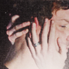

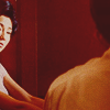

hair porn, hand porn, to add a feeling of claustrophobia, to emphasize space between characters, or to convey a sense of isolation
It helps, of course, if you choose actors who are great with their expressions so you can choose to focus on their eyes/mouth/hands, etc... (I mean, if I haven't said it before, hands can be extremely expressive in telling emotions.)
A quick tip: if you're not used to going extreme in your close crops, you can try using the Adaptive Wide Angle feature on Photoshop (I recently stumbled on it when I mistakenly pressed it instead of Filter Gallery.) It applies a wide angle to your image bringing it closer to you. It's a fun way to change up your close crops if you're feeling a bit blah about yours.

>>>
~
A NOTE ON PICKING CAPS
So how do I pick my caps? Well, like I explained above, I like to choose caps with strong emotions (especially for close crops) or interesting details like the way hands or people are posed and sometimes even details in costume. Did a quick search of caps I saved on my computer and here's what I usually like to work with:


caps I find interesting because of motion, foreground detail, inherent negative space, geometry/angles, "looking" shots, emotive eyes
Working with Blurry Caps
In a perfect world, these caps would also be well lit and not blurry but I'm the sort of stubborn idiot who likes to work with caps that "speak" to me no matter how hard it is to work on. For example:

>>>
icon tutorial here
This is a scene in Hannibal where the statue/image of the devil was superimposed on Hannibal's face. It was something that I immediately wanted to icon because it was just so cool. Well, obviously it worked better in motion because looking at the cap, the scene is dark and you can't see any detail of the devil in his face. The wings are still magnificent though so I chose to focus on that instead, never mind his face is still a messy blob in the final icon. Putting text also helps distract from the blurrier details.
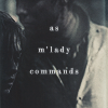
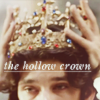
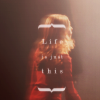


slightly blurry caps + text and boom: profit!
This way, since the text is the "point" of the icon, it doesn't matter if your subjects are a bit soft or they're in motion. I even added an extra blur to the Buffy icon above to add a transient quality to it. Anyway, bottom line is, blurry caps can work as icons!
Manipulated Cropping
Sometimes, no matter how much you love a cap, you can't seem to crop it right. Don't give up! This is where a little manipulation (and blending!) come in. For example, I loved the scene of Brienne and Jamie's fight and I wanted to incorporate it with a famous quote from the books but no matter what i did, I couldn't fit both of them into the square canvas:

>>>
let's begin with this slightly coloured cap>>>this is the best option if i want both of them in the 100x100 frame :/
I could've picked to focus on Brienne alone but that didn't fit the story that I wanted to tell and she couldn't "dance" alone. The solution was to use layer masks and "blend" them so that they're closer

+
=
>>>
brienne on foreground, masked + jamie in background = manipulated crop >>> finished icon
See? Easy-peasy! sorta. Of course, sight/body lines are still important and this could be a little harder to pull off if moving one subject closer skews the logic of what you want to achieve. Like I would've loved to get more of Jamie's face in but this:

...looks just wrong! It looks like she swung at him and totally missed! haha. Just pay attention. If it looks too weird then it probably is too weird and that's the time to give up! (and again sometimes covering the manipulation a bit with text works.)
~
PART TWO: COMPOSITION
so now that we're done with cropping and ~simple~ icons, it's time to move forward to more complex shores. I think I've said it in my ask the maker q&a last year that my icon making process largely depends on my mood and if I'm feeling inspired or not. Challenges seem to bring out the best in me, especially 20inspirations. Idk, if I'm not prompted I tend to fall back on my lazy ways. Some of my favorite compositions involve:


close crops + text


character portraits with random texture dump


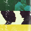
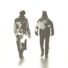
playing with silhouettes


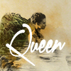
big head + tiny person
I'm fairly predictable lol why is anyone listening to me?
Storytelling
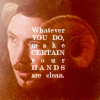
But mostly I like to think that I tell stories with my icons. I mean, that's how we got into fandom isn't it? Because we love these stories so much and want to share/relive them over and over again. So initially, my storytelling went in the form of blocking and blending caps in a (hopefully) coherent manner...
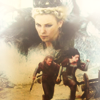
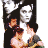
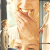
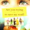
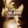
storytelling via blocking/blending caps. also, text
Of course the fun part is trying to tell your story in less...obvious ways. You still use all the techniques of blending, blocking, coloring, etc... but instead of trying to literally paint a scene you try to tell your story through visual cues. For example:

In Dollhouse, Echo has many fractured selves so I use duplication to illustrate this. I similarly used blending and duplication in this fan mix cover with reference to the "three flowers in a vase" quote from the show. (I know, different character, but "Caroline" was sort of a sleeper agent inside Echo, wasn't she?)

Or here, where I try to show how The Doctor is often adrift in space but Rose is his anchor or his bottom line.

This icon was made for a challenge at the7days where I was given the prompt to "Create a series of before and after pieces on the theme of breaking in." I immediately thought of Eternal Sunshine of the Spotless Mind and how they kept trying to break into their brain and change their memories but their love for each other kept returning so I thought of this composition where scenes from the movie were escaping from his head. but I could only blend a couple in :/
Symbolism
Another interesting way to tell stories in icons is to incorporate symbolism and imagery. Sometimes, it's as easy as plopping symbol on top or as a background in your icon.


symbols as foreground, background and as a frame.
A more fun approach would be to blend the symbols into your characters. It's a painstaking process of finding the right part that fits. Like it took pages of google images to find the right goat horns (signifying ambition/the capricorn zodiac) for littlefinger. Or how it took me hours to edit that tattoo of thorns in the third icon below so that it hugged the features of her face better.



transforming characters into their symbols
Storytelling and Symbolism

I said this in the original icon post but The Little Mermaid was more of a martyr in the story and that she felt like knives were cutting her with every step she took. And the idiot prince made her walk up mountains oblivious to her pain. So I decided to cut the feet in the icon to illustrate the pain.

In House of Flying Daggers, the lovers consummate their relationship in nature so I thought it'd be fun to put a forest into a silhouette. But then I decided to also show how their love is doomed and by embracing him, she's embracing her eventual death so I added a sort of blood spatter to it.

>>
For this Hannibal icon, I initially started with just the stag head on Hannibal's body but it didn't seem to have any context to it so I decided to add the silhouette of Will so that it's more of a conversation between the two characters.
...And that's basically it! I hope that answers any burning questions about my iconning ~process and how I think. Again, sometimes it comes easier, especially if I'm really invested in what i'm working on but in general...

ask the maker thread | profile | resources | tags | old icons | watch | request
raktajinos asked me how I conceptually design my icons while littlemissnovel asked for a cropping guide. So without further ado, here is:

PART ONE: CROPPING
I'll begin by saying that I know nothing and what I do know, I picked up from takethewords and oviedo who are amazing at capturing moods and emotions with their crops. Anyhoo, I'll try my best to explain how I crop things.
Center Crops
The truth is, I'm a lazy icon-maker so like 80% of my icons are boringly center-cropped.


center crops FTW! used to emphasize negative space (1,2), symmetry (3) or to make it easier to incorporate text (4,5)
Well, if it works, it works! :P
The Rule of Thirds
But when I'm not being lazy, I do play around a bit. First, there's this thing called the rule of thirds which basically means you divide your canvas into thirds and put your subjects anywhere but the middle. It also helps to put interesting details in the points where the grid intersects. Like in the example below:

>>>

His eye in the point of "power" pulls focus to his emotions and then draws your attention to the object of his affections. I rarely do this intentionally (again, because I'm ~lazy) but it was drilled on me enough times during film classes that sometimes it just happens without me even thinking about it.


other examples: along vertical axis x3, horizontal x2
Geometry
On a sort of related note, another interesting way to crop using the rule of thirds is to find caps with subjects that inherently form lines of geometry then crop accordingly. I'm especially fond of triangles apparently:


Again, most of the work is actually finding caps where the subjects are arranged in a certain way by the show/movie director. A quick tip is to look for diagonals-it can be outward like the Winter Soldier's arm in the first example or sometimes it can be in the way a character is looking at another like how Bel is looking at Freddie in the Hour icon.
Framing
You can also add depth to your icon by finding details in caps that can act as a frame/foreground so your icon has more layers.


hands, heads and bodies in general are a wonderful framing device!
I don't have examples but architecture like arches, windows and doorways also work. Also, trees, branches, or just any object actually...
Extreme/Obscure Cropping
I'm not an expert at this (for that let me direct you to this cropping guide by oviedo) but i mainly use obscure cropping to give focus on other details, for example:


hair porn, hand porn, to add a feeling of claustrophobia, to emphasize space between characters, or to convey a sense of isolation
It helps, of course, if you choose actors who are great with their expressions so you can choose to focus on their eyes/mouth/hands, etc... (I mean, if I haven't said it before, hands can be extremely expressive in telling emotions.)
A quick tip: if you're not used to going extreme in your close crops, you can try using the Adaptive Wide Angle feature on Photoshop (I recently stumbled on it when I mistakenly pressed it instead of Filter Gallery.) It applies a wide angle to your image bringing it closer to you. It's a fun way to change up your close crops if you're feeling a bit blah about yours.

>>>

~
A NOTE ON PICKING CAPS
So how do I pick my caps? Well, like I explained above, I like to choose caps with strong emotions (especially for close crops) or interesting details like the way hands or people are posed and sometimes even details in costume. Did a quick search of caps I saved on my computer and here's what I usually like to work with:


caps I find interesting because of motion, foreground detail, inherent negative space, geometry/angles, "looking" shots, emotive eyes
Working with Blurry Caps
In a perfect world, these caps would also be well lit and not blurry but I'm the sort of stubborn idiot who likes to work with caps that "speak" to me no matter how hard it is to work on. For example:
>>>

icon tutorial here
This is a scene in Hannibal where the statue/image of the devil was superimposed on Hannibal's face. It was something that I immediately wanted to icon because it was just so cool. Well, obviously it worked better in motion because looking at the cap, the scene is dark and you can't see any detail of the devil in his face. The wings are still magnificent though so I chose to focus on that instead, never mind his face is still a messy blob in the final icon. Putting text also helps distract from the blurrier details.


slightly blurry caps + text and boom: profit!
This way, since the text is the "point" of the icon, it doesn't matter if your subjects are a bit soft or they're in motion. I even added an extra blur to the Buffy icon above to add a transient quality to it. Anyway, bottom line is, blurry caps can work as icons!
Manipulated Cropping
Sometimes, no matter how much you love a cap, you can't seem to crop it right. Don't give up! This is where a little manipulation (and blending!) come in. For example, I loved the scene of Brienne and Jamie's fight and I wanted to incorporate it with a famous quote from the books but no matter what i did, I couldn't fit both of them into the square canvas:

>>>

let's begin with this slightly coloured cap>>>this is the best option if i want both of them in the 100x100 frame :/
I could've picked to focus on Brienne alone but that didn't fit the story that I wanted to tell and she couldn't "dance" alone. The solution was to use layer masks and "blend" them so that they're closer

+

=

>>>
brienne on foreground, masked + jamie in background = manipulated crop >>> finished icon
See? Easy-peasy! sorta. Of course, sight/body lines are still important and this could be a little harder to pull off if moving one subject closer skews the logic of what you want to achieve. Like I would've loved to get more of Jamie's face in but this:

...looks just wrong! It looks like she swung at him and totally missed! haha. Just pay attention. If it looks too weird then it probably is too weird and that's the time to give up! (and again sometimes covering the manipulation a bit with text works.)
~
PART TWO: COMPOSITION
so now that we're done with cropping and ~simple~ icons, it's time to move forward to more complex shores. I think I've said it in my ask the maker q&a last year that my icon making process largely depends on my mood and if I'm feeling inspired or not. Challenges seem to bring out the best in me, especially 20inspirations. Idk, if I'm not prompted I tend to fall back on my lazy ways. Some of my favorite compositions involve:


close crops + text


character portraits with random texture dump


playing with silhouettes


big head + tiny person
I'm fairly predictable lol why is anyone listening to me?
Storytelling
But mostly I like to think that I tell stories with my icons. I mean, that's how we got into fandom isn't it? Because we love these stories so much and want to share/relive them over and over again. So initially, my storytelling went in the form of blocking and blending caps in a (hopefully) coherent manner...


storytelling via blocking/blending caps. also, text
Of course the fun part is trying to tell your story in less...obvious ways. You still use all the techniques of blending, blocking, coloring, etc... but instead of trying to literally paint a scene you try to tell your story through visual cues. For example:
In Dollhouse, Echo has many fractured selves so I use duplication to illustrate this. I similarly used blending and duplication in this fan mix cover with reference to the "three flowers in a vase" quote from the show. (I know, different character, but "Caroline" was sort of a sleeper agent inside Echo, wasn't she?)

Or here, where I try to show how The Doctor is often adrift in space but Rose is his anchor or his bottom line.

This icon was made for a challenge at the7days where I was given the prompt to "Create a series of before and after pieces on the theme of breaking in." I immediately thought of Eternal Sunshine of the Spotless Mind and how they kept trying to break into their brain and change their memories but their love for each other kept returning so I thought of this composition where scenes from the movie were escaping from his head. but I could only blend a couple in :/
Symbolism
Another interesting way to tell stories in icons is to incorporate symbolism and imagery. Sometimes, it's as easy as plopping symbol on top or as a background in your icon.

symbols as foreground, background and as a frame.
A more fun approach would be to blend the symbols into your characters. It's a painstaking process of finding the right part that fits. Like it took pages of google images to find the right goat horns (signifying ambition/the capricorn zodiac) for littlefinger. Or how it took me hours to edit that tattoo of thorns in the third icon below so that it hugged the features of her face better.


transforming characters into their symbols
Storytelling and Symbolism

I said this in the original icon post but The Little Mermaid was more of a martyr in the story and that she felt like knives were cutting her with every step she took. And the idiot prince made her walk up mountains oblivious to her pain. So I decided to cut the feet in the icon to illustrate the pain.

In House of Flying Daggers, the lovers consummate their relationship in nature so I thought it'd be fun to put a forest into a silhouette. But then I decided to also show how their love is doomed and by embracing him, she's embracing her eventual death so I added a sort of blood spatter to it.
>>

For this Hannibal icon, I initially started with just the stag head on Hannibal's body but it didn't seem to have any context to it so I decided to add the silhouette of Will so that it's more of a conversation between the two characters.
...And that's basically it! I hope that answers any burning questions about my iconning ~process and how I think. Again, sometimes it comes easier, especially if I'm really invested in what i'm working on but in general...

ask the maker thread | profile | resources | tags | old icons | watch | request