.021
TEXT GUIDE
requested by twistedbones, john_scorpy, oviedo and vetica
How to make the text of:
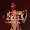
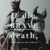
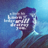
using Adobe Photoshop CS
Before I go into the specific icons, here are some answers to general questions.
favorite fonts:
Basic Fonts
used in almost all of my text icons
Baskerville Old Face
Bell MT / Italic
Berling Antiqua / Italic
Bodoni MT / Italic / Poster Condensed
Elephant / Italic
Modern No. 20
TW Cen MT Condensed / Bold
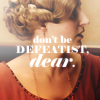
examples:

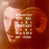
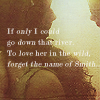

Decorative Fonts
used mostly to emphasize words or in some cases, tiny text
Bon Iver
Courier New
ElegantDragon
IlShakeFest
OldStyle / Italic
Uechi
examples:
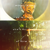
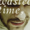
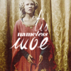
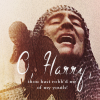

~
favorite font settings:
If it's not obvious from the examples above,
Font Color: white
Tracking: 100-200
Vertical Scale: 100-105%
Anti-Alias: Smooth
Paragraph: Justify All
The rest (font size, leading, etc...differs per icon.) I also make sure to rasterize my icon and use Filter > Blur > Fade Blur 20-50% and I sometimes lower the opacity to around 90-95%
~
how do you know what to write on the icon?
to be honest, most of the time I don't know. It's rare that I start out knowing what I want to put in icons. But sometimes I do get inspired by a line in a poem or a song that strikes me so much that I have to make an icon of it. When this happens, then I go searching for characters/scenes that fits with it.
When inspiration fails, here are some tips to finding what text to put in your icon:
1. Write down or keep track of song lyrics or poems/quotes that you like so that it's easy to apply them to icons in the future
2. Search wikiquote and/or imdb's memorable quotes pages for popular quotes. When that fails I sometimes re-watch the scene I'm iconning to write down quotes
3. Tired of writing "Bad Wolf" in Rose Tyler icons? Try searching "wolf" in sites like SongMeanings.net to look for alternate lines. it also works through google, for example you can search "wolf poem" but that takes longer.
~
how do you go on about adding text
Once you find the perfect line, it's time to add it to your icon. Some general tips on adding text:
1. Know which words you want to emphasize
2. break it into lines (to avoid hyphenation.) I usually write the whole thing out in a text box first then decide where/how to break it. then I cut and copy each line/word into different layers
3. Don't be afraid to use different settings/fonts for each line/word. More on this in the examples below:
~

>>>
"the death of kings" is a quote from the play/series Richard II. I chose it obviously because this is the scene where Richard II dies. I want to emphasize the word "death" and I break the line into layers like this:

I recreated the text so don't mind the rasterized layer of it below. Anyway, so we have three lines: "death" "the" and "of kings". Since I want to emphasize "death" I look for a scripty font to differentiate it from the rest of the text and I use these settings:

for "the" and "of kings" the settings are the same:

I want to emphasize "death" more so I draw a line below it. This works better than underline sometimes because you can control better where to put it. I also add hyphens on either side of "of kings" so that the text is more balanced. The final layout looks like this:

when I'm happy with it, I rasterize, blur and edit the opacity. to compare:

unrasterized text | rasterized text
~

>>>
"If die, brave death, when princes die with us!" is also a quote from Henry IV Part I. I want focus on the whole first part of the phrase so I break the line like this:

If you notice I put the whole phrase "If die, brave death," in one text layer it's because I want to use "Justify All" to make sure the text is in a perfect square.

Now comes the tricky part. You have to edit the text into different settings. I emphasize "If" using italics because it's a hypothetical

"die" and "death" use the same settings:

I also want to emphasize "brave" so I type it in all caps and underline it:

so when you select the whole text layer, the character box looks like this:

for the rest of the line "when princes die with us!" I decide that I don't really need people to be able to read it since it will make the icon overly cluttered.

So I adjust the settings to make it teeny tiny and arrange the tracking so that it aligns with the other text layer. again, here's the comparison when you rasterize it:

~

>>>
"a little bit of knowledge will destroy you." is a song lyric from Radiohead's "Cuttooth" which I think fits Sherlock perfectly. I decide to emphasize "knowledge" but the layout wasn't working so I decide to focus on just "know" instead. so obviously the line would be broken per word:

I can't really explain this step by step since it's been a while since I made this icon but it basically involved a lot of moving, resizing etc...until the words fit together. here are the settings I used starting with "a little bit"

"of"

"know"

"ledge"

"will"

"destroy"

"you."

rasterize, apply a bit of blur and we're done!

on second thought, looking at this now, I think some of the words there ("will" especially) were actually bolded. lol, sorry...but I hope this helps explain my process properly anyway. maybe next time I should keep the unrasterized text layers for future tutorial use. haha if you have any more questions, just ask! ;D
profile | resources | tags | old icons | watch | request
requested by twistedbones, john_scorpy, oviedo and vetica
How to make the text of:

using Adobe Photoshop CS
Before I go into the specific icons, here are some answers to general questions.
favorite fonts:
Basic Fonts
used in almost all of my text icons
Baskerville Old Face
Bell MT / Italic
Berling Antiqua / Italic
Bodoni MT / Italic / Poster Condensed
Elephant / Italic
Modern No. 20
TW Cen MT Condensed / Bold
examples:


Decorative Fonts
used mostly to emphasize words or in some cases, tiny text
Bon Iver
Courier New
ElegantDragon
IlShakeFest
OldStyle / Italic
Uechi
examples:


~
favorite font settings:
If it's not obvious from the examples above,
Font Color: white
Tracking: 100-200
Vertical Scale: 100-105%
Anti-Alias: Smooth
Paragraph: Justify All
The rest (font size, leading, etc...differs per icon.) I also make sure to rasterize my icon and use Filter > Blur > Fade Blur 20-50% and I sometimes lower the opacity to around 90-95%
~
how do you know what to write on the icon?
to be honest, most of the time I don't know. It's rare that I start out knowing what I want to put in icons. But sometimes I do get inspired by a line in a poem or a song that strikes me so much that I have to make an icon of it. When this happens, then I go searching for characters/scenes that fits with it.
When inspiration fails, here are some tips to finding what text to put in your icon:
1. Write down or keep track of song lyrics or poems/quotes that you like so that it's easy to apply them to icons in the future
2. Search wikiquote and/or imdb's memorable quotes pages for popular quotes. When that fails I sometimes re-watch the scene I'm iconning to write down quotes
3. Tired of writing "Bad Wolf" in Rose Tyler icons? Try searching "wolf" in sites like SongMeanings.net to look for alternate lines. it also works through google, for example you can search "wolf poem" but that takes longer.
~
how do you go on about adding text
Once you find the perfect line, it's time to add it to your icon. Some general tips on adding text:
1. Know which words you want to emphasize
2. break it into lines (to avoid hyphenation.) I usually write the whole thing out in a text box first then decide where/how to break it. then I cut and copy each line/word into different layers
3. Don't be afraid to use different settings/fonts for each line/word. More on this in the examples below:
~
>>>
"the death of kings" is a quote from the play/series Richard II. I chose it obviously because this is the scene where Richard II dies. I want to emphasize the word "death" and I break the line into layers like this:
I recreated the text so don't mind the rasterized layer of it below. Anyway, so we have three lines: "death" "the" and "of kings". Since I want to emphasize "death" I look for a scripty font to differentiate it from the rest of the text and I use these settings:
for "the" and "of kings" the settings are the same:
I want to emphasize "death" more so I draw a line below it. This works better than underline sometimes because you can control better where to put it. I also add hyphens on either side of "of kings" so that the text is more balanced. The final layout looks like this:
when I'm happy with it, I rasterize, blur and edit the opacity. to compare:
unrasterized text | rasterized text
~
>>>
"If die, brave death, when princes die with us!" is also a quote from Henry IV Part I. I want focus on the whole first part of the phrase so I break the line like this:
If you notice I put the whole phrase "If die, brave death," in one text layer it's because I want to use "Justify All" to make sure the text is in a perfect square.
Now comes the tricky part. You have to edit the text into different settings. I emphasize "If" using italics because it's a hypothetical
"die" and "death" use the same settings:
I also want to emphasize "brave" so I type it in all caps and underline it:
so when you select the whole text layer, the character box looks like this:
for the rest of the line "when princes die with us!" I decide that I don't really need people to be able to read it since it will make the icon overly cluttered.
So I adjust the settings to make it teeny tiny and arrange the tracking so that it aligns with the other text layer. again, here's the comparison when you rasterize it:
~
>>>

"a little bit of knowledge will destroy you." is a song lyric from Radiohead's "Cuttooth" which I think fits Sherlock perfectly. I decide to emphasize "knowledge" but the layout wasn't working so I decide to focus on just "know" instead. so obviously the line would be broken per word:
I can't really explain this step by step since it's been a while since I made this icon but it basically involved a lot of moving, resizing etc...until the words fit together. here are the settings I used starting with "a little bit"
"of"
"know"
"ledge"
"will"
"destroy"
"you."
rasterize, apply a bit of blur and we're done!
on second thought, looking at this now, I think some of the words there ("will" especially) were actually bolded. lol, sorry...but I hope this helps explain my process properly anyway. maybe next time I should keep the unrasterized text layers for future tutorial use. haha if you have any more questions, just ask! ;D
profile | resources | tags | old icons | watch | request