.029
ASK THE MAKER TUTORIAL
requested by afeastforme

>>>
using Adobe Photoshop CS
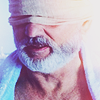
ONE
Prep the cap. As usual, I do it by duplicating layers. For this icon, the layers are Base > Multiply 100% > Screen 100% > Screen 50%. Then I stamped the result on a new layer and set it to Soft Light 100%. I resize it into 100x100 and chose to focus on a close center crop:

>>>
TWO
I add a couple of light blobs:

>>>
THREE
To get deeper colors, I create a new layer, stamp the image and set it to multiply 50%

FOUR
For a little contrast and sharpening, I duplicate the layer, desaturate it and apply the sharpen filter (Sharpen > Fade Sharpen depending on the cap). Then I set it to Hard Light, 33%

>>>
FIVE
It's actually very nicely colored already but a bit boring so I create a new color fill layer and set it on Hard Light and drag it below the light blob layers (in step 2) so that the effect is more subtle. I play around with colors a bit and settle with a purple shade #A77FC1, opacity 100%

>>>
here's a screenshot of the layers so you can see where it is.
SIX
I want to ge a couple more hues in there so I take a texture from lovevariations, rotate it because the light should come from the right side then set it on Screen 100%

>>>
>>>
SEVEN
It's a bit washed out so I stamp the image on a new layer and set it on Overlay, 20%

EIGHT
I find the whites too strong so I create a gray color fill layer #E0E0E0 and set it on multiply 66%

>>>
NINE
It's looking blurry so I stamp the image on a new layer and sharpen again, this time using and Film Grain and Paint Daubs layers. Film Grain to brighten it a bit (set the grain to 0, highlight area 20, intensity 1) and Paint Daubs to sharpen (brush size 1, sharpen 1 then Edit > Fade if it's too strong) and then lower the opacity, 50%

>>>
TEN
Create a Brightness/Contrast Layer: 10, -10 and voila, done!

If you need more clarification, just ask! :)

Ask The Maker 4.0 || My Thread
profile | resources | tags | old icons | watch | request
requested by afeastforme
>>>
using Adobe Photoshop CS
ONE
Prep the cap. As usual, I do it by duplicating layers. For this icon, the layers are Base > Multiply 100% > Screen 100% > Screen 50%. Then I stamped the result on a new layer and set it to Soft Light 100%. I resize it into 100x100 and chose to focus on a close center crop:
>>>
TWO
I add a couple of light blobs:
>>>
THREE
To get deeper colors, I create a new layer, stamp the image and set it to multiply 50%
FOUR
For a little contrast and sharpening, I duplicate the layer, desaturate it and apply the sharpen filter (Sharpen > Fade Sharpen depending on the cap). Then I set it to Hard Light, 33%
>>>
FIVE
It's actually very nicely colored already but a bit boring so I create a new color fill layer and set it on Hard Light and drag it below the light blob layers (in step 2) so that the effect is more subtle. I play around with colors a bit and settle with a purple shade #A77FC1, opacity 100%
>>>
here's a screenshot of the layers so you can see where it is.
SIX
I want to ge a couple more hues in there so I take a texture from lovevariations, rotate it because the light should come from the right side then set it on Screen 100%
>>>
>>>
SEVEN
It's a bit washed out so I stamp the image on a new layer and set it on Overlay, 20%
EIGHT
I find the whites too strong so I create a gray color fill layer #E0E0E0 and set it on multiply 66%
>>>
NINE
It's looking blurry so I stamp the image on a new layer and sharpen again, this time using and Film Grain and Paint Daubs layers. Film Grain to brighten it a bit (set the grain to 0, highlight area 20, intensity 1) and Paint Daubs to sharpen (brush size 1, sharpen 1 then Edit > Fade if it's too strong) and then lower the opacity, 50%
>>>
TEN
Create a Brightness/Contrast Layer: 10, -10 and voila, done!
If you need more clarification, just ask! :)
Ask The Maker 4.0 || My Thread
profile | resources | tags | old icons | watch | request