Tutorial #03
How to get rid of a saturated color in a cap?
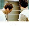
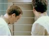
How to go from (a) to (b)?
(a)
» (b)
I've decided to write this tutorial because of a question I was asked regarding some icons in my last SG:A set. In the episode "Aurora", some of the scenes were saturated with blue, and the question was: how did you get rid of the blue? The answer is very simple: when you want to get rid of a saturated color, you have to counterbalance it with its complementary color.
Saturated with blue » counterbalance with orange
Saturated with red » counterbalance with green
Saturated with yellow » counterbalance with purple
Saturated with green » counterbalance with red
Saturated with purple » counterbalance with yellow
Saturated with orange » counterbalance with blue
In this case, I added some orange tones to the cap to attenuate the blue filter used when John and Rodney were on the Aurora.
I made my SG:A set using Corel Photo Paint 12, but I decided to make the tutorial for Photoshop 7, as more people use that program. Subsequently, the icon in this tutorial is not the exact copy of the one originally posted in the set.
I start with this cap. Click on the thumb to see it bigger.

01.
I start by cropping the cap the way I want and resize it so it is 100x100px.
02.
Then I desaturate it a little bit, lighten it and enhance the contrast:
• Image > Adjustments > Hue/Saturation... : On the Master level, I set Saturation to -40.
• Image > Adjustments > Curves... : Input:99 Output: 128
• Image > Adjustments > Brightness/Contrast : Brightness: -6 Contrast: +15
Note: I find starting by desaturating the cap by half very useful, as it avoids dealing with too much saturation once the contrast in enhanced while still keeping the colors.
03.
Now is the most important step and the most delicate. I add what I personally call an orange filter to the cap in order to get rid of the blue:
Image > Adjustments > Variations...
• On the Fine to Coarse scale, set the arrow on the 3rd or middle graduation depending on how subbtle you want the filter to be. It really depends on the cap you use. For the icon you see on the left, I set the arrow right in the middle.
• Click once on yellow and twice on red.
• Set the arrow on the 3rd graduation (so one step down) and click again once on yellow. And that's it.
Note: Remember that these settings won't work every time. The filter you create has to be in proportion with the degree of saturation of the original cap. It's all about equilibrium.
04.
Now you can really start working on your icon. Here, this is a very simple one, so not much needs to be done. I just sharpened it, increased the contrast and added a layer of very soft salmon that I set to color burn, 10%. I then duplicated the layer with the pic, desaturated it completely, played around with the lightning and contrast and set it to soft light, 20%. Erased parts of the bottom of the pic to create an uneven border, added some tiny text and voilà.
How to go from (a) to (b)?
(a)
» (b)
I've decided to write this tutorial because of a question I was asked regarding some icons in my last SG:A set. In the episode "Aurora", some of the scenes were saturated with blue, and the question was: how did you get rid of the blue? The answer is very simple: when you want to get rid of a saturated color, you have to counterbalance it with its complementary color.
Saturated with blue » counterbalance with orange
Saturated with red » counterbalance with green
Saturated with yellow » counterbalance with purple
Saturated with green » counterbalance with red
Saturated with purple » counterbalance with yellow
Saturated with orange » counterbalance with blue
In this case, I added some orange tones to the cap to attenuate the blue filter used when John and Rodney were on the Aurora.
I made my SG:A set using Corel Photo Paint 12, but I decided to make the tutorial for Photoshop 7, as more people use that program. Subsequently, the icon in this tutorial is not the exact copy of the one originally posted in the set.
I start with this cap. Click on the thumb to see it bigger.
01.
I start by cropping the cap the way I want and resize it so it is 100x100px.
02.
Then I desaturate it a little bit, lighten it and enhance the contrast:
• Image > Adjustments > Hue/Saturation... : On the Master level, I set Saturation to -40.
• Image > Adjustments > Curves... : Input:99 Output: 128
• Image > Adjustments > Brightness/Contrast : Brightness: -6 Contrast: +15
Note: I find starting by desaturating the cap by half very useful, as it avoids dealing with too much saturation once the contrast in enhanced while still keeping the colors.
03.
Now is the most important step and the most delicate. I add what I personally call an orange filter to the cap in order to get rid of the blue:
Image > Adjustments > Variations...
• On the Fine to Coarse scale, set the arrow on the 3rd or middle graduation depending on how subbtle you want the filter to be. It really depends on the cap you use. For the icon you see on the left, I set the arrow right in the middle.
• Click once on yellow and twice on red.
• Set the arrow on the 3rd graduation (so one step down) and click again once on yellow. And that's it.
Note: Remember that these settings won't work every time. The filter you create has to be in proportion with the degree of saturation of the original cap. It's all about equilibrium.
04.
Now you can really start working on your icon. Here, this is a very simple one, so not much needs to be done. I just sharpened it, increased the contrast and added a layer of very soft salmon that I set to color burn, 10%. I then duplicated the layer with the pic, desaturated it completely, played around with the lightning and contrast and set it to soft light, 20%. Erased parts of the bottom of the pic to create an uneven border, added some tiny text and voilà.