Tutorial - Masks,Tonal Value, Watercolor Effects, etc...
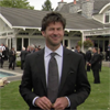
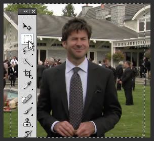
How to go from:
to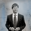
This tutorial deals with masks, tonal values and watercolor effects... among other little details. The icon was made in Photoshop 7 but the tutorial is explained with screenshots of CS4, and shortcuts are given for both versions. This means, as far as I know, that this tutorial can be adapted to pretty much any version of PS you may have.
01.
The cap.
I
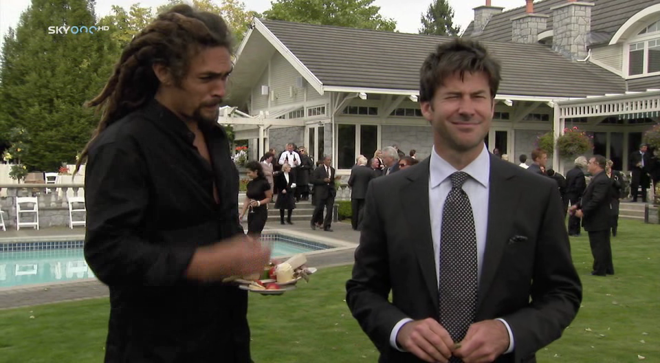
start with this cap I made of John and Ronon
in the episode 'Outcast' of Stargate: Atlantis. Ronon is blurry but it doesn't
matter as it is John I want to icon in this case. The cap is 960x528 and I'm
keeping it as it is for now as I prefer to work on a canvas larger than 100x100
for as long as possible.
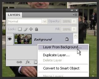
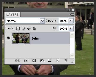
Right
now, the cap is on the background layer and I want it to be on an independant
layer. In Photoshop 7, I select the whole document by pressing
Ctrl+A --a dashed border appears all around it--,
right-click on the background layer and select 'Layer
via Cut'. In CS3/CS4, right clicking
on the background and selecting 'Layer From Background'
is enough. For clarity, I name my new layer 'John'.
02.
Cropping the cap.
In
the case of this icon, the cropping is nothing fancy. I want John to be in the
middle of the icon and that's it. There are several ways to achieve this and
here is one way to do it: with the rectangular marquee
tool, I click where I want the top left corner of the square to be and
then drag my mouse down to the bottom right while pressing Shift,
forcing my selection to be squared. (You can also do that by setting the style
of the marquee tool to have a fixed aspect ratio
of 1 and 1.) Note that you can move the selection if needed by using the arrow
keys if you're not completely happy with its placement. Once satisfied, I select
in the menu Image > Crop, I now have a nice
square with John in it.
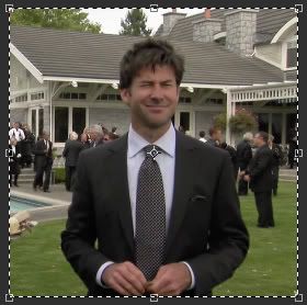
(Screenshots
are at 50% of the real image throughout most of the tutorial.)
03.
Masking the background.
I
now want to remove the background. Again, there are plently of ways to do that.
I personally prefer to use masks. With the polygonal lasso
tool --or with the lasso tool, depending
on how dexterous you are with your mouse-- I make a rough selection of John.
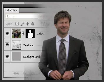
Once done, I click on the mask icon and a mask is created from the selection.
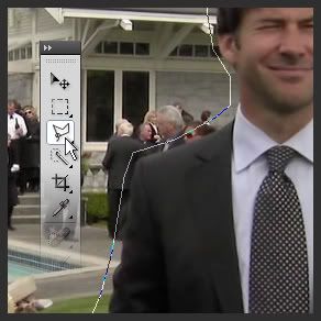
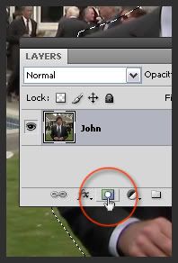
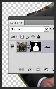
Now
I still need to clean up John's silhouette because at that stage, it looks like
it's been detoured with a knife. I zoom in until I have a big enough view of
the contour, make sure that I have the mask selected, and with
the brush tool start applying black to the area
that still needs to be masked.
Using
the brush tool allows me to be extremely precise; the size of the brush depends
on the size of the area that needs to be masked --but it's usually pretty small:
10 to 2px-- and also depends on the amount of details and indentations of the
outline. A simple round brush with soft or hard edges is usually the best. Remember
that if you make a mistake and erase too much, you just need to apply white
to the mask instead of black.
I
paint all around John's silhouette that way. I always do this with my pen tablet
so I'm usually done within minutes, but even with a mouse, once you've gotten
the hang of it, you can do it fairly quickly. As always, practice makes perfect.
I'm not gonna lie to you though, it is a work of patience, but it's worth every
minute.
Tips!
1.
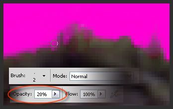
When detouring hair, I find that lowering the opacity of the brush
tool can be useful as it gives transparency to the hair tips as I brush over
them.
2. From time to time, zoom out to the 100% view and see if
you've masked enough or too much. Retouch if needed.
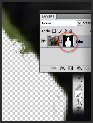
3. I sometimes create a layer below the layer I'm masking
and fill it with a flashy color that can't be found in the original cap, like
fluo pink for instance. It helps me see if there are any traces left that
should be masked.
Once
done, I get this:
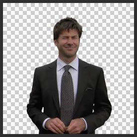
and
I can now start on the fun stuff. :)
04.
Creating a new background.
I
create a new layer that I name 'Background'. I
fill it with gray (#a1a0a0). I place this layer below 'John'.
I then create another new layer in which I paste this
texture, which I made from one of my photographs (you can download it and
others like it here).
I name it 'Texture'. Because the texture is already
square, I can very easily resize or flip it any way I want until I'm satisfied
with its placement. I set
it to Multiply, 38%.
05.
Tonal balance and desaturation.
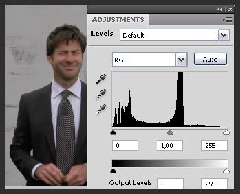
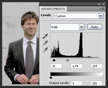
As
most caps, the cap I work with is too dark, so I'm going to have to correct
its tonal value a bit to bring out the details hidden in the dark. To do so,
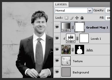
I create a 'Levels' adjustment layer (
)
on top of 'John'. I can see on the histogram that
the amount of dark and midtone pixels is higher than of the light ones. You
can use the droppers to establish dark, neutral midtone and light points, but
in this case, I just played with the three triangles (the one on the left is
for dark points, the middle one for midtones, the right one for white/light
points): push them to the left to lighten, to the right to darken.
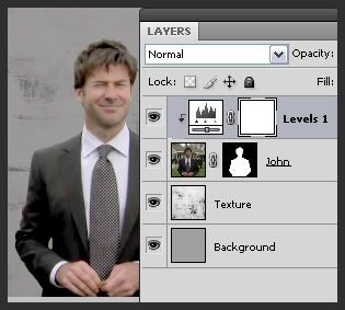
Now
I want the adjustments to be applied to 'John'
and to 'John' only, so I select the adjusment layer
and then press Ctrl+G in Photoshop 7,
or Ctrl+Alt+G in CS3/CS4.
An arrow now indicates that the adjusment layer only affects the layer below
it.
The
next step is desaturating the soon-to-be icon. There are again various ways
to do that: black and white adjustment layer, hue/saturation adjustment layer,
channels, etc. For this icon, I chose to use a Gradient
Map adjustment layer (
)
as I like how it renders the various levels of gray. Once the Gradient
Map adjustment layer box opens, I select the black and white default
gradient and then edit it like so:
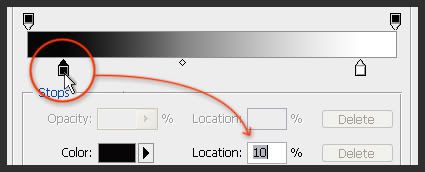
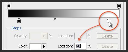
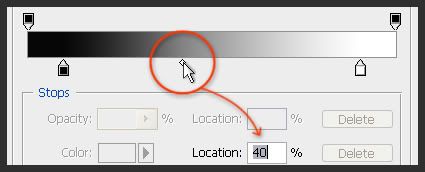
06.
Colors and lights.
I
want to add a touch of blue with a watercolor effect to the black and white,
so I create a new layer, which I name 'Watercolor'.
To create a watercolor effect in Photoshop is really simple as long as you have
a graphic tablet:
Select
the soft mechanical brush of 100px for example --it's a default brush-- and
in the brush panel, make sure that you check 'Shape Dynamics'
and then select 'Pen Pressure' in the roll-down
list under 'Size Jitter'. Lower the opacity
of your brush to about 20 to 30%
and then when you're applying the color to your canvas, put more or less pressure
on your pen. And that's it! Watercolor effects guaranteed.
Now
for those of you who don't own a pen tablet, you can try to do that by changing
the size and opacity of your brush manually, or use a pre-made brush/pic; there
are plenty of brushes or stock pictures out there which you can use. You can
find a few in this very journal, right
here.
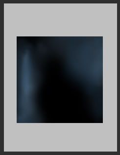
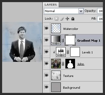
I
placed the 'Watercolor' layer on top of a black
background so that you can see what it looks like without the distraction of
the 'Texture' and 'John'
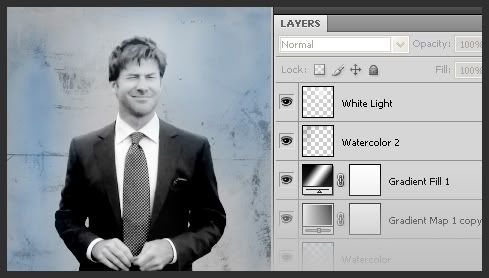
layers. On the right, you can see what the PS file looks like at that point.
It's
now time to work on the lighting and contrast a little bit. To accentuate the
contrast, I duplicate the 'Gradient Map 1' layer,
place it above 'Watercolor' and set it to Soft
Light, 20%. I then create a new Gradient
adjustment layer (
), with
the following settings:
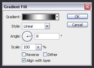
The
gradient is really simple in its composition: #000000 to the left and right,
#ffffff right in the middle. I set the Gradient adjustment
layer to Color Burn, 20%.
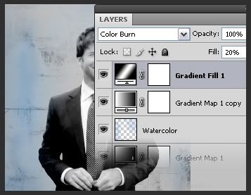
At that moment, the PS file looks like this:
Then,
in a similar manner to the blue layer I added before, I create a new layer which
I name 'Watercolor 2' and in which I paint a smudge
of black at the top of the square. I set it to Linear
Burn, 40%. I then create yet another layer
which I name 'White Light' and in which I paint
a blurry and translucid blob of white over John's face. I set this new layer
to Soft Light, 100%.
07.
Resizing and sharpening.
All
that's left now is resizing this big square into a much smaller square. I go
in Image > Image Size, and enter 102px in width
and 102px in height --I only crop it down to 100x100 once I've sharpened the
image. I now have a square of 102x102, and I create a new layer which I call
'Sharpen'. I press Ctrl+Alt+E
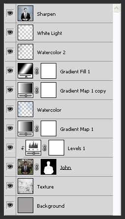
so that all visible layers are copied and pasted into this one layer.
I
make sure I have 'Sharpen' selected and I go into
Filter > Sharpen > Sharpen. Then I go into
Edit > Fade Sharpen and lower the sharpening
to about 50%.
Tip!
You can play with the opacity of the 'Sharpen'
layer to attenuate or accentuate the sharpening as well!
Most
of the time when sharpening an icon, the pixels all around the edges become
marked which is why I resize it to 102 and not 100 directly because now I can
crop down the canvas to 100x100, removing in the process the degraded edges.
I go into Image > Canvas Size and enter 100
and 100. All done!
This tutorial is of course not to be reproduced exactly. Its only purpose is to hopefully help a few people out there. :)
Thank you for reading!
newkidfan
to
This tutorial deals with masks, tonal values and watercolor effects... among other little details. The icon was made in Photoshop 7 but the tutorial is explained with screenshots of CS4, and shortcuts are given for both versions. This means, as far as I know, that this tutorial can be adapted to pretty much any version of PS you may have.
01.
The cap.
I
start with this cap I made of John and Ronon
in the episode 'Outcast' of Stargate: Atlantis. Ronon is blurry but it doesn't
matter as it is John I want to icon in this case. The cap is 960x528 and I'm
keeping it as it is for now as I prefer to work on a canvas larger than 100x100
for as long as possible.
Right
now, the cap is on the background layer and I want it to be on an independant
layer. In Photoshop 7, I select the whole document by pressing
Ctrl+A --a dashed border appears all around it--,
right-click on the background layer and select 'Layer
via Cut'. In CS3/CS4, right clicking
on the background and selecting 'Layer From Background'
is enough. For clarity, I name my new layer 'John'.
02.
Cropping the cap.
In
the case of this icon, the cropping is nothing fancy. I want John to be in the
middle of the icon and that's it. There are several ways to achieve this and
here is one way to do it: with the rectangular marquee
tool, I click where I want the top left corner of the square to be and
then drag my mouse down to the bottom right while pressing Shift,
forcing my selection to be squared. (You can also do that by setting the style
of the marquee tool to have a fixed aspect ratio
of 1 and 1.) Note that you can move the selection if needed by using the arrow
keys if you're not completely happy with its placement. Once satisfied, I select
in the menu Image > Crop, I now have a nice
square with John in it.
(Screenshots
are at 50% of the real image throughout most of the tutorial.)
03.
Masking the background.
I
now want to remove the background. Again, there are plently of ways to do that.
I personally prefer to use masks. With the polygonal lasso
tool --or with the lasso tool, depending
on how dexterous you are with your mouse-- I make a rough selection of John.
Once done, I click on the mask icon and a mask is created from the selection.
Now
I still need to clean up John's silhouette because at that stage, it looks like
it's been detoured with a knife. I zoom in until I have a big enough view of
the contour, make sure that I have the mask selected, and with
the brush tool start applying black to the area
that still needs to be masked.
Using
the brush tool allows me to be extremely precise; the size of the brush depends
on the size of the area that needs to be masked --but it's usually pretty small:
10 to 2px-- and also depends on the amount of details and indentations of the
outline. A simple round brush with soft or hard edges is usually the best. Remember
that if you make a mistake and erase too much, you just need to apply white
to the mask instead of black.
I
paint all around John's silhouette that way. I always do this with my pen tablet
so I'm usually done within minutes, but even with a mouse, once you've gotten
the hang of it, you can do it fairly quickly. As always, practice makes perfect.
I'm not gonna lie to you though, it is a work of patience, but it's worth every
minute.
Tips!
1.
When detouring hair, I find that lowering the opacity of the brush
tool can be useful as it gives transparency to the hair tips as I brush over
them.
2. From time to time, zoom out to the 100% view and see if
you've masked enough or too much. Retouch if needed.
3. I sometimes create a layer below the layer I'm masking
and fill it with a flashy color that can't be found in the original cap, like
fluo pink for instance. It helps me see if there are any traces left that
should be masked.
Once
done, I get this:
and
I can now start on the fun stuff. :)
04.
Creating a new background.
I
create a new layer that I name 'Background'. I
fill it with gray (#a1a0a0). I place this layer below 'John'.
I then create another new layer in which I paste this
texture, which I made from one of my photographs (you can download it and
others like it here).
I name it 'Texture'. Because the texture is already
square, I can very easily resize or flip it any way I want until I'm satisfied
with its placement. I set
it to Multiply, 38%.
05.
Tonal balance and desaturation.
As
most caps, the cap I work with is too dark, so I'm going to have to correct
its tonal value a bit to bring out the details hidden in the dark. To do so,
I create a 'Levels' adjustment layer (
)
on top of 'John'. I can see on the histogram that
the amount of dark and midtone pixels is higher than of the light ones. You
can use the droppers to establish dark, neutral midtone and light points, but
in this case, I just played with the three triangles (the one on the left is
for dark points, the middle one for midtones, the right one for white/light
points): push them to the left to lighten, to the right to darken.
Now
I want the adjustments to be applied to 'John'
and to 'John' only, so I select the adjusment layer
and then press Ctrl+G in Photoshop 7,
or Ctrl+Alt+G in CS3/CS4.
An arrow now indicates that the adjusment layer only affects the layer below
it.
The
next step is desaturating the soon-to-be icon. There are again various ways
to do that: black and white adjustment layer, hue/saturation adjustment layer,
channels, etc. For this icon, I chose to use a Gradient
Map adjustment layer (
)
as I like how it renders the various levels of gray. Once the Gradient
Map adjustment layer box opens, I select the black and white default
gradient and then edit it like so:
06.
Colors and lights.
I
want to add a touch of blue with a watercolor effect to the black and white,
so I create a new layer, which I name 'Watercolor'.
To create a watercolor effect in Photoshop is really simple as long as you have
a graphic tablet:
Select
the soft mechanical brush of 100px for example --it's a default brush-- and
in the brush panel, make sure that you check 'Shape Dynamics'
and then select 'Pen Pressure' in the roll-down
list under 'Size Jitter'. Lower the opacity
of your brush to about 20 to 30%
and then when you're applying the color to your canvas, put more or less pressure
on your pen. And that's it! Watercolor effects guaranteed.
Now
for those of you who don't own a pen tablet, you can try to do that by changing
the size and opacity of your brush manually, or use a pre-made brush/pic; there
are plenty of brushes or stock pictures out there which you can use. You can
find a few in this very journal, right
here.
I
placed the 'Watercolor' layer on top of a black
background so that you can see what it looks like without the distraction of
the 'Texture' and 'John'
layers. On the right, you can see what the PS file looks like at that point.
It's
now time to work on the lighting and contrast a little bit. To accentuate the
contrast, I duplicate the 'Gradient Map 1' layer,
place it above 'Watercolor' and set it to Soft
Light, 20%. I then create a new Gradient
adjustment layer (
), with
the following settings:
The
gradient is really simple in its composition: #000000 to the left and right,
#ffffff right in the middle. I set the Gradient adjustment
layer to Color Burn, 20%.
At that moment, the PS file looks like this:
Then,
in a similar manner to the blue layer I added before, I create a new layer which
I name 'Watercolor 2' and in which I paint a smudge
of black at the top of the square. I set it to Linear
Burn, 40%. I then create yet another layer
which I name 'White Light' and in which I paint
a blurry and translucid blob of white over John's face. I set this new layer
to Soft Light, 100%.
07.
Resizing and sharpening.
All
that's left now is resizing this big square into a much smaller square. I go
in Image > Image Size, and enter 102px in width
and 102px in height --I only crop it down to 100x100 once I've sharpened the
image. I now have a square of 102x102, and I create a new layer which I call
'Sharpen'. I press Ctrl+Alt+E
so that all visible layers are copied and pasted into this one layer.
I
make sure I have 'Sharpen' selected and I go into
Filter > Sharpen > Sharpen. Then I go into
Edit > Fade Sharpen and lower the sharpening
to about 50%.
Tip!
You can play with the opacity of the 'Sharpen'
layer to attenuate or accentuate the sharpening as well!
Most
of the time when sharpening an icon, the pixels all around the edges become
marked which is why I resize it to 102 and not 100 directly because now I can
crop down the canvas to 100x100, removing in the process the degraded edges.
I go into Image > Canvas Size and enter 100
and 100. All done!
This tutorial is of course not to be reproduced exactly. Its only purpose is to hopefully help a few people out there. :)
Thank you for reading!
newkidfan