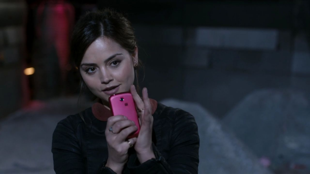
Clara Tutorial
First things first, thank you applepips16 for requesting this (also, thanks for a wonderful text tutorial, it's one I've gone back to many times). I'll start thinking of ideas to stuff into the cropping guide you also asked for, but for now, I know I can do this!

( Read more... )

( Read more... )
Comments 2
Also, I never ever tend to touch the Curves layer. I dont know why but I tend to find it so intimidating. Maybe its time I started though. :D
Many thanks for the lovely and quick tutorial. And hush up. It wasn't all over the place at all! Very neat and concise. :D
Reply
Sometimes I just 'feel' solid colour background [as with a few in my latest set], sometimes I just blur the background manually a bit, and sometimes I use a very blurred base [or a texture, since a blurred base is essentialy a homemade texture] behind a cutout, like here. Depends on my mood, really! :D
Thank you for all the compliments!
Reply
Leave a comment