Tutorials
Tutorials for these icons, asked by tor_na_do at Ask the Maker:


Original image
1.
→
I've cropped the image fairly simply. To get a nice sharpness, I generally duplicate it, and sharpen it. Then, lower the opacity of the sharpened layer, until it's at a sharpness I like.
Here I've set the sharpened layer to 47%.
2. Next is a new adjustment layer, Vibrance, at +100. Saturation at 0:

3. A new Curves adjustment layer, with just a slight input/output ratio:

4. Here I've actually used a "texture" - a photo of a skate park in Sarasota. I've set it to Screen and lowered the opacity to 46%.
→
5. A new Color Balance layer, one where I bring out some more yellows and a bit of red in the Midtones and Shadows.

6. A Selective Color layer! I played with Red, Yellow, Cyan, White, and Neutral.
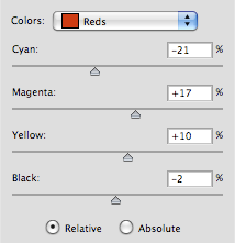
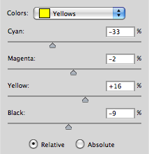
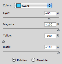
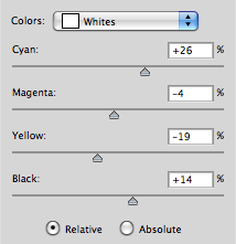
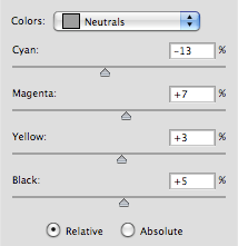

7. Last, a new Exposure layer. I only adjust the Gamma Correction by 0.82. And then, ta-da!

Original image
1. Here I do the same thing - crop, and duplicate the layer and sharpen. Here I've set the sharpened layer to 62%.

→
2. New Vibrance layer, set to +100. Then a new Curves layer with a slight curve for a bit of brightness. Also, I don't really like the sort of elbow behind Ray's backpack, so I use a brush on a new layer to swipe it out with some white. Nothing overly complicated.

→
→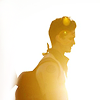
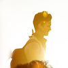
3. Here, I actually use the original sized image and set it to multiply, while moving it downwards. If you look closely, it's just a bit of Ray's hair that creates the bottom block of color. I do this again, except I move the image enough so the front of Ray's shirt creates this texture on the left side of the icon.
→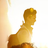
4. A new Color Balance layer to bring out Reds in the Midtones. And last, a Selective Color layer where I play with the Reds and Neutrals until I get something I like!

→
blueymcphluey asked: I'm curious about your colouring because it always seems so natural, but there's always a bit of a kick! also would you describe yourself as a 'crop and colour' maker or something else?
I love bringing out the natural colors in photos! It's generally just a matter of tweaking adjustment layers until they're at a place where if you do any more it will become unnatural or even a bit muddied, which is something I hate to see happen. I love using vibrance layers to bring out stronger and brighter colors, instead of messing with saturation. I'll often have two or three vibrance layers, and about seven color balance layers.
I guess I would generally say I'm a crop & color maker? At least, I am at the moment. As far as the style of my icons I'm sure it has a crazy range, and often switches up every few months, but that's mostly a respond to trends. I have this thing where when something gets popular I do my damnedest to do any other thing than what's popular. It's a... thing.
:)


Original image
1.
→
I've cropped the image fairly simply. To get a nice sharpness, I generally duplicate it, and sharpen it. Then, lower the opacity of the sharpened layer, until it's at a sharpness I like.
Here I've set the sharpened layer to 47%.
2. Next is a new adjustment layer, Vibrance, at +100. Saturation at 0:
3. A new Curves adjustment layer, with just a slight input/output ratio:
4. Here I've actually used a "texture" - a photo of a skate park in Sarasota. I've set it to Screen and lowered the opacity to 46%.
→
5. A new Color Balance layer, one where I bring out some more yellows and a bit of red in the Midtones and Shadows.
6. A Selective Color layer! I played with Red, Yellow, Cyan, White, and Neutral.
7. Last, a new Exposure layer. I only adjust the Gamma Correction by 0.82. And then, ta-da!
Original image
1. Here I do the same thing - crop, and duplicate the layer and sharpen. Here I've set the sharpened layer to 62%.
→
2. New Vibrance layer, set to +100. Then a new Curves layer with a slight curve for a bit of brightness. Also, I don't really like the sort of elbow behind Ray's backpack, so I use a brush on a new layer to swipe it out with some white. Nothing overly complicated.
→
→
3. Here, I actually use the original sized image and set it to multiply, while moving it downwards. If you look closely, it's just a bit of Ray's hair that creates the bottom block of color. I do this again, except I move the image enough so the front of Ray's shirt creates this texture on the left side of the icon.
→
4. A new Color Balance layer to bring out Reds in the Midtones. And last, a Selective Color layer where I play with the Reds and Neutrals until I get something I like!
→
blueymcphluey asked: I'm curious about your colouring because it always seems so natural, but there's always a bit of a kick! also would you describe yourself as a 'crop and colour' maker or something else?
I love bringing out the natural colors in photos! It's generally just a matter of tweaking adjustment layers until they're at a place where if you do any more it will become unnatural or even a bit muddied, which is something I hate to see happen. I love using vibrance layers to bring out stronger and brighter colors, instead of messing with saturation. I'll often have two or three vibrance layers, and about seven color balance layers.
I guess I would generally say I'm a crop & color maker? At least, I am at the moment. As far as the style of my icons I'm sure it has a crazy range, and often switches up every few months, but that's mostly a respond to trends. I have this thing where when something gets popular I do my damnedest to do any other thing than what's popular. It's a... thing.
:)