Tutorial #5 - CSI Sara (Adobe Photoshop Elements)
From 
to
Program: Adobe Photoshop Elements.
This tutorial assumes some familiarity with the program. Also, images shown are that specific step, not the overall appearance of the icon at that point.
Introduction: A couple of weeks ago, _kissmygrass posted a coloring tutorial using Adobe Photoshop 6 (and curves!). quantrail commented that it's a fab tutorial but that they didn't have curves, and I decided to show people that you don't necessarily need curves to fix up images that have whacky color proportions.
For comparison purposes:
vs.
(mine)
(Pretty close, right?)
Step 1: Take your base image:
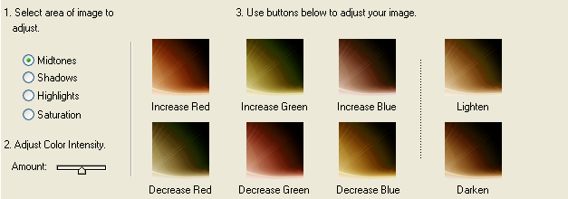
Step 2: Copy Layer 1 into a new layer. Go to Enhance -> Adjust Color -> Color Variations. Here we have options like Increase/Decrease Red/Blue/Green, Lighten/Darken, and Less/More Saturation. It looks like this:
.
These tools will become your very good friends for this tutorial. For this particular icon, make sure that "Amount" slider is set to the middle (as shown in the image above). Then click "decrease blue" twice, "increase red" once, and "lighten" three times. It should look like this:
.
Step 3: Copy Layer 1 into a new layer set to screen at 100%. (Not the very blue layer, the modified one that we made:
). We're going back to Color Variations again. Click "decrease green" once, "increase blue" once, "darken" once, "less saturation" once. Looks like this:
.
Step 4: Copy Layer 1 into a new layer set to soft light at 100%. Once again, we're back at Color Variations. Click "increase red" once, "increase blue" once. Looks like this:
.
Step 5: Copy Layer 1 into a new layer set to soft light at 100%.
Step 6: Copy Layer 1 into a new layer set to soft light at 100% and desaturate it (Enhance -> Adjust Color -> Remove Color). Adjust brightness/contrast levels (Enhance -> Adjust Brightness/Contrast -> Brightness/Contrast) until satisfied. Looks like this:
Final result:
Note: The coloring of an icon depends on the base image - even "black and white" images can result in different coloring with the same gradients if the amounts of black, white, and gray differ. For this icon, select an image with similar coloring (very blue and dark).
Do not copy this tutorial exactly and claim the icon as your own. Instead, take the steps that I showed you here and modify them to fit your own icon. I'd be happy to see the results :D
If you have any questions on how to do any of the steps, please leave a comment and I'll do my best to help you.

to

Program: Adobe Photoshop Elements.
This tutorial assumes some familiarity with the program. Also, images shown are that specific step, not the overall appearance of the icon at that point.
Introduction: A couple of weeks ago, _kissmygrass posted a coloring tutorial using Adobe Photoshop 6 (and curves!). quantrail commented that it's a fab tutorial but that they didn't have curves, and I decided to show people that you don't necessarily need curves to fix up images that have whacky color proportions.
For comparison purposes:

vs.

(mine)
(Pretty close, right?)
Step 1: Take your base image:

Step 2: Copy Layer 1 into a new layer. Go to Enhance -> Adjust Color -> Color Variations. Here we have options like Increase/Decrease Red/Blue/Green, Lighten/Darken, and Less/More Saturation. It looks like this:

.
These tools will become your very good friends for this tutorial. For this particular icon, make sure that "Amount" slider is set to the middle (as shown in the image above). Then click "decrease blue" twice, "increase red" once, and "lighten" three times. It should look like this:

.
Step 3: Copy Layer 1 into a new layer set to screen at 100%. (Not the very blue layer, the modified one that we made:

). We're going back to Color Variations again. Click "decrease green" once, "increase blue" once, "darken" once, "less saturation" once. Looks like this:

.
Step 4: Copy Layer 1 into a new layer set to soft light at 100%. Once again, we're back at Color Variations. Click "increase red" once, "increase blue" once. Looks like this:

.
Step 5: Copy Layer 1 into a new layer set to soft light at 100%.
Step 6: Copy Layer 1 into a new layer set to soft light at 100% and desaturate it (Enhance -> Adjust Color -> Remove Color). Adjust brightness/contrast levels (Enhance -> Adjust Brightness/Contrast -> Brightness/Contrast) until satisfied. Looks like this:

Final result:

Note: The coloring of an icon depends on the base image - even "black and white" images can result in different coloring with the same gradients if the amounts of black, white, and gray differ. For this icon, select an image with similar coloring (very blue and dark).
Do not copy this tutorial exactly and claim the icon as your own. Instead, take the steps that I showed you here and modify them to fit your own icon. I'd be happy to see the results :D
If you have any questions on how to do any of the steps, please leave a comment and I'll do my best to help you.