challenge 10; round 01: results
Thank you for all the votes and those who entered! Unfortunately we have to say goodbye to one participant this round but I hope you stick around to vote!
ELIMINATED
(with -9 votes)
loveyouhuns

VOTER'S CHOICE
(with +8 votes)
jorge-2
MOD'S CHOICE
breakinglocks


BANNER
BANNER
TALLY:
If your number is not listed, you received no comments.
01: - - + | -1 |
02: - - - - - - - - - | -9 | ELIMINATED
03: - - + | -1 |
04: + + | +2 |
05: + + + + + | +5 |
06: - + + + | +2 |
07: + + + + + + + + | +8 | VOTER'S CHOICE
08: - - - - - - | +6 |
COMMENTS:
01.

by darklydanie
- The black&white could be brighter and more contrasted. It looks rather dull.
- i actually really like the idea of putting the crown on her head but the text/font choice takes away from the icon
+ lovely use of b/w and I really like the use of yellow - draws focus to the icon
02.

by loveyouhuns
- The icon would have been better if something more excited was added to it. The heart doesn't really add to it.
- Whilst the cropping is interesting the use of texture is awkward and the heart brush doesn't really add anything to the icon
- that little flying heart wasn't well chosen
- Not very visually interesting and the color of the brush work doesn't really match
- The overall composition is sort of... flat. That little heart thingy does not add anything to the icon, it just looks floating there. The cropping is interesting, though.
- Bad coloring. Doesn't look like much was done to it. The brush or texture used looks low quality.
- This icon has a very interesting cropping but you could have done a lot more when it comes about colouring. Plus, that heart doesn't match very well.
- the crop is awkward, the coloring is a bit simple, and the heart brush is out of place
- the crop is nice but the texture and the hard don't really do well with the image
03.
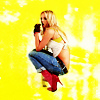
by kateliciously
- The picture is a little too bright; the yellow background is too overwhelming and it makes the image look burned.
- there is too much color in the icon, looks overexposed
+ texture matches amazingly good
04.

by untiitled
+ Very nice coloring, visually interesting crop, and the paint texture fits the picture nicely
+ The coloring and texture used on the picture look nice.
05.
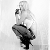
by hellb0y42
+ The crop is well done, the texture added looks nice, you can't see it a whole lot, but thats why it works 'cause its not overpowering but doesn't leave the background plain. The black&white is wonderful.
+ The b&w use is good. I like the centered cropping. It's simple, but it's good enough.
+ Sure, it's in black and white, but it looks better than the ones in color, for the most part. It's contrasting is nice. The texture used on the picture looks really good on it.
+ really like the texture & the b/w coloring
+ lovely use of black and white and textures
06.

by breakinglocks
- The color looks washed out and the picture looks a little over sharpened
+ This one is very eye-catching. The soft coloring is beautiful, and the cropping's just awesome.
+ I really love the colouring and the cropping. Pink colouring was a really good choice for this picture.
+ the coloring is beautiful
07.

by jorge-2
+ The crop is great, the coloring fits very nicely. The text/font completes the icon.
+ great cropping and lovely use of text
+ love the font/writing
+ Nice coloring and the text fits the icon nicely
+ The cropping is awesome and the text you've added to the icon looks really cool and well-made.
+ awesome crop & love the text
+ great cropping and text
+ the text is clear and the coloring is nice
08.
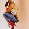
by redhour
- the use of the brown/orange colour is rather distracting as it discolours Britney slightly
- texture doesn't match
- The coloring isn't great. The image seems unnecessarily dark.
- This icon looks dark, maybe you shouldn't have used that texture/brush (If you wanted to use it, no matter what, lowing down its opacity would have helped). The cropping is amazing, though.
- the icon is too dark
- the icon doesn't look blended enough
Did I miscount the votes? Does a comment not make sense? Think a comment needs to be fixed? Let me know about any of those things, or even anything at all about the entire round. I will do the best that I can to fix!
ELIMINATED
(with -9 votes)
loveyouhuns

VOTER'S CHOICE
(with +8 votes)
jorge-2
MOD'S CHOICE
breakinglocks


BANNER
BANNER
TALLY:
If your number is not listed, you received no comments.
01: - - + | -1 |
02: - - - - - - - - - | -9 | ELIMINATED
03: - - + | -1 |
04: + + | +2 |
05: + + + + + | +5 |
06: - + + + | +2 |
07: + + + + + + + + | +8 | VOTER'S CHOICE
08: - - - - - - | +6 |
COMMENTS:
01.

by darklydanie
- The black&white could be brighter and more contrasted. It looks rather dull.
- i actually really like the idea of putting the crown on her head but the text/font choice takes away from the icon
+ lovely use of b/w and I really like the use of yellow - draws focus to the icon
02.

by loveyouhuns
- The icon would have been better if something more excited was added to it. The heart doesn't really add to it.
- Whilst the cropping is interesting the use of texture is awkward and the heart brush doesn't really add anything to the icon
- that little flying heart wasn't well chosen
- Not very visually interesting and the color of the brush work doesn't really match
- The overall composition is sort of... flat. That little heart thingy does not add anything to the icon, it just looks floating there. The cropping is interesting, though.
- Bad coloring. Doesn't look like much was done to it. The brush or texture used looks low quality.
- This icon has a very interesting cropping but you could have done a lot more when it comes about colouring. Plus, that heart doesn't match very well.
- the crop is awkward, the coloring is a bit simple, and the heart brush is out of place
- the crop is nice but the texture and the hard don't really do well with the image
03.

by kateliciously
- The picture is a little too bright; the yellow background is too overwhelming and it makes the image look burned.
- there is too much color in the icon, looks overexposed
+ texture matches amazingly good
04.

by untiitled
+ Very nice coloring, visually interesting crop, and the paint texture fits the picture nicely
+ The coloring and texture used on the picture look nice.
05.

by hellb0y42
+ The crop is well done, the texture added looks nice, you can't see it a whole lot, but thats why it works 'cause its not overpowering but doesn't leave the background plain. The black&white is wonderful.
+ The b&w use is good. I like the centered cropping. It's simple, but it's good enough.
+ Sure, it's in black and white, but it looks better than the ones in color, for the most part. It's contrasting is nice. The texture used on the picture looks really good on it.
+ really like the texture & the b/w coloring
+ lovely use of black and white and textures
06.

by breakinglocks
- The color looks washed out and the picture looks a little over sharpened
+ This one is very eye-catching. The soft coloring is beautiful, and the cropping's just awesome.
+ I really love the colouring and the cropping. Pink colouring was a really good choice for this picture.
+ the coloring is beautiful
07.

by jorge-2
+ The crop is great, the coloring fits very nicely. The text/font completes the icon.
+ great cropping and lovely use of text
+ love the font/writing
+ Nice coloring and the text fits the icon nicely
+ The cropping is awesome and the text you've added to the icon looks really cool and well-made.
+ awesome crop & love the text
+ great cropping and text
+ the text is clear and the coloring is nice
08.

by redhour
- the use of the brown/orange colour is rather distracting as it discolours Britney slightly
- texture doesn't match
- The coloring isn't great. The image seems unnecessarily dark.
- This icon looks dark, maybe you shouldn't have used that texture/brush (If you wanted to use it, no matter what, lowing down its opacity would have helped). The cropping is amazing, though.
- the icon is too dark
- the icon doesn't look blended enough
Did I miscount the votes? Does a comment not make sense? Think a comment needs to be fixed? Let me know about any of those things, or even anything at all about the entire round. I will do the best that I can to fix!