challenge 10; round 02: results
Thank you for all the votes and those who entered! Unfortunately we have to say goodbye to one participant this round but I hope you stick around to vote!
ELIMINATED
(with -4 votes)
fuuurs
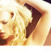
VOTER'S CHOICE
(with +3 votes)
kateliciously
MOD'S CHOICE
hellb0y42

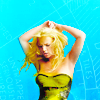
BANNER
BANNER
TALLY:
If your number is not listed, you received no comments.
01: - - + + + | +1 |
02: - - + | -1 |
03: - - - - | -4 | ELIMINATED
04: - + + + + | +3 | VOTER'S CHOICE
05: - - - + | -2 |
06: + + | +2 |
07: - - + + + | +1 |
COMMENTS:
01.

by hellb0y42
- for me, the image is far too oversaturated
- The coloring of Britney mixed with the background texture used just doesn't work. The edges of Britney are too sharp, they look pixelated.
+ The coloring was very well done on this icon. The coloring of the background compliments the coloring you did for Britney.
+ Beautiful coloring, beautiful icon
+ Love the bright and vibrant colors, and the center crop works well!
02.

by vamp-doll-diva
- The coloring is very dark and too blue, could use more reds. The text is hard to read, its kind of squashed.
- the font looks "cheap"
+ lovely use of text and texture
03.

by fuuurs
- The coloring is too light, could have used a little more contrast.
- i like the cropping but it doesn't look sharp and it's too bright
- the crop is iritation because nothing is in focus
- Very blurry and the coloring isn't great
04.

by kateliciously
- the image of Britney is quite dark and the large film reels kinda take the focus away from Britney
+ The coloring is nice and its very unique amongst the others.
+ I love the use of the texture
+ Very creative and fun icon
+ The texture is very creative, and it really draws your eye to Britney!
05.

by breakinglocks
- the icon is overloaded and the colouring too pink
- The idea of the icon is nice, but the execution just doesn't sum up. The coloring doesn't work at all.
- The coloring is REALLY muddy and red, and the crops aren't the most flattering.
+ I really like the use of the image and the placement/crops
06.
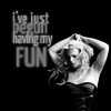
by jelly-head91
+ it's great that the maker kept this icon b/w and it matches perfectly with the texture/text
+ The formatting of the text mixed with the crop of the picture looks really nice. It would be better with a little splash of color, though.
07.

by redhour
- Rather bland crop and coloring and it doesn't feel like much was done to the icon
- Certain ares look really washed out, and it looks oversharpened along her arm.
+ a simple icon that is not overloaded with colouring and text - a lovely icon :)
+ great crop
+ The simplicity and coloring of the icon is beautiful.
Did I miscount the votes? Does a comment not make sense? Think a comment needs to be fixed? Let me know about any of those things, or even anything at all about the entire round. I will do the best that I can to fix!
ELIMINATED
(with -4 votes)
fuuurs

VOTER'S CHOICE
(with +3 votes)
kateliciously
MOD'S CHOICE
hellb0y42


BANNER
BANNER
TALLY:
If your number is not listed, you received no comments.
01: - - + + + | +1 |
02: - - + | -1 |
03: - - - - | -4 | ELIMINATED
04: - + + + + | +3 | VOTER'S CHOICE
05: - - - + | -2 |
06: + + | +2 |
07: - - + + + | +1 |
COMMENTS:
01.

by hellb0y42
- for me, the image is far too oversaturated
- The coloring of Britney mixed with the background texture used just doesn't work. The edges of Britney are too sharp, they look pixelated.
+ The coloring was very well done on this icon. The coloring of the background compliments the coloring you did for Britney.
+ Beautiful coloring, beautiful icon
+ Love the bright and vibrant colors, and the center crop works well!
02.
by vamp-doll-diva
- The coloring is very dark and too blue, could use more reds. The text is hard to read, its kind of squashed.
- the font looks "cheap"
+ lovely use of text and texture
03.

by fuuurs
- The coloring is too light, could have used a little more contrast.
- i like the cropping but it doesn't look sharp and it's too bright
- the crop is iritation because nothing is in focus
- Very blurry and the coloring isn't great
04.

by kateliciously
- the image of Britney is quite dark and the large film reels kinda take the focus away from Britney
+ The coloring is nice and its very unique amongst the others.
+ I love the use of the texture
+ Very creative and fun icon
+ The texture is very creative, and it really draws your eye to Britney!
05.

by breakinglocks
- the icon is overloaded and the colouring too pink
- The idea of the icon is nice, but the execution just doesn't sum up. The coloring doesn't work at all.
- The coloring is REALLY muddy and red, and the crops aren't the most flattering.
+ I really like the use of the image and the placement/crops
06.

by jelly-head91
+ it's great that the maker kept this icon b/w and it matches perfectly with the texture/text
+ The formatting of the text mixed with the crop of the picture looks really nice. It would be better with a little splash of color, though.
07.
by redhour
- Rather bland crop and coloring and it doesn't feel like much was done to the icon
- Certain ares look really washed out, and it looks oversharpened along her arm.
+ a simple icon that is not overloaded with colouring and text - a lovely icon :)
+ great crop
+ The simplicity and coloring of the icon is beautiful.
Did I miscount the votes? Does a comment not make sense? Think a comment needs to be fixed? Let me know about any of those things, or even anything at all about the entire round. I will do the best that I can to fix!