challenge 10; round 06: results
Thank you for all the votes and those who entered! Unfortunately we have to say goodbye to one participant this round but I hope you stick around to vote!
ELIMINATED
(with - votes)
breakinglocks
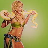
VOTER'S CHOICE
(with + votes)
kateliciously
MOD'S CHOICE
NONE THIS WEEK.
BANNER
NO BANNER
TALLY:
If your number is not listed, you received no comments.
01: + | +1 |
02: - - - - - | -5 | ELIMINATED
03: + + + | +3 | VOTER'S CHOICE
04: - + + | +1 |
COMMENTS:
01.
by redhour
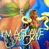
+ the blending is really well done and the text really ties it together well.
02.

by breakinglocks
- the icon is pretty dark and Britney is off focus
- The icon is too much on the dark side, the coloring should be more eye-popping, it would have looked great!
- The crop isn't very engaging, and the icon is VERY dark. The masking around Britney isn't the smoothest either.
- The icon is a little bit too sharpened (makes it look a little grainy) and it's a tad too dark.
- the coloring of the image matches to closely to the texture so the image seems to fade into the background a touch to much.
03.

by kateliciously
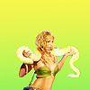
+ i totally love the coloring, croping and texture. perfect icon
+ This icon is bright and vibrant. While it may be simpler than 1 & 4, the simplicity works in this icons favor. Good use of gradient and negative space.
+ The icon is so simple but says so much. The colors are very vibrant and the position of Britney is perfect.
04.
by fuuurs
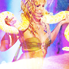
- i don't like the texture and it looks like it's too sharp
+ awesome colouring and use of texture
+ The coloring/texture works wonderful with the image, well done!
Did I miscount the votes? Does a comment not make sense? Think a comment needs to be fixed? Let me know about any of those things, or even anything at all about the entire round. I will do the best that I can to fix!
ELIMINATED
(with - votes)
breakinglocks

VOTER'S CHOICE
(with + votes)
kateliciously
MOD'S CHOICE

NONE THIS WEEK.
BANNER
NO BANNER
TALLY:
If your number is not listed, you received no comments.
01: + | +1 |
02: - - - - - | -5 | ELIMINATED
03: + + + | +3 | VOTER'S CHOICE
04: - + + | +1 |
COMMENTS:
01.

by redhour
+ the blending is really well done and the text really ties it together well.
02.

by breakinglocks
- the icon is pretty dark and Britney is off focus
- The icon is too much on the dark side, the coloring should be more eye-popping, it would have looked great!
- The crop isn't very engaging, and the icon is VERY dark. The masking around Britney isn't the smoothest either.
- The icon is a little bit too sharpened (makes it look a little grainy) and it's a tad too dark.
- the coloring of the image matches to closely to the texture so the image seems to fade into the background a touch to much.
03.

by kateliciously
+ i totally love the coloring, croping and texture. perfect icon
+ This icon is bright and vibrant. While it may be simpler than 1 & 4, the simplicity works in this icons favor. Good use of gradient and negative space.
+ The icon is so simple but says so much. The colors are very vibrant and the position of Britney is perfect.
04.

by fuuurs
- i don't like the texture and it looks like it's too sharp
+ awesome colouring and use of texture
+ The coloring/texture works wonderful with the image, well done!
Did I miscount the votes? Does a comment not make sense? Think a comment needs to be fixed? Let me know about any of those things, or even anything at all about the entire round. I will do the best that I can to fix!