TUTORIAL 3: CHARLIZE THERON
Requirements: Photoshop
Info: Desaturation, light texture, and gradients.
I originally started out doing a tutorial on desaturation, but then I realized that there wasn't much to go on about (and since it was raining outside), so I just made an icon and did a tutorial on it.
NOTE: When I talk about adding a gradient, text, or ANYTHING, assume that I am talking about adding a new layer before you add the gradient/text/etc. Having a new layer for everything that you do prevents you from making "unerasable" mistakes. Instead, you can just delete the layer and start over.
We will be going from this:
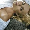
to this:

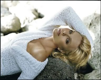

This will be the image we start off with. Use the Unsharpen Mask (if you don't know how, refer back to tutorial 2 or 2.5), crop/resize it to 100x100, and then use the smudge tool to smooth out the skin, if necessary.


Duplicate the layer, and desaturate it (Shift + Ctrl + U). Then set the layer on screen.


It looked okay, but her face and neck looked too red for me, so I added a new layer, and flood filled it with a peachy/creamy color (#DFC48A). I erased the parts I didn't want to change (basically everything but her face and neck), and set the layer on overlay. It was a little too much, so I used a round blurred eraser, set the opacity to about 20%, and then started erasing the layer until her skin looked natural (about 4-6 times...ish).


Add this gradient (I believe they're by crumblingwalls. Anyone know for sure?), set it on screen at opacity 66%, and fill 66%.
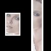
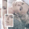
I saved my PSD, then merged my layers (if you don't, then when you do this step, you will not get the coloring of the icon as it looks now). Using the Rectangular Marquee Tool (M), I selected a strip from Charlize's face horizontally, then copy and pasted the trip into a new document. Then I rotated it so now it was diagonal. Next, I picked a region from her face and went through the same thing.
At this point, you can either choose to unmerge your layers or keep them merged. I unmerged them so I could look through my steps for this tutorial, but you don't need to. DECIDE!
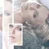
Okay, decided? Good. Now paste those strips back into the icon, and position them anywhere you want. For each layer, I added a "stroke" of 2 pixels. To do this, go to Layer --> Layer Style --> Stroke. I generally like to have different "tones" for each strip, so I duplicated each layer, and set the duplicated long strip layer to screen, and the duplicated rectangle to overlay.




Add a layer flood filled with a creamy color (#F7DBA0), and set it to soft light. Then add our old buddy the blue/pink gradient a few steps up, set to pin light. Then, add a red gradient set to soft light.
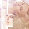
We're almost there! The color of the rock was a bit too dark, so I used a round blurred brush with a low opacity, and using a creamy color (#F7DBA0), just went over the rock (on a new layer set on screen).

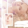
(black background just to show the blob)
Next, I created a white blooby brush thingymajiggy using a small square brush, and a small round brush. It may look just like a blob, but it was really hard to make! There's a certain artistic skill to it! (I'm not kidding. It took me 10 minutes before I found a blob I liked).

I wrote out "CHARLIZE" in Arial Black, size 6, color #CC9A82. Underneath that, I wrote out "without you i'm incomplete" (what? I had the BSB song stuck in my head :P) in Arial, size 2, color #CC9A82.



I added a light texture by ingrid set on overlay, but the black made her face too dark for the icon, so I took my eraser, set the opacity on about 45%, and erased all the area except the strips, and the text (I liked the effect the light texture had on them).
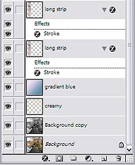
And you're done! Here's my palette layout, in case this whole thing seemed like Greek instead of English:
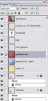

I did add a border by sistahsoul99, but I'm kind of "eh" about it. I generally don't like borders, mostly because I can never pick one that "fits" the icon.
Anyhoo, I'd love to see any icons that you make with this tutorial, if you do. Give me some feedback! :D I wasn't that boring, was I? ;)
Info: Desaturation, light texture, and gradients.
I originally started out doing a tutorial on desaturation, but then I realized that there wasn't much to go on about (and since it was raining outside), so I just made an icon and did a tutorial on it.
NOTE: When I talk about adding a gradient, text, or ANYTHING, assume that I am talking about adding a new layer before you add the gradient/text/etc. Having a new layer for everything that you do prevents you from making "unerasable" mistakes. Instead, you can just delete the layer and start over.
We will be going from this:

to this:


This will be the image we start off with. Use the Unsharpen Mask (if you don't know how, refer back to tutorial 2 or 2.5), crop/resize it to 100x100, and then use the smudge tool to smooth out the skin, if necessary.


Duplicate the layer, and desaturate it (Shift + Ctrl + U). Then set the layer on screen.


It looked okay, but her face and neck looked too red for me, so I added a new layer, and flood filled it with a peachy/creamy color (#DFC48A). I erased the parts I didn't want to change (basically everything but her face and neck), and set the layer on overlay. It was a little too much, so I used a round blurred eraser, set the opacity to about 20%, and then started erasing the layer until her skin looked natural (about 4-6 times...ish).


Add this gradient (I believe they're by crumblingwalls. Anyone know for sure?), set it on screen at opacity 66%, and fill 66%.


I saved my PSD, then merged my layers (if you don't, then when you do this step, you will not get the coloring of the icon as it looks now). Using the Rectangular Marquee Tool (M), I selected a strip from Charlize's face horizontally, then copy and pasted the trip into a new document. Then I rotated it so now it was diagonal. Next, I picked a region from her face and went through the same thing.
At this point, you can either choose to unmerge your layers or keep them merged. I unmerged them so I could look through my steps for this tutorial, but you don't need to. DECIDE!

Okay, decided? Good. Now paste those strips back into the icon, and position them anywhere you want. For each layer, I added a "stroke" of 2 pixels. To do this, go to Layer --> Layer Style --> Stroke. I generally like to have different "tones" for each strip, so I duplicated each layer, and set the duplicated long strip layer to screen, and the duplicated rectangle to overlay.


Add a layer flood filled with a creamy color (#F7DBA0), and set it to soft light. Then add our old buddy the blue/pink gradient a few steps up, set to pin light. Then, add a red gradient set to soft light.

We're almost there! The color of the rock was a bit too dark, so I used a round blurred brush with a low opacity, and using a creamy color (#F7DBA0), just went over the rock (on a new layer set on screen).


(black background just to show the blob)
Next, I created a white blooby brush thingymajiggy using a small square brush, and a small round brush. It may look just like a blob, but it was really hard to make! There's a certain artistic skill to it! (I'm not kidding. It took me 10 minutes before I found a blob I liked).

I wrote out "CHARLIZE" in Arial Black, size 6, color #CC9A82. Underneath that, I wrote out "without you i'm incomplete" (what? I had the BSB song stuck in my head :P) in Arial, size 2, color #CC9A82.


I added a light texture by ingrid set on overlay, but the black made her face too dark for the icon, so I took my eraser, set the opacity on about 45%, and erased all the area except the strips, and the text (I liked the effect the light texture had on them).
And you're done! Here's my palette layout, in case this whole thing seemed like Greek instead of English:


I did add a border by sistahsoul99, but I'm kind of "eh" about it. I generally don't like borders, mostly because I can never pick one that "fits" the icon.
Anyhoo, I'd love to see any icons that you make with this tutorial, if you do. Give me some feedback! :D I wasn't that boring, was I? ;)