Tutorial-Color and effect from premade textures
Time for another tutorial. And while no one has requested this, I thought there might be an interest in seeing this technique. Now, this is actually a fairly simple icon to make. It's just all about experimenting with color and blending modes. So hopefully this will help people learn the way diffrent layer blending modes work with each other to create great effects.
Oh, and remember kids: Like all my tutorials, this was made with PSP9 but should be easily translatable into other programs or versions.
So we're going to be taking this photo and making this icon:
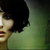
So, first it's time to crop (R). After trying a few diffrent crops, I settle with only half of Natalie's face in the icon. I do this for two reasons; a). it gives Natalie and the icon an air of class and mystery. She's a classy lady and that's something I want to bring ot in the tone of the icon and b). I really like the way the background of the photo changed from this grey green color to a charqual brown and I wanted to keep that.
Now, always make sure when you crop, the area is a perfect square so you don't get any weird stretching. Resize (shift-S) to 100x100 and then sharpen. You should have something that looks like this:

Time to work with the image to bring out it's natural coloring. The first thing I do is duplicate the background image twice. I set the fist copy to Screen and the second to Soft Light (from the bottom your layers should go Background-Soft Light-Screen). This is a great way to bring out really vibrant coloring and I do this almost all of my icons.
Now it's time to start working towards coloring and texture. Now Natalie is very pale and I want to bring out a more natural skin tone. Ordinarily, I would use a pale peach color to add that natural color to the icon. But since I'm trying to add texture as well, I go looking for a texture base in the same kind of color tone I want.
So I paste in this texture base by Tre-Xture as a new layer (crtl-L) and set the blending mode to Multiply.

To soften this effect and get a more faded coloring, I create a new layer and fill (F) with a dark blue color set to Exclusion.

I like this coloring but I want it stronger so I duplicate both the Multiply and Exclusion layers. (the order of these effect layers should now be Multiply-Exclusion-Multiply-Exclusion).
I play with the order of the layers now. I've seen alot of people ask questions about ways to use textures. Now one of my favorite techniques is to put the texture beneath a Soft Light image layer. This gives a dramatic coloring effect and stops the texture from overwhelming the icon while still letting the texture show through. So I drag my Soft Light background copy all the way to the top. I duplicate this layer again to increase the effect and the contrast of the image.
The order of your layers should now go Background-Screen-Multiply-Exclusion-Multiply-Exclusion-Soft Light-Soft Light.
Now that I have some coloring I like, I'm going to work on increasing the texture effect. So I paste another base from Tre-Xture:
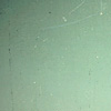
I keep the blending mode on Normal and move the layer around, seeing what kind of location gives what kind of effect. Again, because I have the soft light image layers on top, I can keep the blending on Normal and have the texture show through. After some experimentation, I decide I like this layer at the bottom and place it above my Screen layer.
Time to make a couple of final finishing touches to pull the whole thing together. I don't like how Natalie's face is so dark and the rest of the icon is much lighter. I want all the focus to be on Natalie. One way to brightern certain ares of an icon is to use a black and white gradient.
I create a new layer and fill it with this gradient (comes standard with PSP) and set the blending mode on Soft Light. The white will brighten Natalies face while the black will take some emphasis off the rest of the icon.

After moving this layer around to see where it looks best, I place the layer underneath my last Exclusion layer. The Multiply-Exclusin layers on the icon should now go, from the bottom: Multiply, Exclusion, Multiply, Soft Light Gradient, Exclusion.
Almost done. I want to make the icon slightly darker and more contrasting, to help with that classy and mysterious tone I'm goinge for. I duplicate the top Soft Light image layer and then desaturate it (Adjust>>Hue and Saturation>>Hue/Saturation/Lightness). I set the brightness to 0 and the saturation to -100.
Last step! To make Natalie's eyes stand out, I use the sharpen brush (J and then select Sharpen from the drop down options) set small on size 1 or 2. I then go over Natalie's eyes to brighten them up and make them stand out.
That's it. You're done.
Now, I know that was kind of complicated and there are alot of layers. If anyone has any questions, please feel free to ask.
ANd remember: the best way to create effects like this is experiment. Try diffrent blending, diffrent textures, move layers around to come up with an effect you like.
Oh, and remember kids: Like all my tutorials, this was made with PSP9 but should be easily translatable into other programs or versions.
So we're going to be taking this photo and making this icon:

So, first it's time to crop (R). After trying a few diffrent crops, I settle with only half of Natalie's face in the icon. I do this for two reasons; a). it gives Natalie and the icon an air of class and mystery. She's a classy lady and that's something I want to bring ot in the tone of the icon and b). I really like the way the background of the photo changed from this grey green color to a charqual brown and I wanted to keep that.
Now, always make sure when you crop, the area is a perfect square so you don't get any weird stretching. Resize (shift-S) to 100x100 and then sharpen. You should have something that looks like this:

Time to work with the image to bring out it's natural coloring. The first thing I do is duplicate the background image twice. I set the fist copy to Screen and the second to Soft Light (from the bottom your layers should go Background-Soft Light-Screen). This is a great way to bring out really vibrant coloring and I do this almost all of my icons.
Now it's time to start working towards coloring and texture. Now Natalie is very pale and I want to bring out a more natural skin tone. Ordinarily, I would use a pale peach color to add that natural color to the icon. But since I'm trying to add texture as well, I go looking for a texture base in the same kind of color tone I want.
So I paste in this texture base by Tre-Xture as a new layer (crtl-L) and set the blending mode to Multiply.

To soften this effect and get a more faded coloring, I create a new layer and fill (F) with a dark blue color set to Exclusion.

I like this coloring but I want it stronger so I duplicate both the Multiply and Exclusion layers. (the order of these effect layers should now be Multiply-Exclusion-Multiply-Exclusion).
I play with the order of the layers now. I've seen alot of people ask questions about ways to use textures. Now one of my favorite techniques is to put the texture beneath a Soft Light image layer. This gives a dramatic coloring effect and stops the texture from overwhelming the icon while still letting the texture show through. So I drag my Soft Light background copy all the way to the top. I duplicate this layer again to increase the effect and the contrast of the image.
The order of your layers should now go Background-Screen-Multiply-Exclusion-Multiply-Exclusion-Soft Light-Soft Light.
Now that I have some coloring I like, I'm going to work on increasing the texture effect. So I paste another base from Tre-Xture:

I keep the blending mode on Normal and move the layer around, seeing what kind of location gives what kind of effect. Again, because I have the soft light image layers on top, I can keep the blending on Normal and have the texture show through. After some experimentation, I decide I like this layer at the bottom and place it above my Screen layer.
Time to make a couple of final finishing touches to pull the whole thing together. I don't like how Natalie's face is so dark and the rest of the icon is much lighter. I want all the focus to be on Natalie. One way to brightern certain ares of an icon is to use a black and white gradient.
I create a new layer and fill it with this gradient (comes standard with PSP) and set the blending mode on Soft Light. The white will brighten Natalies face while the black will take some emphasis off the rest of the icon.

After moving this layer around to see where it looks best, I place the layer underneath my last Exclusion layer. The Multiply-Exclusin layers on the icon should now go, from the bottom: Multiply, Exclusion, Multiply, Soft Light Gradient, Exclusion.
Almost done. I want to make the icon slightly darker and more contrasting, to help with that classy and mysterious tone I'm goinge for. I duplicate the top Soft Light image layer and then desaturate it (Adjust>>Hue and Saturation>>Hue/Saturation/Lightness). I set the brightness to 0 and the saturation to -100.
Last step! To make Natalie's eyes stand out, I use the sharpen brush (J and then select Sharpen from the drop down options) set small on size 1 or 2. I then go over Natalie's eyes to brighten them up and make them stand out.
That's it. You're done.
Now, I know that was kind of complicated and there are alot of layers. If anyone has any questions, please feel free to ask.
ANd remember: the best way to create effects like this is experiment. Try diffrent blending, diffrent textures, move layers around to come up with an effect you like.