Lucky number seven
It's been a little while since I've done a tutorial and I figured now was as good a time as any. This tutorial focuses on coloring, using mostly layer settings and a single texture.
Before I begin, a word on tutorials. Tutorials are made so that you can learn new tips and tricks to apply to your own icons. But am I going to freak that you've copied my style (as generic as this icon is)? No. If I didn't want you to know how to make icons that look like this, I wouldn't tell you how. Just don't take the same cap I used, then follow the tutorial to make the same icon as I did. That is stealing and it's not cool. Other wise, have fun and I hope this helps.
Oh and this tutorial was made with PSP9 but should translate easily into other versions or to PS.
Now, we'll be making this icon:
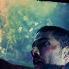
I start with this cap by numerocinco:

Note: I've shrunk down the size of the original cap so that my photobucket account doesn't explode.
I crop the image and then resize the image. Oh and a tip on resizing: go to Enahance Image>>Edge Preserving Smooth (I leave the amount of smoothing set at 2) before resizing. I always do this and helps prevent distortion or pixelation after resizing. After you've resized, always Sharpen. You should be looking at a base like this:
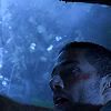
A word about cropping: I cropped the image this way because it keeps the focus of the icon on Jack's face. If I crop lower down to reduce the amount of empty space in the icon, Jack's arm is the first thing that attracts the eye and that's not what I want. Also, I love the beauty of empty space. It can really make a statement.
Alright, the cap is really dark so it's time to brighten it up. I duplicate the base twice and set both new layers to Screen. See? Much better. Your icon now looks this:
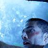
Now, though the image is much brighter the colors seem a little too monotone for me. I want something with a little more pop to it. So I duplicate the base layer and drag it all the way to the top and set it to Soft Light. You layers should now go, from the bottom: base>>Screen>>Screen>>Soft Light. This creates much more contrast.
But I'm still not satisfied. The blue coloring is just too dark and overpowering. So I decide to adjust my Soft Light layer. I go to Enhance Photo>>Automatic Color Balance and set the temperature at 6803 (I just slid the slider until I found something I liked). By using Color Balance to warm up my Soft Light, I add a slight pink color to my layer, reducing the way the blue overpwowers the icon. Your icon should now look like this:
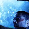
But now it's to dark again. So I duplicate one of my Screen layers and drag it all the way to the top. Your layers from the bottom should now go base>>Screen>>Screen>>Soft Light>>Screen. I also use the Lighten/Darken tool to lighten the area under Jack's eye. Just a little bit to keep the shadows from overpowering the image. Because I want to see Jack clearly. Much better. Your icon now looks like this:
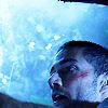
Now, I could stop there, but to me, it doesn't look like an icon yet. Time to play with the coloring.
I create a new layer at the top and fill it with the following color set to Multiply:

This lessens the natural blue coloring of the icon and gives the icon a more natural feel. Your icn now looks like this:
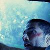
I make another new layer at the top and fill it with this color set to Exclusion:

The Exclusion layer takes away the blueness, making it more brown. The icon now looks like this:
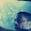
But my icon is a little too washed out and I like images with lots of contrast so to darken the icon up and get more contrast I add a new layer at the top and fill it with the following color at Burn:

The order of your layers from the bottom should now go: base>>Screen>>Screen>>Soft Light>>Screen>>Multiply>>Exclusion>>Burn. The icon now looks like this:

I want to keep working towards a higher contrast icon. So I duplicate my Soft Light layer twice and drag both copies up to the top. But this seems a little too much for me. It's too dark, too overdone. I think about my options and decide to try making this Soft Layer black and white to reduce the heavy amount of contrast and darkness. So I adjust the Hue/Saturation/Lighteness on the topmost Soft Light layer (Shift-H). I keep the Lightness at 0 and set the Saturation to -89 (a number I thought looked good).
I look at the results, trying to decide if I like it. I set the layer I just destaurated to zero opacity to see how things look. I like the way the empty space looks without that extra layer. I push the opacity back to 100 and then reduce the opacity of the other Soft Light Layer. I like how the desatuaration looks on the face but not the open space of the icon.
So I take my selection tool, and using Freehand Selection set on Anti-Alias, I selct the area around Jack's head and arm and delete it (Crtl-X). This Soft Light layer now only has the desaturated image of Jack's head and arm. I do the same thing on the normal colored Soft Light layer below, except this time, I select Jack's head and arm and leave the background as the only thing on the layer.
Make sense?
My icon now looks like this:
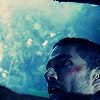
Now Jack's face is a little too dark while the open space is a little bit too bright. To fix this, I use the following gradient on Soft Light:

The white part of the gradient emphasizes Jack's face while the dark part takes the focus off the background. Becuse Jack is where all the attention should be.
My icon now looks like this:
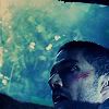
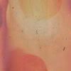
Almost done! I think I can get a little bit more natural coloring in Jack's face, so on a whim, I decide to try out this texture from Tre since the pinkish color of it should add pink to Jack's face. I paste the layer (Ctrl-L) all the way at the top and set it on Soft Light:
I love the way that looks so that's it! I'm done! You've now made this icon:

Comments? Questions? Let me know.
Before I begin, a word on tutorials. Tutorials are made so that you can learn new tips and tricks to apply to your own icons. But am I going to freak that you've copied my style (as generic as this icon is)? No. If I didn't want you to know how to make icons that look like this, I wouldn't tell you how. Just don't take the same cap I used, then follow the tutorial to make the same icon as I did. That is stealing and it's not cool. Other wise, have fun and I hope this helps.
Oh and this tutorial was made with PSP9 but should translate easily into other versions or to PS.
Now, we'll be making this icon:
I start with this cap by numerocinco:
Note: I've shrunk down the size of the original cap so that my photobucket account doesn't explode.
I crop the image and then resize the image. Oh and a tip on resizing: go to Enahance Image>>Edge Preserving Smooth (I leave the amount of smoothing set at 2) before resizing. I always do this and helps prevent distortion or pixelation after resizing. After you've resized, always Sharpen. You should be looking at a base like this:
A word about cropping: I cropped the image this way because it keeps the focus of the icon on Jack's face. If I crop lower down to reduce the amount of empty space in the icon, Jack's arm is the first thing that attracts the eye and that's not what I want. Also, I love the beauty of empty space. It can really make a statement.
Alright, the cap is really dark so it's time to brighten it up. I duplicate the base twice and set both new layers to Screen. See? Much better. Your icon now looks this:
Now, though the image is much brighter the colors seem a little too monotone for me. I want something with a little more pop to it. So I duplicate the base layer and drag it all the way to the top and set it to Soft Light. You layers should now go, from the bottom: base>>Screen>>Screen>>Soft Light. This creates much more contrast.
But I'm still not satisfied. The blue coloring is just too dark and overpowering. So I decide to adjust my Soft Light layer. I go to Enhance Photo>>Automatic Color Balance and set the temperature at 6803 (I just slid the slider until I found something I liked). By using Color Balance to warm up my Soft Light, I add a slight pink color to my layer, reducing the way the blue overpwowers the icon. Your icon should now look like this:
But now it's to dark again. So I duplicate one of my Screen layers and drag it all the way to the top. Your layers from the bottom should now go base>>Screen>>Screen>>Soft Light>>Screen. I also use the Lighten/Darken tool to lighten the area under Jack's eye. Just a little bit to keep the shadows from overpowering the image. Because I want to see Jack clearly. Much better. Your icon now looks like this:
Now, I could stop there, but to me, it doesn't look like an icon yet. Time to play with the coloring.
I create a new layer at the top and fill it with the following color set to Multiply:
This lessens the natural blue coloring of the icon and gives the icon a more natural feel. Your icn now looks like this:
I make another new layer at the top and fill it with this color set to Exclusion:
The Exclusion layer takes away the blueness, making it more brown. The icon now looks like this:
But my icon is a little too washed out and I like images with lots of contrast so to darken the icon up and get more contrast I add a new layer at the top and fill it with the following color at Burn:
The order of your layers from the bottom should now go: base>>Screen>>Screen>>Soft Light>>Screen>>Multiply>>Exclusion>>Burn. The icon now looks like this:
I want to keep working towards a higher contrast icon. So I duplicate my Soft Light layer twice and drag both copies up to the top. But this seems a little too much for me. It's too dark, too overdone. I think about my options and decide to try making this Soft Layer black and white to reduce the heavy amount of contrast and darkness. So I adjust the Hue/Saturation/Lighteness on the topmost Soft Light layer (Shift-H). I keep the Lightness at 0 and set the Saturation to -89 (a number I thought looked good).
I look at the results, trying to decide if I like it. I set the layer I just destaurated to zero opacity to see how things look. I like the way the empty space looks without that extra layer. I push the opacity back to 100 and then reduce the opacity of the other Soft Light Layer. I like how the desatuaration looks on the face but not the open space of the icon.
So I take my selection tool, and using Freehand Selection set on Anti-Alias, I selct the area around Jack's head and arm and delete it (Crtl-X). This Soft Light layer now only has the desaturated image of Jack's head and arm. I do the same thing on the normal colored Soft Light layer below, except this time, I select Jack's head and arm and leave the background as the only thing on the layer.
Make sense?
My icon now looks like this:
Now Jack's face is a little too dark while the open space is a little bit too bright. To fix this, I use the following gradient on Soft Light:
The white part of the gradient emphasizes Jack's face while the dark part takes the focus off the background. Becuse Jack is where all the attention should be.
My icon now looks like this:
Almost done! I think I can get a little bit more natural coloring in Jack's face, so on a whim, I decide to try out this texture from Tre since the pinkish color of it should add pink to Jack's face. I paste the layer (Ctrl-L) all the way at the top and set it on Soft Light:
I love the way that looks so that's it! I'm done! You've now made this icon:
Comments? Questions? Let me know.