Tutorial: Bright colors
So, remember last week when I said I was going to do a tutorial? Yeah, so I lied. But here it is now. This tutorial is about how to achieve nice bright colors without having to do work with levels or things like that. Before I begin, a note about my tutorials. I write my tutorials for beginners. I explain my thought proscess and why I do what I do (because I think the only thing that makes an icon maker "experienced" is that they know when to do what) and also the location of all tools. Simple for advanced users, but it makes it so all people can use my tuts. So if you're advanced user looking for new tips and tricks, look at what I do and skip things like where the tools are. So, in PSP9 (though the tut is easily translatable), we're going to make this icon:
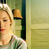
Alright, so we're going to start with a screencap made _jems_. For conveience's sake, I've already cropped it. A couple of things about cropping: when you crop, always make sure the end result is a perfect square and also: I'm a real big fan of "creative" cropping. I love open space and tend to avoid center crops. I've also cropped the screencap to 200x200. Now, I don't always, but here that's just the rate size and since we'll be reducing it by 50% later, it'll resize nice and even.
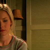
Before you resize, go to Enhance Photo>>Edge Preserving Smooth. I keep the level of smoothing always set on 2. The reason for this is so that when we resize and sharpen, it'll help reduce pixelation around the egges. Now resize to 100x100 by going to Image>>Resize or by pressing Shift-S. Then sharpen by going to Adjust>>Sharpness>>Sharpen or going by selecting sharpen from Enhance Photo.
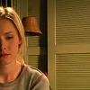
After sharpening I begin working on the icon by brightening it up, since the cap is a little dark. Go to Adjust>>Brightness and Contrast>>Brightness and Contrast or by pressing Shift-B. I set the Brightness to 25 and the Contrast to 15. After some experimentation, I find that these settings usually work well on a variety of caps.
I then duplicate the new brighter base twice by going to Layers>>Duplicate. The topmost layer I set to Soft Light by clicking the drop down menu on the Layers Pallette and the middle layer is set to Screen. From the bottom, your layers should now go: base, screen, softlight. The screen layer brightens up the icon while the soft light layer increases the boldness of the colors and the strength of the contrast.

>>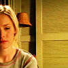
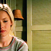
Now, the icon is much much too orange for my liking. The skin tone doesn't look natural. So, I adjust the Color Balance, starting at the top with the soft light layer. I go to Enhance Photo>>Automatic Color Balance. I move the slider all the way over to the end of Blue at 9300K. This takes away the orange-ness of the image, by replacing it in cooler, blue tones. But because the icon looks still too orange, I do the same thing for the screen layer and the base layer as well.

>>
Now that's much better and it's time to play with coloring. Make a new layer by clicking on the new Raster Layer button on the layer pallette (it looks like two squares overlapped) or by going to Layers>>New Raster Layer. Fill that layer with this gradient (comes standard with PSP):

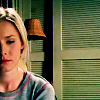
Set your gradient layer to burn. I choose burn because it darkens an icon and increases the contrast. Which makes it look really really good. The order of the layers from the bottom should now go: base, screen, soft light, burn.

>>
But my icon is still too dar, not the light and breezy coloring I'm going for. So I make a new layer and fill it with the following gradient by crumblingwalls:

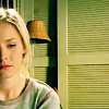
I use this yellowish gradient because I think it can bring the type of bright coloring I want. And I want to use a gradient instead of just a single fill color because gradients add depth and subtlety to the coloring. I set this new layer to soft light, because light colors on that setting really tend to brighten things up. Howeve, I'm not sure I like this layer on top of everything else, so I move it beneath my burn layer. I like that much better. The order of your layers from the bottom should now go: base, screen, base copy on softlight, gradient on soft light, burn.

>>
One last step! In order to balance out the brightness of Veronica's face in one corner by adding a bit of brightness in the opposite corner. I do that by deciding to use the following gradient brush, by quebelly:

Now, in order to show the brush for the tut, I used black, however, on the icon, I set my color to white. Now, that's just a little too strong, so on the opacity slider on the layer pallette I play with various opacity's eventually deciding on 56%, just because I think it looks goood there. Final thing: in order for the whit of the gradient to blend in and not overpower the coloring, I move the layer below my burn layer. The final order of your layers from the bottom should now go: base, screen, base copy on soft light, gradient on soft light, gradient brush on normal, burn.

>>
And you're done!
A note about adapting this technique: this is how I colored my Scrubs icons, with only a few subtle differences. I left out the gradient brush, and replaced the yellow-y gradient with a light pink fill layer set to burn (cause the yellow looks bad with Scrubs colors).
There you go! Have fun!

Alright, so we're going to start with a screencap made _jems_. For conveience's sake, I've already cropped it. A couple of things about cropping: when you crop, always make sure the end result is a perfect square and also: I'm a real big fan of "creative" cropping. I love open space and tend to avoid center crops. I've also cropped the screencap to 200x200. Now, I don't always, but here that's just the rate size and since we'll be reducing it by 50% later, it'll resize nice and even.

Before you resize, go to Enhance Photo>>Edge Preserving Smooth. I keep the level of smoothing always set on 2. The reason for this is so that when we resize and sharpen, it'll help reduce pixelation around the egges. Now resize to 100x100 by going to Image>>Resize or by pressing Shift-S. Then sharpen by going to Adjust>>Sharpness>>Sharpen or going by selecting sharpen from Enhance Photo.

After sharpening I begin working on the icon by brightening it up, since the cap is a little dark. Go to Adjust>>Brightness and Contrast>>Brightness and Contrast or by pressing Shift-B. I set the Brightness to 25 and the Contrast to 15. After some experimentation, I find that these settings usually work well on a variety of caps.
I then duplicate the new brighter base twice by going to Layers>>Duplicate. The topmost layer I set to Soft Light by clicking the drop down menu on the Layers Pallette and the middle layer is set to Screen. From the bottom, your layers should now go: base, screen, softlight. The screen layer brightens up the icon while the soft light layer increases the boldness of the colors and the strength of the contrast.

>>

Now, the icon is much much too orange for my liking. The skin tone doesn't look natural. So, I adjust the Color Balance, starting at the top with the soft light layer. I go to Enhance Photo>>Automatic Color Balance. I move the slider all the way over to the end of Blue at 9300K. This takes away the orange-ness of the image, by replacing it in cooler, blue tones. But because the icon looks still too orange, I do the same thing for the screen layer and the base layer as well.

>>

Now that's much better and it's time to play with coloring. Make a new layer by clicking on the new Raster Layer button on the layer pallette (it looks like two squares overlapped) or by going to Layers>>New Raster Layer. Fill that layer with this gradient (comes standard with PSP):

Set your gradient layer to burn. I choose burn because it darkens an icon and increases the contrast. Which makes it look really really good. The order of the layers from the bottom should now go: base, screen, soft light, burn.

>>

But my icon is still too dar, not the light and breezy coloring I'm going for. So I make a new layer and fill it with the following gradient by crumblingwalls:

I use this yellowish gradient because I think it can bring the type of bright coloring I want. And I want to use a gradient instead of just a single fill color because gradients add depth and subtlety to the coloring. I set this new layer to soft light, because light colors on that setting really tend to brighten things up. Howeve, I'm not sure I like this layer on top of everything else, so I move it beneath my burn layer. I like that much better. The order of your layers from the bottom should now go: base, screen, base copy on softlight, gradient on soft light, burn.

>>

One last step! In order to balance out the brightness of Veronica's face in one corner by adding a bit of brightness in the opposite corner. I do that by deciding to use the following gradient brush, by quebelly:

Now, in order to show the brush for the tut, I used black, however, on the icon, I set my color to white. Now, that's just a little too strong, so on the opacity slider on the layer pallette I play with various opacity's eventually deciding on 56%, just because I think it looks goood there. Final thing: in order for the whit of the gradient to blend in and not overpower the coloring, I move the layer below my burn layer. The final order of your layers from the bottom should now go: base, screen, base copy on soft light, gradient on soft light, gradient brush on normal, burn.

>>

And you're done!
A note about adapting this technique: this is how I colored my Scrubs icons, with only a few subtle differences. I left out the gradient brush, and replaced the yellow-y gradient with a light pink fill layer set to burn (cause the yellow looks bad with Scrubs colors).
There you go! Have fun!