Tutorial #1
Learn how I started with this 
and ended with this
Made in PS CS3, not translatable.
1. This goes without saying, but start by creating your base. Screencap from here.
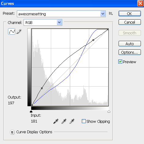
2. First, I created a new adjustment layer >>> curves. My settings look like this:

Be sure to play around until you get it at asetting that you like. Keep in mind that it should look a little more brighter and vibrant.
3. Them I made a adjustment layer >>> hue/saturation with these settings:
saturation +18
lightness +6
4. Lastly, I made a new adjustment later >>> selective color
REDS:
CYAN -12
MAGENTA -11
YELLOW -19
BLACK 26
YELLOWS:
CYAN +21
MAGENTA -6
YELLOW -25
BLACK -68
NEUTRALS:
CYAN -10
MAGENTA -9
YELLOW -16
BLACK +13
Other icons made with this basic technique, with alterations of the settings on certain steps:


.
Make sure that you don't copy this tutorial exactly. It won't work on every icon perfectly, so play around with the settings until you get something you're happy with :)

and ended with this

Made in PS CS3, not translatable.
1. This goes without saying, but start by creating your base. Screencap from here.
2. First, I created a new adjustment layer >>> curves. My settings look like this:

Be sure to play around until you get it at asetting that you like. Keep in mind that it should look a little more brighter and vibrant.
3. Them I made a adjustment layer >>> hue/saturation with these settings:
saturation +18
lightness +6
4. Lastly, I made a new adjustment later >>> selective color
REDS:
CYAN -12
MAGENTA -11
YELLOW -19
BLACK 26
YELLOWS:
CYAN +21
MAGENTA -6
YELLOW -25
BLACK -68
NEUTRALS:
CYAN -10
MAGENTA -9
YELLOW -16
BLACK +13
Other icons made with this basic technique, with alterations of the settings on certain steps:


.
Make sure that you don't copy this tutorial exactly. It won't work on every icon perfectly, so play around with the settings until you get something you're happy with :)