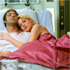
Grey's Anatomy Tutorial
Grey's Anatomy tutorial!
from
TO
OKAY PEOPLE. GREY'S ANATOMY. WHOOOOOOO.
Step one: Crop your base and bring it down to whatever size you want it to be. Mine, of course, is at 100x100 pixels.

Pretty, right? No. Not at all. We have a long way to go before the pretty starts.
Step two: A NEW CURVES LAYER. If you don't know how to get there, you really should learn. Layer - New Adjustment Layer - Curves. Whoopee.
RGB
Input: 124
Output: 209
Now click okay.

Step three: A HUE/SATURATION LAYER. Now if you're the type that catches on quickly, you'll know exactly where to go. Layer - New Adjustment Layer - Hue/Saturation. Go you, smary-pants.
Master saturation: +19

Step four: A COLOR BALANCE LAYER. Oh Em Gee, guess where that is. You guessed it. Layer - New Adjustment Layer - Color Balance.
Midtones: 0, +6, 0

Step five: Almost there, people. ANOTHER CURVES LAYER. I'm not even gonna tell you how to get there. Here's the catch, though. You have to set it to softlight 32%. Or after you're done with the layer, you can adjust the opacity to whatever fits your icon. Here's another catch, after hitting "OK" after adjusting the opacity, I want you to click "OK" in the curves box. That's right. Don't do anything. All this layer did was add some much needed contrast to your graphic. :]

Note: I learned this step from another tutorial a while ago, but I didn't save it. If anyone knows who's tutorial it's from, pleeeease tell me so I can give proper credit. :]
Step six: LAST ONE! ANOTHER COLOR BALANCE LAYER. You know how to get there.
Midtones: +28, +34, 0

And there you go. That's your icon. I'd love, love, love to see your results, and comment to ask questions. Comments, to me, are sugary goodness wrapped in unadulterated love. Thank you, thank you very much.
Other icons achieved by using this method:


from

TO

OKAY PEOPLE. GREY'S ANATOMY. WHOOOOOOO.
Step one: Crop your base and bring it down to whatever size you want it to be. Mine, of course, is at 100x100 pixels.

Pretty, right? No. Not at all. We have a long way to go before the pretty starts.
Step two: A NEW CURVES LAYER. If you don't know how to get there, you really should learn. Layer - New Adjustment Layer - Curves. Whoopee.
RGB
Input: 124
Output: 209
Now click okay.

Step three: A HUE/SATURATION LAYER. Now if you're the type that catches on quickly, you'll know exactly where to go. Layer - New Adjustment Layer - Hue/Saturation. Go you, smary-pants.
Master saturation: +19

Step four: A COLOR BALANCE LAYER. Oh Em Gee, guess where that is. You guessed it. Layer - New Adjustment Layer - Color Balance.
Midtones: 0, +6, 0

Step five: Almost there, people. ANOTHER CURVES LAYER. I'm not even gonna tell you how to get there. Here's the catch, though. You have to set it to softlight 32%. Or after you're done with the layer, you can adjust the opacity to whatever fits your icon. Here's another catch, after hitting "OK" after adjusting the opacity, I want you to click "OK" in the curves box. That's right. Don't do anything. All this layer did was add some much needed contrast to your graphic. :]

Note: I learned this step from another tutorial a while ago, but I didn't save it. If anyone knows who's tutorial it's from, pleeeease tell me so I can give proper credit. :]
Step six: LAST ONE! ANOTHER COLOR BALANCE LAYER. You know how to get there.
Midtones: +28, +34, 0

And there you go. That's your icon. I'd love, love, love to see your results, and comment to ask questions. Comments, to me, are sugary goodness wrapped in unadulterated love. Thank you, thank you very much.
Other icons achieved by using this method:


