(no subject)
Requested Tutorial #1 (for PSP8)
potthead requested a tutorial for lightening dark SPN caps and coloring. There's a lot to cover so I've split it up.
But before you read the tutorials you MUST read the Guidelines and before you ask a question PLEASE read the FAQ.
Part 1
---->
Tutorial 1
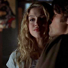
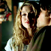
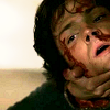
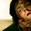
I cropped and then resized a cap of Sam & Jess to 100x100.
--->
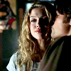
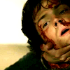
To lighten the image I copied the image and then pasted it in a new layer (Edit / Copy - Edit / Paste / Paste As New Layer). I then set the new layer on "Screen"
--->

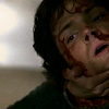
It's still not light enough so I repeated the step but differently -- Edit / Copy Merged / Edit / Paste As New Layer. I again set the new layer on "Screen"

--->

Then I filled a new layer with this light blue color. Set the Opacity on 20% and the layer on "Burn"
--->
Then I merged the layers and went to Adjust / Brightness and Contrast / BrightnessContrast / and set the brightness on 10 and the contrast on 20. This step is different for every icon so you have to play around with it.
--->

I smoothed out the pixelated areas by using the Smudge Brush and setting the size to 3, hardness to 0, opacity to 30 and going over the areas I wanted to smooth out. (For the more pixelated areas you might have to increase the opacity)

--->
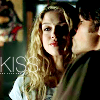
And to add a little warmth to the pic I filled a new layer with this light yellow color. Set the Opacity on 20% and the layer on "Overlay"
--->
And finally, I added some text (Font: Lane - Narrow , Size: 16) and tiny text to complete the icon.
Part 2
---->
Tutorial 2
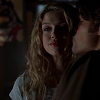
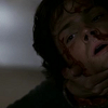
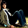
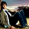
I cropped and then resized a cap of Sam to 100x100.

--->
To lighten the image I filled a new layer with this light cream color and set in to opacity 100% and the layer on overlay
--->
It's still not light enough so I repeated the step with the layer on 100% opacity again.

--->
And to add a little warmth to the pic I filled a new layer with this light yellow color. Set the Opacity on 20% and the layer on "Overlay"
--->

Then I merged the layers and went to Adjust / Brightness and Contrast / BrightnessContrast / and set the brightness on 8 and the contrast on 15. This step is different for every icon so you have to play around with it.
--->
I smoothed out the pixelated areas by using the Smudge Brush and setting the size to 3, hardness to 0, opacity to 30 and going over the areas I wanted to smooth out.
Part 3
&
Tutorial 3
So coloring. Well, it really depends on the image but mostly I just try to enhance the colors already in the image.
-----------------------------------------
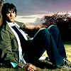
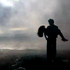
For example, in this Kyle XY icon, I went over the upper half with a light blue color (set on "Overlay" - or you can use "Burn" too) and the bottom half with green. It's really just the small touches that make a difference.
--->
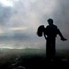
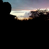
And everyone seems to really like this icon but I hardly did anything to it all. The only thing I added was the image in the background (I didn't even touch the coloring in that either). And at the end I burned the same light blue color used in the first tutorial (which I do in all my icons anyways).

--->
--->
--->
-----------------------------------------
Coloring is the part that's really hard to write a tutorial for because it requires trusting your feelings on what looks right. It takes a slightly aesthetic eye to get a feel for what colors work well together but if you experiment you'll eventually find what suits you. And that's really the key: to find something unique that's just yours.
-----------------------------------------------------------------------------------------------------------------
IMPORTANT!
Please remember that tutorials are guides and are not meant to be copied step-for-step. It is okay to do that when you are practicing but do not post icons in the exact same style as a tutorial and definitely DO NOT enter icons made using tutorials into contests. I know it sounds improbable but it has happened to me many times before.
PLEASE read the FAQ before asking a question. And remember my tutorials are for people with some basic knowledge of the program. Don't ask me simple stuff like "How do I open an image?" because that's something you need to learn by playing around with the program.