(no subject)
my old tutorials
from
to
000
crop your cap/picture. mine was from hilarie-burton.com

001
make a new adjustment layer -> curves
RGB; input:96 output:173

002
make a new adjustment layer -> selective color
Reds: -100 | 0 | +100 | 0
Yellows: 0 | 0 | -100 | 0
Neutrals: +10 | -10 | -5 | +10
!reduce the opacity to 50%

003
make a new adjustment layer -> color balance
Midtones: +15 | +10 | +25

005
make a color fill layer with #FCD45C. set it to soft light and reduce the opacity to 77%

005
make a new adjustment layer -> selective color.
Yellows: +33 | -12 | -34 | 0
Neutrals: +43 | 0 | -18 | -2
!reduce the opacity to 81%

006
add a new adjustment layer -> brighgtness/contrast
b: -15
c: +4

007
make a new adjustment layer -> curves
RGB
1st: move the lefthand corner point to; Input:21 (Output:0)
2nd: input: 150 output: 170

008
make a new adjustment layer -> colorbalance
Shadows: -5 | 0 | -19
Midtones: +11 | -3 | -8
Highlights: -1 | -1 | 0
!reduce the opacity to 28%

other icons made with this tutorial (with similar settings):
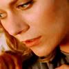

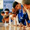
from
to
000
crop your picture/cap. i started with a cap from revelatiion.

001
make a new adjustment layer -> curves.
RGB; Input: 96 Output:162

002
make a color fill layer and fill it with #140202. set it to exclusion at 100% opacity.

003
create a second color fill layer, fill it with #EEEADF and set it to colorburn at about 62% opacity.

004
make a new adjustment layer -> brightness/contrast.
brightness: +10
contrast: +6

005
another new adjustment layer -> channel mixer
Red: +100 | 0 | +4 | 0
Green: +1 | +100 | 0 | 0
Blue: -2 | +10 | +100 | -5

006
new adjustment layer -> curves
RGB;
1st: move the lefthand corner point to; Input:11 (Output:0)
2nd: Input: 77 Output: 50
3rd: Input: 150 Output: 143

007 (optional, to get a tiny bit more contrast)
now copy merged (edit -> copy merged or Shift + Ctrl + C) and paste.
set the copy soft light at around 13% opacity.

008
make a new adjustment layer -> hue/saturation
Master: 0 | +5 | 0

also made with this tutorial:

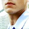
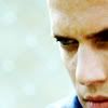
from
to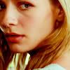
000
crop your base (mine was a screencap from screencap paradise).

001
duplicate it and set the copy to screen at 75% opacity.

002
add a new adjustment layer -> curves
RGB; Input: 114 Output: 155

003
make a new color fill layer. fill it with #150101 and set it to exclusion at 100% opacity.

004
add a second color fill layer. fill it with #FBD4D4 and set it to color burn at 50% opacity.

005
make a third color fill layer. fill it with #E6E5C9. set it to color burn at 68% opacity.

006
make a new adjustment layer -> brightness/contrast.
brightness: -9
contrast: +18

007
make a new adjustment layer -> selective color.
Reds: -1 | -5 | +12 | -1
Neutrals: +10 | -4 | -5 | -8

008
make a new adjustment layer -> curves.
RGB;
1st: push the point in the lefthand corner to Input: 9 (Outuput: 0)
2nd: Input:128 Output:135
looks like this

009
make a new adjustment layer -> hue/saturation:
Master: 0 | +9 | 0
Reds: 0 | -4 | 0
Yellows: 0 | +12 | 0

from
to
01
crop your picture (mine was a cap by _jems_) and create a new curves adjustment layer with the following settings:
RGB screen
1st (the one that is usually in the lefthand corner):
I:5 | O:3
2nd
I: 52 | O: 111
3rd
I:121 | O:193
Red srceen
1st
I:140 | O:150
Blue srceen
1st
I:107 | O:114
2nd
I:147 | O: 164
02
make a new selective color adjustment layer with these settings (opacity 19%!):
Reds:
-100 | 0 | 0 | 0
Yellows:
-26 | 0 | 0 | 0
Whites:
-100 | 0 | 0 | 0
Neutrals:
-29 | -5 | +16 | +10
03
make a new color balance adjustment layer with the following settings:
Shadows:
-20 | 0 | +9
Midtones:
+5 | -4 | +18
Highlights:
+7 | 0 | -23
04
add a hue/saturation adjustment layer
Reds:
S: -7
05
make another selective color adjustment layer with these settings
Reds:
0 | 0 | +18 | 0
Yellows:
0 | 0 | +26 | 0
Neutrals:
0 | 0 | +3 | -5
06
fill a new layer with #230505 and set it to exclusion (100%)
07
and another color fill layer with #020513 to exclusion (100%)
08
make a 3rd selective color adjustment layer with these settings:
Reds:
-3 | 0 | +18 | +22
Yellows:
-17 | 0 | +21 | -29
Neutrals:
0 | 0 | -3 | +2
09
make a 2nd hue/saturation adjustment layer with this setting:
RGB
S: +2
10
a brightness/contrast adjustment layer with these settings:
B: +11
C: +24
11
one last step: a new color balance adjustment layer with the following settings:
Midtones:
-4 | 0 | +11
Highlights:
-12 | 0 | +14
other icons with this (or a very similar) coloring


from
to
step one
duplicate the base and set to screen (mine was duplicated twice; first 100% opacity, second 66% opacity)
(step two and three (+ a some settings from four) are from this tutorial by _chokeanddie)
step two
add a new layer, fill it with #110202 and set it to exclusion (100%)
step three
add a new layer, fill it with #FEEDED and set it to color burn (100%)
step four
make a selective color adjustment layer with the following settings:
neutrals:
C: +15 | M: -11 | Y: +3 | B: +11
step five
make another selective color adjustement layer with these settings:
reds:
C: 0 | M: 0 | Y: +10 | B: -22
yellows:
C: +4| M: +6 | Y: -20 | B: -33
neutrals:
C: -2 | M: +7 | Y: 0 | B: +15
step six
make a new curves adjustment layer, set these points and make the opacity to about 39%.
RGB:
Input; 121 | Output; 153
Blue:
1st: Input; 164 | Output; 206
2nd: Input; 123 | Output; 74
step seven
make a new hue/saturation adjustment layer. set:
master: saturation; +12
step eight
make a color balance adjustment layer.
shadows: +7 | +4 | +14
midtones: 0 | -17 | +22
highlights: -4 | 0 | +25
other icons made with this technique or similar:
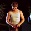
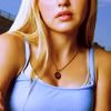
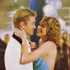
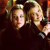
from
to
00
take a picture. crop it. this is gonna be your base.
i used a picture from lost-media.com

01
dublicate your base. set it to screen. lower the opacity (mine was 71% but that depends on your base)

02
layer >> new adjustment layer >> selective color
reds:
-100/+16/+100/0
yellows:
-47/0/-31/-22
neutrals:
17/-11/-18/-18

03
duplicate the selective color layer. (you might need to lower the opacity. on this picture i didn't have to)

04
layer >> new adjustment layer >> selective color
(opacity with my base was 45%)
reds:
-70/-30/-27/22
yellow:
-60/-27/-27/-27
neutrals:
-16/-4/21/3

05
last but not least.
a new layer. fill it with yellow (#FFF006) set it to soft light and lower the opacity (mine was 9%)

06
and now you can add whatever you want.
i added a texture by loveicon
et voilà

with slightly different settings (changing the opacities etc.) i also came up with the following:
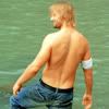

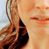
from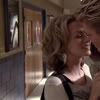
to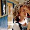
000
find a picture.
mine is this one from lucasandpeyton.com
crop it.

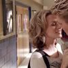
001
duplicate the base.
set it to screen.
opacity 100%.
002
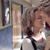
layer >> new adjustment layer >> selective color
use the following settings:
reds
cyan: -51
magenta: -11
yellow: +80
black: 0
yellows
cyan: -30
magenta: -1
yellow: +28
black: 0
neutrals
cyan: +21
magenta: 0
yellow: -21
black: -9
003
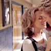
layer >> new adjustment layer >> curves
use the follwing settings:
RGB looks like this
#1 Input: 20
Output: 0
#2 Input: 106
Output: 112
red
#1 Input: 135
Output: 150
blue
#1 Input: 131
Output: 124
download the curves @ sendspace
004
layer >> new adjustment layer >> selective color
use the following settings:
reds
cyan: -22
magenta: 0
yellow: +17
black: 0
yellows
cyan: -67
magenta: 0
yellow: +18
black: 0
neutrals
cyan: +33
magenta: 0
yellow: 0
black: 0
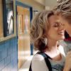
005
layer >> new adjustment layer >> curves
use the follwing settings:
RGB looks like this
#1 Input: 32
Output: 0
#2 Input: 121
Output: 121
download the curves @ sendspace

that's it!
you can of course add some text, a nice texture, some brushes or whatever you want ;)
my icon turned out weird. what can i change?
every picture is different so you won't be able to copy this tutorial exactly.
if you don't like your outcome try the following things;
the icon is too bright/dark
add another screen-layer (or reduce the opacity of the first one)
the icon has too much contrast
leave out the last step.
the coloring is too bluish/redish
leave away one of the selective colorings or the first curves-layer (or just play with the numbers)
the coloring still looks like something is missing
try another selective color/curves-layer
add a color-filled layer (e.g. light blue on color burn or light pink on soft light.
etc.
other examples made with (almost) the same technique
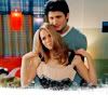
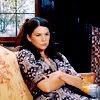
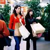
from
to
i used this picture;
from jennifer morrison online
and now step by step:
#0: crop it
#1: add a darkblue layer
(# 01051C) set it to exclusion (100%)
#2: add a lightblue layer
(# C9F9FD) set it to color burn (100%)
now my picture looks like this:
after #4 it is going to look like this:
#3: here comes the "tricky" part (i'm not quite sure if the english names are correct, because i use a german verion...)
Layer >> New Adjustment Layer >> Hue/Saturation
standard(?): saturation; +50 looks like this
reds: saturation; +30 looks like this
yellows: saturation; -75 looks like this
greens: +33 looks like this
cyans: +33 looks like this
leave the rest.
these numbers depend a lot on your picture, so play with them.
#4: add an intensive lightblue layer
(# 8BE0FD) set to soft light (60%)
#5: add a pink layer
(# E2A5A0) set to overlay (100%)
#6: copy your base to the top and set it to soft light. play with the opacity (i used 80%)
that's it.
now i only added this mask
by ewanism
and i added some text (violation, size 18, # 0054BC).
et voilà:
also made with this tutorial:

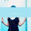
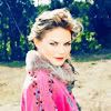
from

to

000
crop your cap/picture. mine was from hilarie-burton.com

001
make a new adjustment layer -> curves
RGB; input:96 output:173

002
make a new adjustment layer -> selective color
Reds: -100 | 0 | +100 | 0
Yellows: 0 | 0 | -100 | 0
Neutrals: +10 | -10 | -5 | +10
!reduce the opacity to 50%

003
make a new adjustment layer -> color balance
Midtones: +15 | +10 | +25

005
make a color fill layer with #FCD45C. set it to soft light and reduce the opacity to 77%

005
make a new adjustment layer -> selective color.
Yellows: +33 | -12 | -34 | 0
Neutrals: +43 | 0 | -18 | -2
!reduce the opacity to 81%

006
add a new adjustment layer -> brighgtness/contrast
b: -15
c: +4

007
make a new adjustment layer -> curves
RGB
1st: move the lefthand corner point to; Input:21 (Output:0)
2nd: input: 150 output: 170

008
make a new adjustment layer -> colorbalance
Shadows: -5 | 0 | -19
Midtones: +11 | -3 | -8
Highlights: -1 | -1 | 0
!reduce the opacity to 28%

other icons made with this tutorial (with similar settings):
from

to

000
crop your picture/cap. i started with a cap from revelatiion.

001
make a new adjustment layer -> curves.
RGB; Input: 96 Output:162

002
make a color fill layer and fill it with #140202. set it to exclusion at 100% opacity.

003
create a second color fill layer, fill it with #EEEADF and set it to colorburn at about 62% opacity.

004
make a new adjustment layer -> brightness/contrast.
brightness: +10
contrast: +6

005
another new adjustment layer -> channel mixer
Red: +100 | 0 | +4 | 0
Green: +1 | +100 | 0 | 0
Blue: -2 | +10 | +100 | -5

006
new adjustment layer -> curves
RGB;
1st: move the lefthand corner point to; Input:11 (Output:0)
2nd: Input: 77 Output: 50
3rd: Input: 150 Output: 143

007 (optional, to get a tiny bit more contrast)
now copy merged (edit -> copy merged or Shift + Ctrl + C) and paste.
set the copy soft light at around 13% opacity.

008
make a new adjustment layer -> hue/saturation
Master: 0 | +5 | 0

also made with this tutorial:
from

to
000
crop your base (mine was a screencap from screencap paradise).

001
duplicate it and set the copy to screen at 75% opacity.

002
add a new adjustment layer -> curves
RGB; Input: 114 Output: 155

003
make a new color fill layer. fill it with #150101 and set it to exclusion at 100% opacity.

004
add a second color fill layer. fill it with #FBD4D4 and set it to color burn at 50% opacity.

005
make a third color fill layer. fill it with #E6E5C9. set it to color burn at 68% opacity.

006
make a new adjustment layer -> brightness/contrast.
brightness: -9
contrast: +18

007
make a new adjustment layer -> selective color.
Reds: -1 | -5 | +12 | -1
Neutrals: +10 | -4 | -5 | -8

008
make a new adjustment layer -> curves.
RGB;
1st: push the point in the lefthand corner to Input: 9 (Outuput: 0)
2nd: Input:128 Output:135
looks like this

009
make a new adjustment layer -> hue/saturation:
Master: 0 | +9 | 0
Reds: 0 | -4 | 0
Yellows: 0 | +12 | 0
from

to

01
crop your picture (mine was a cap by _jems_) and create a new curves adjustment layer with the following settings:
RGB screen
1st (the one that is usually in the lefthand corner):
I:5 | O:3
2nd
I: 52 | O: 111
3rd
I:121 | O:193
Red srceen
1st
I:140 | O:150
Blue srceen
1st
I:107 | O:114
2nd
I:147 | O: 164
02
make a new selective color adjustment layer with these settings (opacity 19%!):
Reds:
-100 | 0 | 0 | 0
Yellows:
-26 | 0 | 0 | 0
Whites:
-100 | 0 | 0 | 0
Neutrals:
-29 | -5 | +16 | +10
03
make a new color balance adjustment layer with the following settings:
Shadows:
-20 | 0 | +9
Midtones:
+5 | -4 | +18
Highlights:
+7 | 0 | -23
04
add a hue/saturation adjustment layer
Reds:
S: -7
05
make another selective color adjustment layer with these settings
Reds:
0 | 0 | +18 | 0
Yellows:
0 | 0 | +26 | 0
Neutrals:
0 | 0 | +3 | -5
06
fill a new layer with #230505 and set it to exclusion (100%)
07
and another color fill layer with #020513 to exclusion (100%)
08
make a 3rd selective color adjustment layer with these settings:
Reds:
-3 | 0 | +18 | +22
Yellows:
-17 | 0 | +21 | -29
Neutrals:
0 | 0 | -3 | +2
09
make a 2nd hue/saturation adjustment layer with this setting:
RGB
S: +2
10
a brightness/contrast adjustment layer with these settings:
B: +11
C: +24
11
one last step: a new color balance adjustment layer with the following settings:
Midtones:
-4 | 0 | +11
Highlights:
-12 | 0 | +14
other icons with this (or a very similar) coloring


from

to

step one
duplicate the base and set to screen (mine was duplicated twice; first 100% opacity, second 66% opacity)
(step two and three (+ a some settings from four) are from this tutorial by _chokeanddie)
step two
add a new layer, fill it with #110202 and set it to exclusion (100%)
step three
add a new layer, fill it with #FEEDED and set it to color burn (100%)
step four
make a selective color adjustment layer with the following settings:
neutrals:
C: +15 | M: -11 | Y: +3 | B: +11
step five
make another selective color adjustement layer with these settings:
reds:
C: 0 | M: 0 | Y: +10 | B: -22
yellows:
C: +4| M: +6 | Y: -20 | B: -33
neutrals:
C: -2 | M: +7 | Y: 0 | B: +15
step six
make a new curves adjustment layer, set these points and make the opacity to about 39%.
RGB:
Input; 121 | Output; 153
Blue:
1st: Input; 164 | Output; 206
2nd: Input; 123 | Output; 74
step seven
make a new hue/saturation adjustment layer. set:
master: saturation; +12
step eight
make a color balance adjustment layer.
shadows: +7 | +4 | +14
midtones: 0 | -17 | +22
highlights: -4 | 0 | +25
other icons made with this technique or similar:
from

to

00
take a picture. crop it. this is gonna be your base.
i used a picture from lost-media.com

01
dublicate your base. set it to screen. lower the opacity (mine was 71% but that depends on your base)

02
layer >> new adjustment layer >> selective color
reds:
-100/+16/+100/0
yellows:
-47/0/-31/-22
neutrals:
17/-11/-18/-18

03
duplicate the selective color layer. (you might need to lower the opacity. on this picture i didn't have to)

04
layer >> new adjustment layer >> selective color
(opacity with my base was 45%)
reds:
-70/-30/-27/22
yellow:
-60/-27/-27/-27
neutrals:
-16/-4/21/3

05
last but not least.
a new layer. fill it with yellow (#FFF006) set it to soft light and lower the opacity (mine was 9%)

06
and now you can add whatever you want.
i added a texture by loveicon
et voilà

with slightly different settings (changing the opacities etc.) i also came up with the following:
from
to
000
find a picture.
mine is this one from lucasandpeyton.com
crop it.
001
duplicate the base.
set it to screen.
opacity 100%.
002
layer >> new adjustment layer >> selective color
use the following settings:
reds
cyan: -51
magenta: -11
yellow: +80
black: 0
yellows
cyan: -30
magenta: -1
yellow: +28
black: 0
neutrals
cyan: +21
magenta: 0
yellow: -21
black: -9
003
layer >> new adjustment layer >> curves
use the follwing settings:
RGB looks like this
#1 Input: 20
Output: 0
#2 Input: 106
Output: 112
red
#1 Input: 135
Output: 150
blue
#1 Input: 131
Output: 124
download the curves @ sendspace
004
layer >> new adjustment layer >> selective color
use the following settings:
reds
cyan: -22
magenta: 0
yellow: +17
black: 0
yellows
cyan: -67
magenta: 0
yellow: +18
black: 0
neutrals
cyan: +33
magenta: 0
yellow: 0
black: 0
005
layer >> new adjustment layer >> curves
use the follwing settings:
RGB looks like this
#1 Input: 32
Output: 0
#2 Input: 121
Output: 121
download the curves @ sendspace
that's it!
you can of course add some text, a nice texture, some brushes or whatever you want ;)
my icon turned out weird. what can i change?
every picture is different so you won't be able to copy this tutorial exactly.
if you don't like your outcome try the following things;
the icon is too bright/dark
add another screen-layer (or reduce the opacity of the first one)
the icon has too much contrast
leave out the last step.
the coloring is too bluish/redish
leave away one of the selective colorings or the first curves-layer (or just play with the numbers)
the coloring still looks like something is missing
try another selective color/curves-layer
add a color-filled layer (e.g. light blue on color burn or light pink on soft light.
etc.
other examples made with (almost) the same technique
from

to

i used this picture;

from jennifer morrison online
and now step by step:
#0: crop it

#1: add a darkblue layer

(# 01051C) set it to exclusion (100%)
#2: add a lightblue layer

(# C9F9FD) set it to color burn (100%)
now my picture looks like this:

after #4 it is going to look like this:

#3: here comes the "tricky" part (i'm not quite sure if the english names are correct, because i use a german verion...)
Layer >> New Adjustment Layer >> Hue/Saturation
standard(?): saturation; +50 looks like this
reds: saturation; +30 looks like this
yellows: saturation; -75 looks like this
greens: +33 looks like this
cyans: +33 looks like this
leave the rest.
these numbers depend a lot on your picture, so play with them.
#4: add an intensive lightblue layer

(# 8BE0FD) set to soft light (60%)
#5: add a pink layer

(# E2A5A0) set to overlay (100%)
#6: copy your base to the top and set it to soft light. play with the opacity (i used 80%)
that's it.
now i only added this mask

by ewanism
and i added some text (violation, size 18, # 0054BC).
et voilà:

also made with this tutorial:
